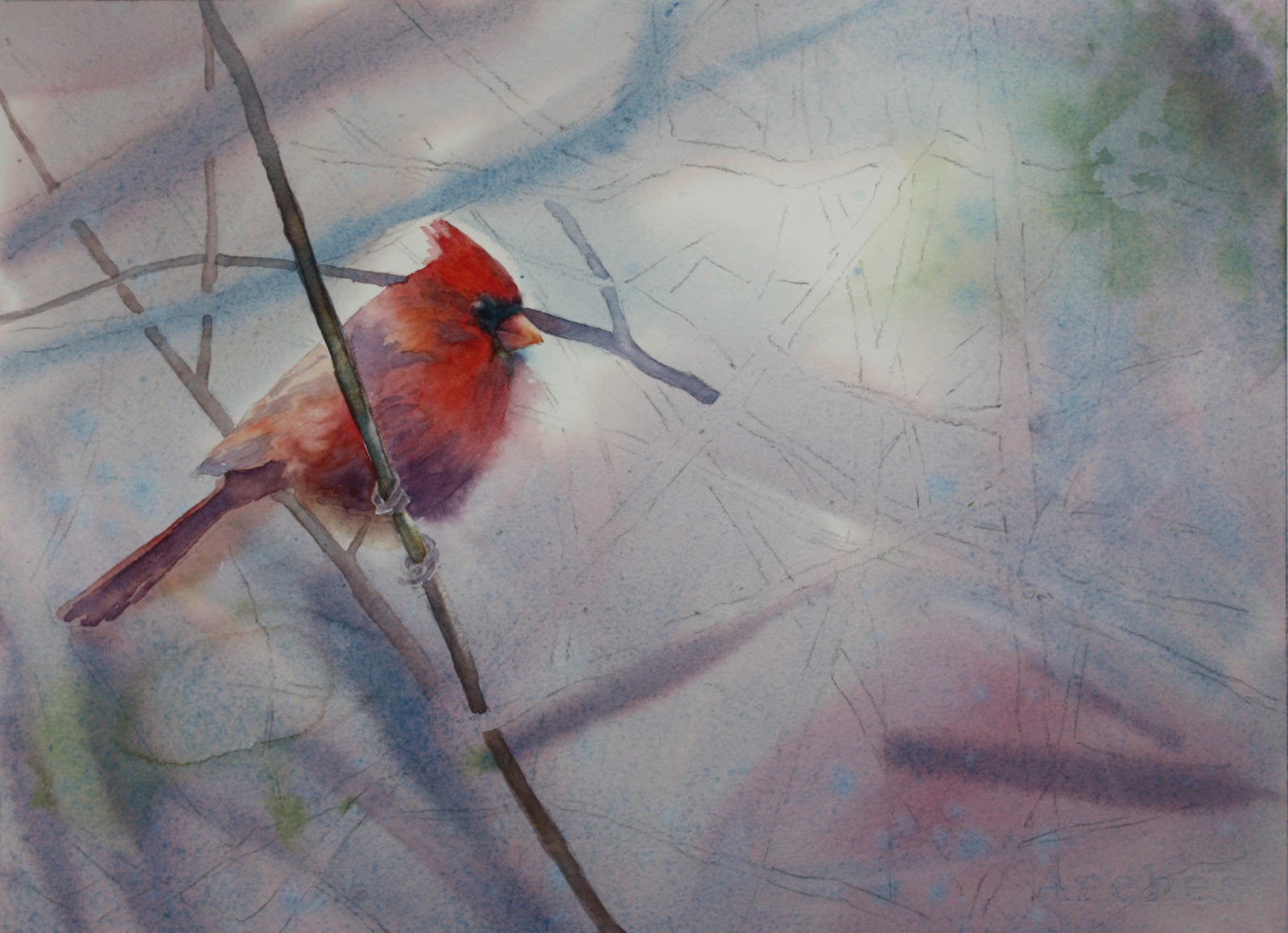
Winter class sessions have begun! We are focusing on edges...or I guess I could say we are becoming less focused! Blurring edges and having lost edges are key to interesting watercolors believe it not! I myself do not do it enough in my work, so I thought we would really get into it! Having crisper edges near your focal point is a natural draw to the eye. You see here in the cardinal that you immediately look at it's head....hopefully! Of course this picture is not finished yet, but that is my goal.
I started this painting with a wet-on-wet wash with cerulean blue mixed with a little perm. alizarin plus a little burnt sienna to take the color down a bit since it is a foggy misty scene. I added a little green in opposite corners made with ultramarine blue mixed with a little new gamboge. If you notice I added a bit more alizarin in spots also. While the wash was still wet I made some branches that are in the very far distance and I want them to be very blurry. I made that with cerulean blue and cadmium red.....there are areas where I used a little more cerulean in the mix.
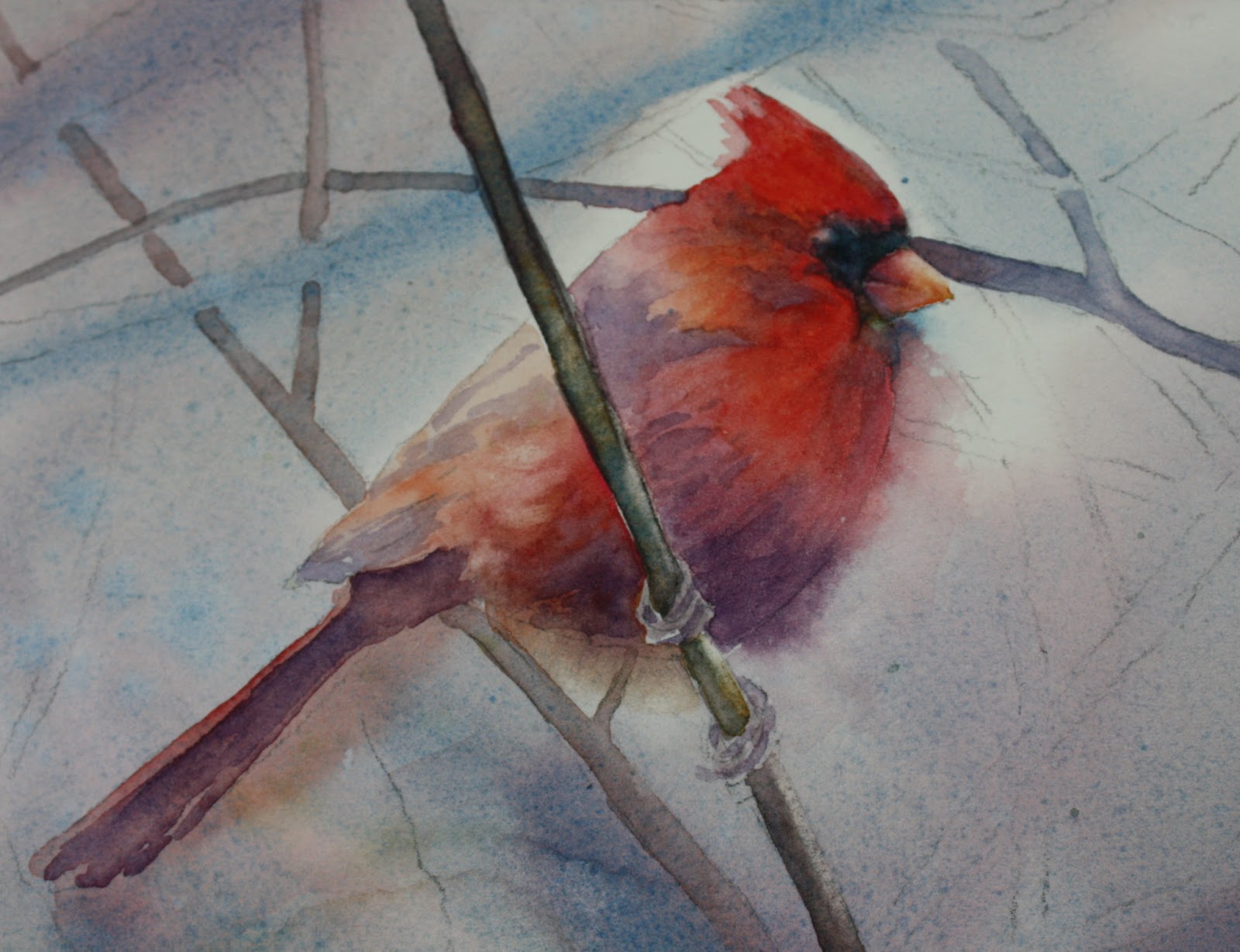
Focusing in on the cardinal, as you can see I softened the edge in the breast area and under the beak. I think it gives it a misty quality and I do think it keeps the eye from lingering too long where you don't want it to. I used cadmium red and alizarin mixed together at times, but other times I used them both separately. I also added a touch of new gamboge to the shoulder area and on top of the head. I was careful not to get too strong with color towards the back area of the bird. In order to soften the edge of the breast area I added water outside the outline of the bird so that when I painted the bird itself the color blended outside the line. You should prethink adding the water outside beforehand....the results are better than if you paint the bird first and then add water on the edge. Practice that before doing it on your painting....it helps! As you can see I also added VIOLET! What else! I used cobalt blue and alizarin in those areas and changed up to ultramarine on the tail area because it needed to be a little stronger. It's ok to mix some of the cadmium red with the violet....it blends with the bird and also tones down that violet a bit....don't overdo it though....you don't want the bird to be brown. The black area of the head I used payne's gray but added some cerulean to it in places. The beak has some yellow in it and alizarin with a little violet in the area closer to the head. I've been using new gamboge and alizarin for those colors. Violet with cobalt and alizarin.
More to come later!
Here it is later and I'm just adding the rest of the branches now. I noticed so many different colors of the branches in the photo. There is an ochre color, green, violet with more blue in it, violet with more red in it, and burnt sienna colored branches. These are the ones I am going to put in. The branches that have more yellow in it, which is the ochre, also have some burnt sienna added to it while still wet. I like to vary the color of the branches because indeed the light changes the coloring. Even the branches near the cardinal have a tinge of red to them .....maybe from the reflection of the bird.....which one of my students actually pointed out to me! Very good!!! I love it when my students point things out to me! Now I should go back and adjust me painting!!!
Ok let's continue......I can't exactly point out all the branches but take notice of the colors and the colors I give you. So you have the ochre ones, now the green. I made that with cobalt and new gamboge. Don't make the green branches too dark.....they don't stand out in the photo and shouldn't be too prominent. They also shouldn't be too yellow because it's a foggy day. The violet branches I made with ultramarine blue, alizarin and a little burnt sienna. After painting them in the violet color, you can drop in some other colors where you see it like burnt sienna or yellow ochre or green. It gives the branches some variation which is always good. In some places I added more blue, and in others more red. Also I made sure that the branches near the birds head weren't too strong in value. I didn't want the head to look like it was getting speared! Also, I made most of the branches lighter in value near the outer edges of the paper.
There are different levels of atmospheric perspective. Make sure you have branches in the foreground, middle and back of your painting. The branches in the way back are blurred and the middle ground should be paler than the foreground. Just make sure you have enough of each level. When putting the middle ground branches in, don't get too fussy about them......loosely put them in otherwise you will spend a lot of time with it and it shouldn't be that stiff.
Lastly after the branches dry, I checked to make sure there are dark spots or areas that should be noted and light areas that should be scrubbed. The tops of many of the branches are highlighted and I scrubbed those out. You can either use a scrub brush, or use a regular damp brush and blot afterwards.
I spattered my painting also. I spattered with yellow ochre, greens and violets. You can take note of those areas on the finished painting. I used a lot of water in my color to spatter so it makes larger more varied spatters. I also put in some green leaves that look dried up since it is a winter scene and they wouldn't be nice perky leaves. Don't overdo it though....I only added a few and they are pale. Also, I added some extra background in the upper and middle left of the painting because I thought it needed some darker value. You can do this after the fact - it works just fine. Just make sure that whatever you paint on one side of a branch, also comes out on the other side, otherwise you will end up with color that stops short.
That's it.....if you have any questions that I didn't cover, please feel free to email me or make a comment on the blog. Happy painting!
Monday, January 14, 2013
Monday, November 19, 2012
WATERMILL AT EASTERN
This is a well known sight at Eastern University - a very picturesque college campus that my daughter Emily attended. It was the day of her graduation in May and it was a bright sunny morning. Below is how I painted it. (I am going to take another picture of this as I took it at night and don't like the tones of green...they are not too correct....the other photos are more accurate)
I started with some of the background because I wanted to establish some darks and light greens. I used new gamboge and cobalt blue for the greens in different ratios. More yellow in some and more blue in others. I intermingled the two contrasting green in the distant bushes.
I didn't make the background grasses too dark at first but put an initial layer of the greens and did some drybrush in the foreground to indicate some light areas in the grass. Careful not to get too detailed and just indicated some grass near the edges and along the lilies. I painted the watermill with an initial layer of yellow ochre and then some areas mixed with cobalt blue to make a dull green. Burnt sienna was used in some stones on the building and the darks were made with ultramarine blue and burnt sienna. The building is in shadow and I glazed it later on. The waterwheel itself is dark....I used ultramarine and alizarin with burnt sienna. I tried to indicate water coming down and I ended up scaping some highlights. The roof is kind of tricky and I don't know if I like the results. I saw lots of violets and clay colors in the photo and tried to get those colors. I used permanent rose and burnt sienna but I would probably glaze it first with a violet and then go back with the rose....if I were to do it over. The violet I would use cobalt blue and perm. rose. It's bright, but would eventually tone it down.
Thursday, November 15, 2012
"FALLEN LEAVES"
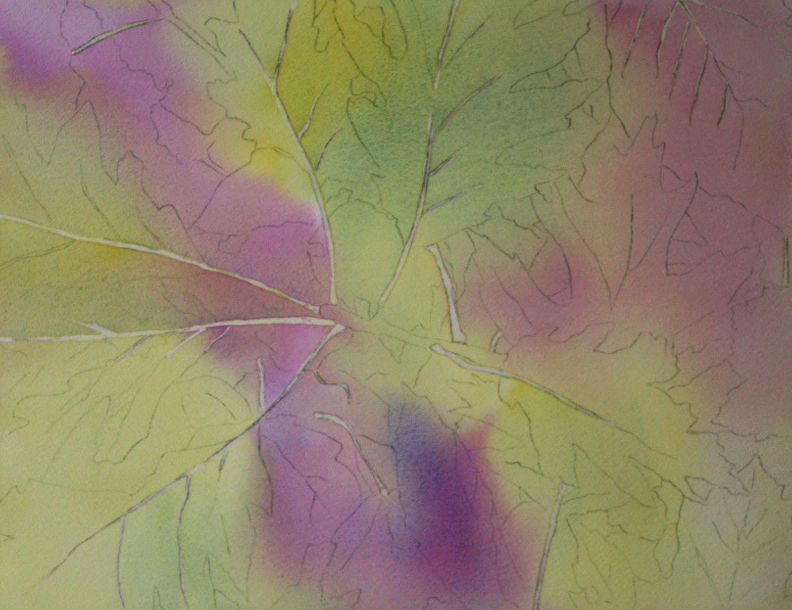
I was inspired to paint the leaves because it's autumn! I liked the composition of my photo, and I liked the colors of course. I have included below how I arrived at the finished painting. |
I started adding in the darks at this point. My reasoning is that I want to establish how dark my darkest darks should be before adding the darker leaves. (Too many dark words!!!) Sometimes if you don't do this you can get into trouble and your darks can become too dark because you've made your midtones too dark. Oh my. I used none other than VIOLET, of course, and some blues to do the deeper background...you thought I was going to say "dark" again didn't you! I used ultramarine and perm. alizarin crimson with a touch of burnt sienna to get the darker violet and used some cobalt instead to get lighter tones. I dropped cobalt in here and there to achieve a little light effect because I didn't want all my darks to be the same. Other areas I added a little more alizarin to the violet to again add some variation, but I also saw that in the picture. I added the red leaf and painted it first with winsor yellow and then dropped in cadmium red, some violet (cobalt and permanent rose) and some green (cobalt and winsor yellow). The yellow leaf in the lower right corner started also with the yellow and I just dropped in violet and some green to actually try to muddy it up a little.
Finally I painted the remaining leaves using many of the same colors. The leaf in the upper right corner which is more brown, I used a mix of burnt sienna, cobalt blue, permanent rose and a little bit of yellow. Glazing here and there with some violet along the edges to get a shadowed effect. The stem of the branch is not brown! It's VIOLET, of course, so I used some cobalt and alizarin and did much tweeking to get it right by dropping in come cobalt directly and scrubbing out some highlights then dropping in more cobalt til I got it right. The veins I had to fix a little with the paint I used for the leaves to straighten them out and make them a little smaller here and there. Sometimes I can't get the masking fluid on quite right! Adjustments can be made if done carefully. I used a semi-wet brush to just scrub out extra veins...the paint will lift easily and you do need to blot. Last but not least SPATTER.....I love spatter. Maybe too much, so I've been told!!! Leaves do have many spots so I added more! Why not.....I used a violety brown for that. If you have any questions, just leave it in the comment section and I will gladly try to answer them......have fun! I added the original photo at the end so you can see it.....it's kind of blurry...sorry, bad photographer!
Here's the photo......of course I accentuated some of the colors, but that's artistic license!!
Monday, October 15, 2012
CAPE COD CLAMMER
Did this painting today for a class I'm taking. What's nice is that I get to sit and have it critiqued on Wednesday. I'm not sure I like it. I feel like I didn't quite capture the early morning light.....I guess we'll find out!
Friday, October 12, 2012
THE PROCESS
In the finished painting, I decided the top area was too much so I cropped it. I also didn't like how I painted that stem on top so I took a big 2" brush and laid in some winsor yellow and dropped in cobalt and ultramarine to mush it together....sort of obliterating the top left side.....I guess it was successful, but have my doubts....I discovered halfway through the painting why I was having so much trouble getting the paint to move and blend.....I had filled my ultramarine blue well up with student grade paint while in class because I ran out of my professional grade paint.....and low and behold I was totally frustrated. I had also used that to mix my greens and everything else....I couldn't figure out what was wrong ......just a true test of using student grade is NOT beneficial. When I switched it was a WORLD of difference! Only wished I had noticed it sooner.
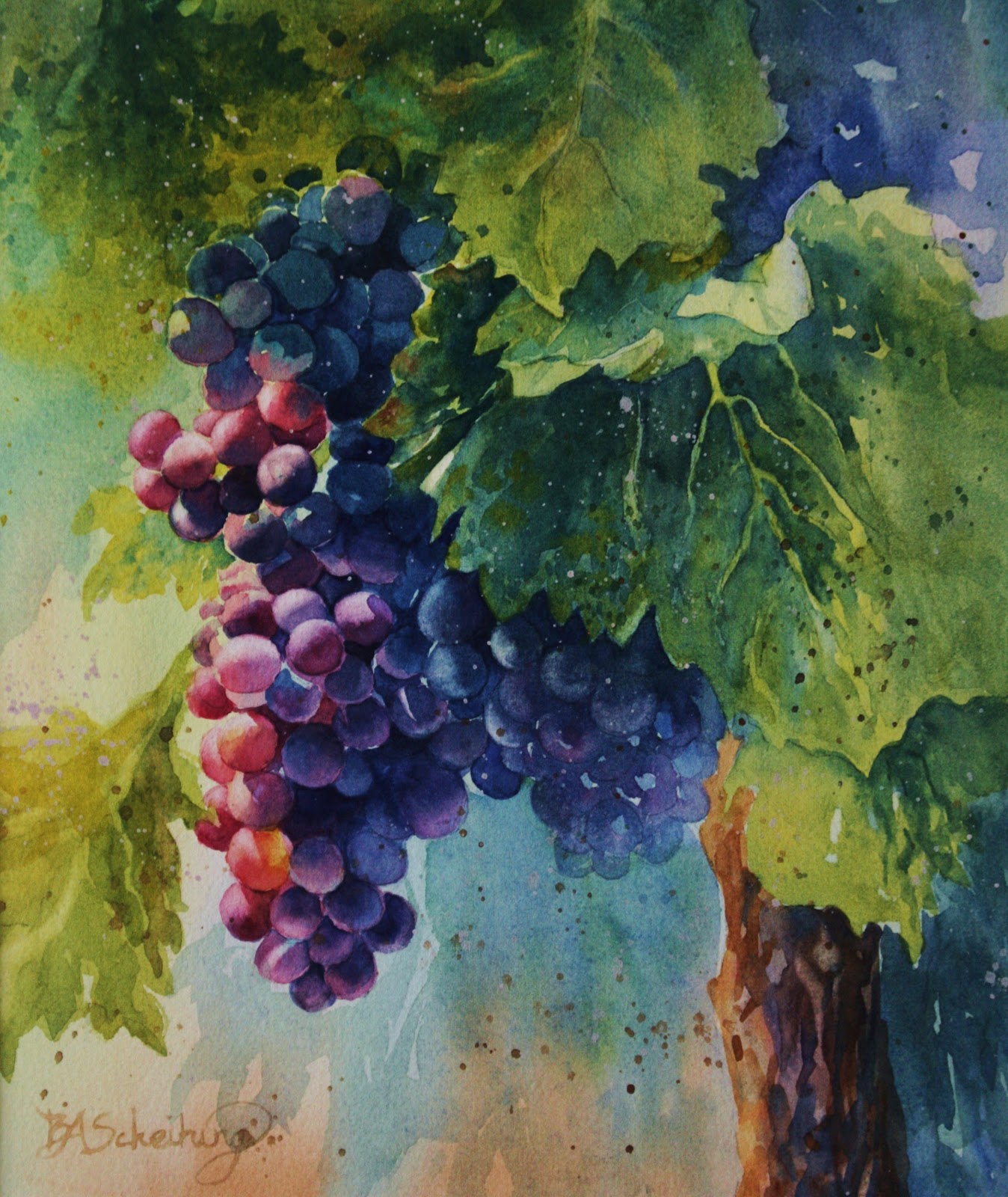
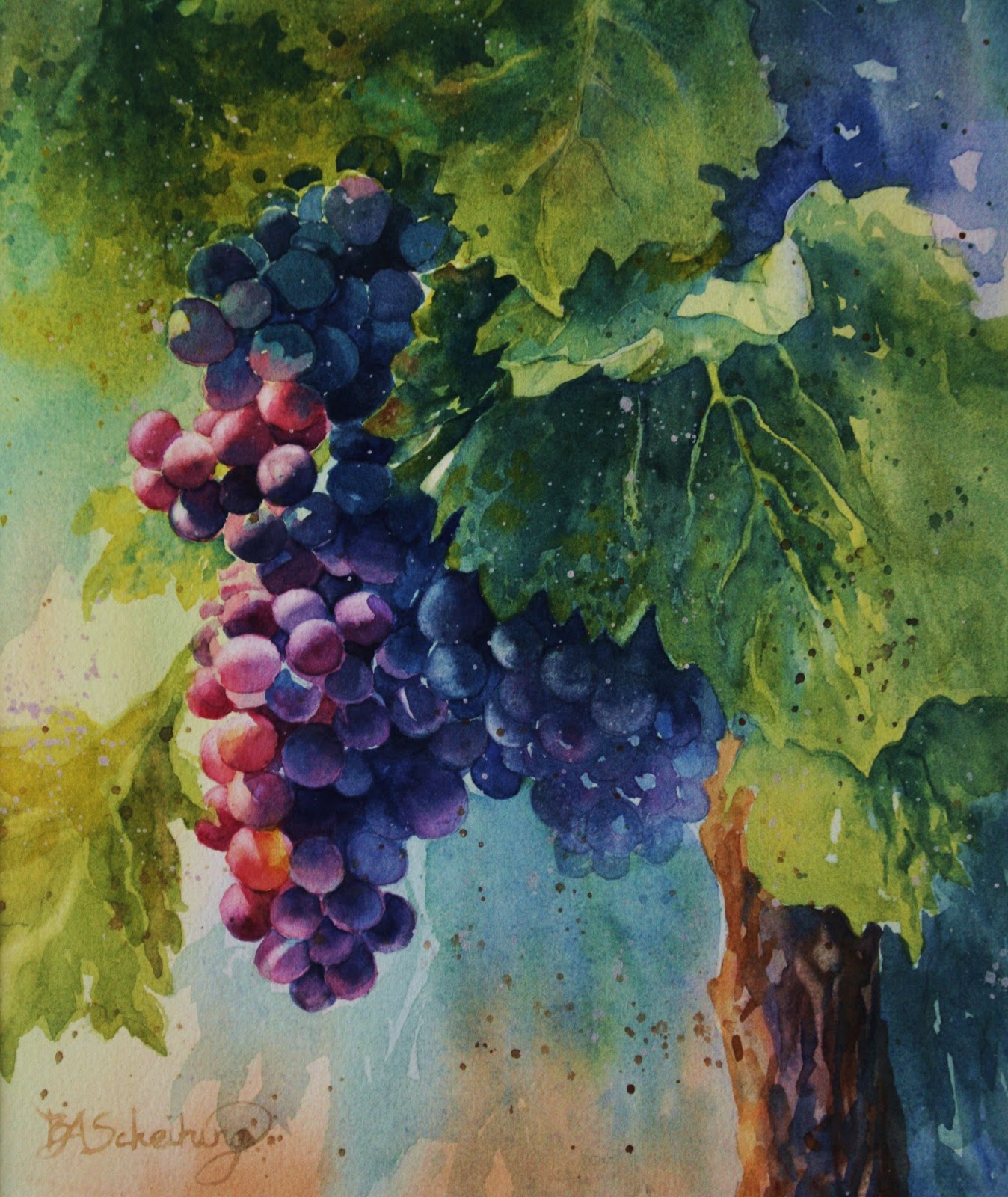
CALIFORNIA GRAPES
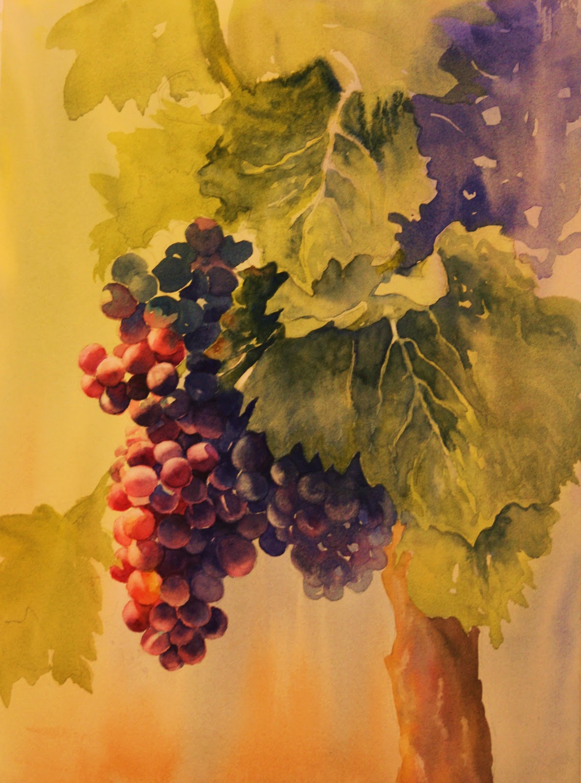
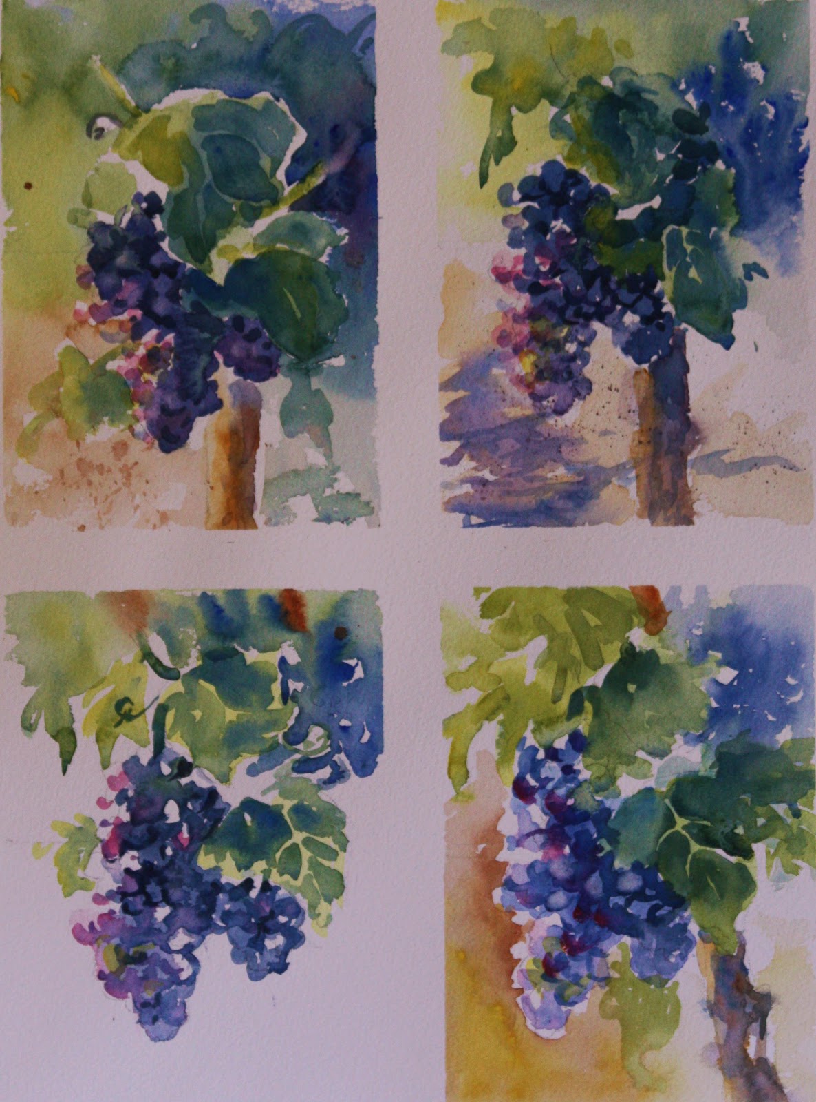
It's class time again and we are doing grapes after my trip to Sonoma County California. How luscious these grapes were and very inspiring. I loved the different tones of blues with the inclusion of orange and pink. Made me want to paint them and bring them to the class. We worked with different thumbnail sketches posted below to determine the best way to plan our final painting.
It's so good to do thumbnail paintings.....it helps with having a more definite idea of where you want to go. That doesn't necessarily mean you aren't going to change things along the way while you're painting but it does help with placement and value. The thing about watercolor is that it has that unexpected quality and you should always leave room for creative additions that either happen on purpose or not! That's the beauty of it.
Monday, September 24, 2012
Mary White Workshop - Cape Cod Creative Arts Center
I just got back from attending a Mary Whyte workshop in Cape Cod....it was the best workshop I've ever been to as far as learning from and viewing an amazing talent. I can say I was very blessed to be there. We had a great one on one time session and round table discussions as well as demonstrations. We painted figures, still life and went out to do some plein air landscape painting also. We covered a lot of areas in 5 days which was very tiring for me, can't imagine how tiring it was for her. She says she's not doing anymore 5 day workshops, so I'm so glad I got to be at her last one. I bought her book "Working South" which is an absolutely beautiful book that not only has great stories that she so eloquently wrote, but the artwork that makes up the series is gorgeous. She even signed my copy....:) I'm a groupy now! I plan on seeing the "Working South" Exhibition that is touring the southern states in Newport News, VA next spring.....here is the info:
April 6–July 7, 2013
Penninsula Fine Arts Center
Newport News, Virginia
www.pfac-va.org
This is the last part of the tour, so if you want to see these paintings, and I suggest you do, then make sure you catch it here.....I know I will. I also suggest you buy her books....they are wonderful. I can't say enough good things about her, between her faith, her work and her accomplishments, she's someone I'm proud to call a mentor.
Subscribe to:
Posts (Atom)