Thursday, May 23, 2013

Mary's Garden (May Change the Title)


I started a painting that is a little more on the challenging side.  It is not finished yet but I can walk you through the stages up to this point.
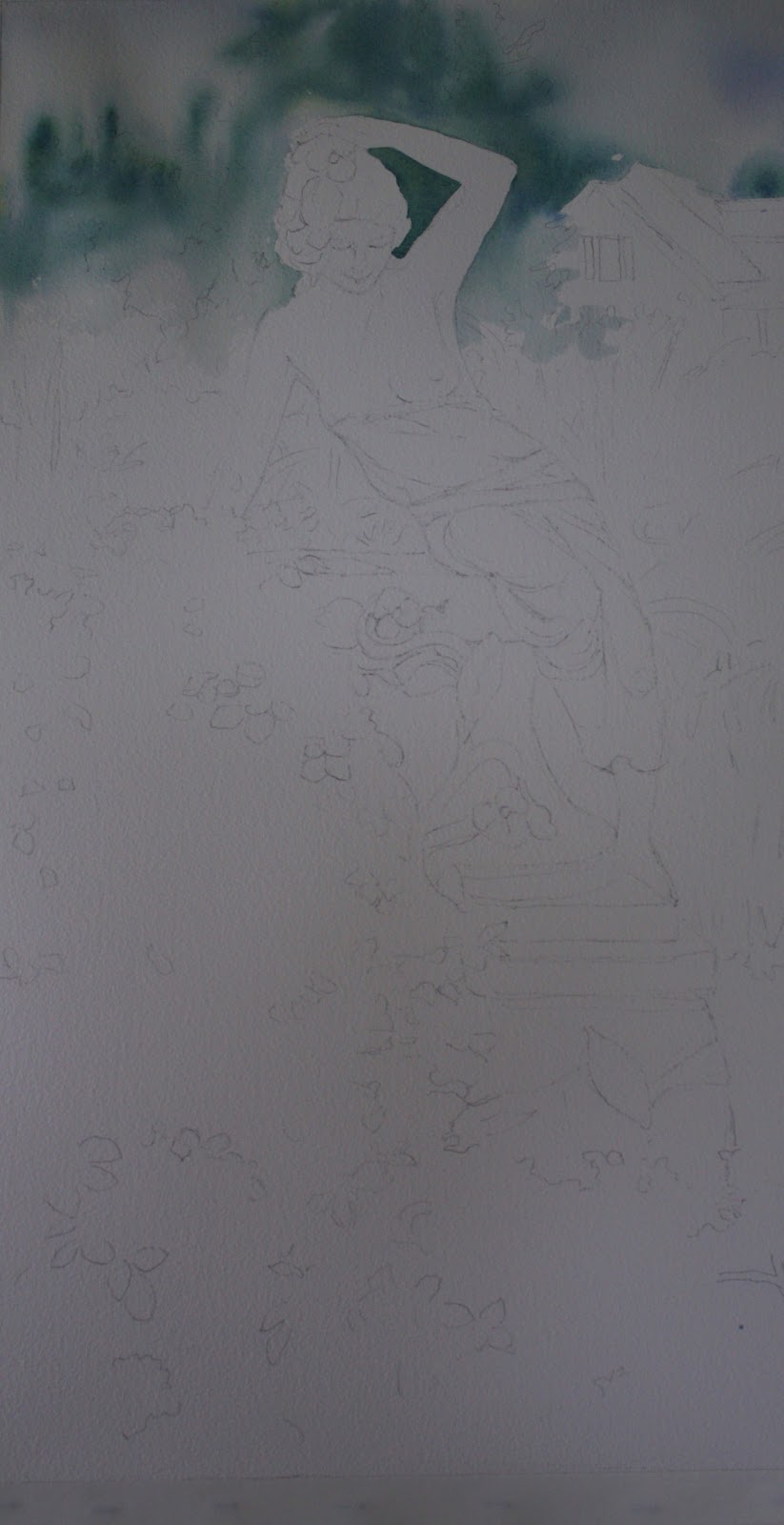

I didn't use any masking but rather painted around the figure.  I first wet all around the upper portion (up to her shoulders) of the painting, carefully going around the figure.  I put in a few clouds in the sky with a very light mix of cobalt blue and permanent rose.....more on the cobalt side.  I did not wash the whole sky but rather left it white in most parts.  Then I wanted to indicate evergreens in the background so I put in a mix of ultramarine blue and winsor  yellow in shapes of trees.  It is very blurry at this point as you can see. 


There is a house in the background that I added for depth and to make it look like a home garden.  I tried to not put a lot of emphasis on it so I painted it with cobalt blue but later could see it still stood out too much.  That's later.  The roof of the house was painted with watered down cobalt blue and a little permanent rose in  the mix.  Those colors are used throughout the house.  The shadows on the roof have much more cobalt in them and I don't think I used any perm. rose at all actually.  The shutters are cobalt and burnt sienna with a little perm. rose.  I then began to work the evergreen in the back of the statue.  Using the same colors of ultramarine and winsor yellow but in a darker mix (less water).  I try not to mix the paint too much on my palette.  I like to see the individual colors that I use so you will see more blue in areas and more yellows in others.  It's my style, so if you don't choose to do that, it's up to you .....but that's what I enjoy about watercolor.....it allows you to do that and it adds beautiful variation within your work.  I decided later that I needed to move the tree a little further out to the right of her extended arm covering more of the house.  The outline of the tree was following too close to the figure's form.  So if you want to do that now you can instead of doing it later like I did.  You can see from the first picture I posted where I went with that.  I didn't totally darken the tree.....I will go back later for that.  I don't want to darken areas too much too early....easier to darken than to lighten!  Just want to take note of the negative painting done where the lilies come up into the evergreen.  You can draw them in to make it easier for you to see.  I just eyeballed it....sometimes it's a little more spontaneous for me.  Next I moved over to the left to do the red bush.  I used perm. alizarin crimson and raw sienna (you can you yellow ochre).  First I made a mix of the two (more alizarin) and I also used the raw sienna separately.  I started with the raw sienna toward the top of the bush and then added my mix into it.  I wanted the top of the bush to appear a little lighter.  I also added green into it towards the bottom of the bush with the same mix as the evergreen.  It created a shadowed effect.  Also being careful to do negative painting of the lilies in front of the bush.  As you move over towards the figure, there are some yellow lilies there.  I used winsor yellow for the flower tips and used a cobalt and winsor yellow (more yellow) mix to do the leaves.  I added more cobalt to create a darker value (not too dark) within the leaves.  Basically the lily leaves all over the painting to the right have 3 values.  The light green (cobalt and winsor yellow), medium green...(more cobalt) and a darker value green (ultramarine and winsor).
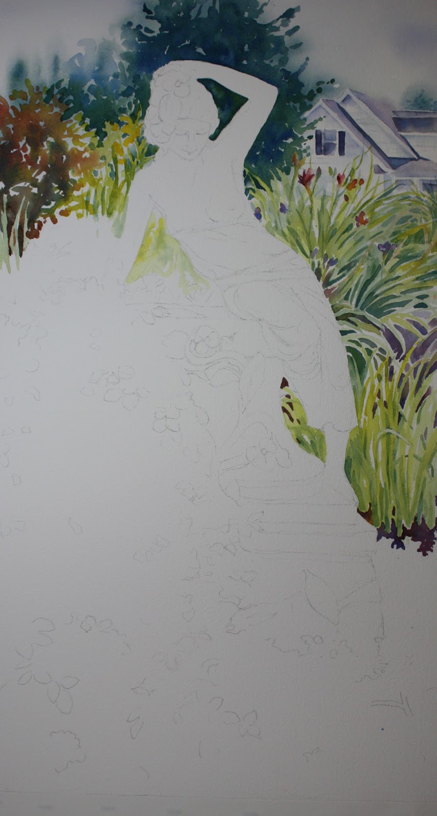

As we move over to the lilies on the right you will see a variety of color within them.  If I did the lilies all one color, I feel it would be quite boring.  I also (of course) saw a lot of violet within the leaves.  I will post the photo of the garden below.  I started figuring out where I wanted the larger lily flowers to go and painted those in with alizarin and a little violet plus a dap or two of winsor yellow.  You can darken them or lighten them how you want.....there is not set way to do this.  I also added purple iris flowers in there (cobalt and perm. rose).  I added the other lily flowers later after I painted some of the leaves so I could make it look like some leaves were going in front of the flowers.  Just be careful not to make them look to aligned and even with each other.  It's natural to want to do that.  After that I started to paint the light value of the leaves as mentioned above.  Just quickly stroking in shapes.  As you notice as you get to her hip area the leaves go out more horizontally.  Change them up so they don't all go in the same direction.  You can look at the photo below.  I then painted the medium value green.  Used that to add stems to flowers and other areas that needed to be darker.  Next I worked on some darks within those shapes.  Many of the darks appear triangular in shape.  Try to look at shape and not the fact you are painting leaves.  Squint your eyes at the photo below and notice the values shapes....if you do, it will become a lot easier to see.  I decided that many of my leaves had looked too individual so I took the medium value green and just threw it into the leaf area and blobbed it in to mix it up a bit.  It helped also to fill in some empty white spaces I had.  I added violet in the area down further.  A mix of ultramarine and alizarin with a dash of burnt sienna.  You can probably see where I put that.  Dropping in a little burnt sienna down by the base of the lilies near her foot adds interest.


Now we move on to the statue itself.  Fun!  I gave her a wash of cobalt blue (watered down....not too dark!!!) in all her shadowed areas first.  Being careful not to cover the highlighted areas!!  The very outer areas of her arms, the top of her head, her legs and pedestal all have a sort of halo of white around it.....including interior portions.  By doing this, it helps to establish the areas you need to paint and the blue is a good base.  I used some drybrush techniques as I layered other colors so it looks like stone.  I used yellow ochre next in drybrush and also cobalt with perm. rose in it.  Some areas I used a little green to create the feeling of moss, like under her arms.  That's how far I have gotten.  Will add more later!

Sunday, April 21, 2013

"SUNNY FLOWER"

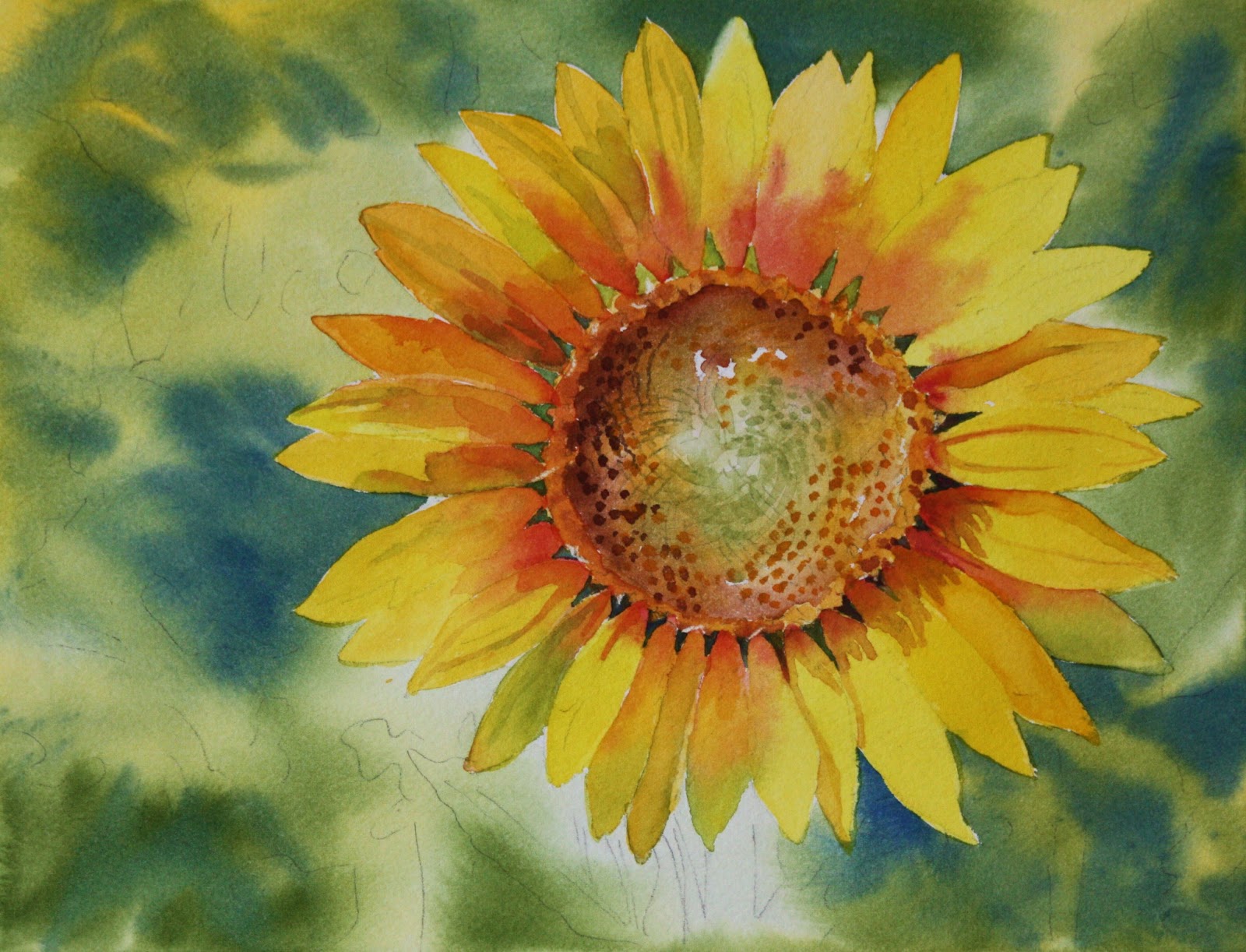
We're doing a single sunflower in class and this is my finished painting done from a picture a student of mine took.  She let me use it for the painting.  It was fun doing it because the background is loose and the flower a little more defined. 
This is the first step, or maybe I should say many steps later than the first step.  I forgot to take photos of the progress.....guess I got into to it too much.  I have to say I almost like this painting better than the finished one.  It's more simplified and fresh looking......guess I need to know when to stop!  I started by masking out the petals with masking fluid just halfway.  Then I could put the background in easily.  I painted wet on wet with new gamboge sporadically.  Then I used sap green sporadically making sure that the yellow I just put down shows through in places.  I used ultramarine blue in places also where I wanted dark areas.  After that dried, I took off the masking.  Then proceeded to paint the petals.....some with new gamboge, others with winsor yellow.  I used permanent rose on petal bases while still wet to have a blended effect.  I then worked on the center.  I wet it first then dropped in new gamboge then sap green around the center, being carefl to leave some white in the center.  You can always blot it you cover it up.  Then while wet I added burnt sienna around the edges.  When that dries I painted the area around the edge of the center with new gamboge and burnt sienna in places. The petal shadows I put sap green on and just intensified the areas of permanent rose with some burnt sienna and perm. rose mixed together.  Those are all the colors I used throughout the painting......by looking at the finished painting you can see how to do the remainder.

Wednesday, February 6, 2013

"BAG OF APPLES"


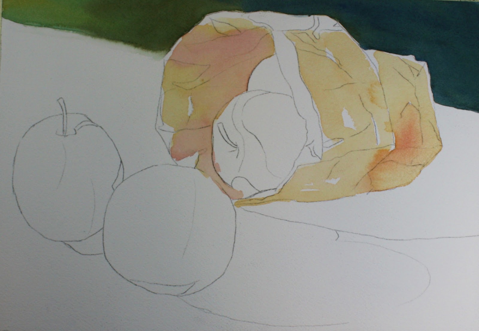
We are doing this painting in the beginner class, although I had my doubts as to whether this was a beginner painting!  There are three challenging aspects to this painting.  The bag is one, the shadow is another and then the apples are the third.  The upper background is a good size to try to master.....it's not too large of an area, so I felt it was good for a beginner and not too difficult.  

Unfortunately, I only took one progress picture......I forgot to take anymore!  Sorry, when I get engrossed in a painting I can also get absent minded.    Anyway....let's start with the background.  I used Thalo blue, winsor yellow and burnt sienna.  I made the mix a little more yellow on the left and more blue on the right.  I didn't want the background to be all one color.  I painted it wet on dry and I slightly blurred the edge between the table and the background on the left by adding a little water along the painted edge after I painted it.  Be careful not to add too much water or you'll get a bloom!                                                                                                      


Next I started on the bag.  I just used plain 'ol yellow ochre in a very light wash to cover the bag and leaving the parts that remain white.  I added permanent rose while wet in the what I felt were the pinker areas.  This is reflected light from the apples through the bag or against the bag.

Monday, January 14, 2013

Cardinal Painting

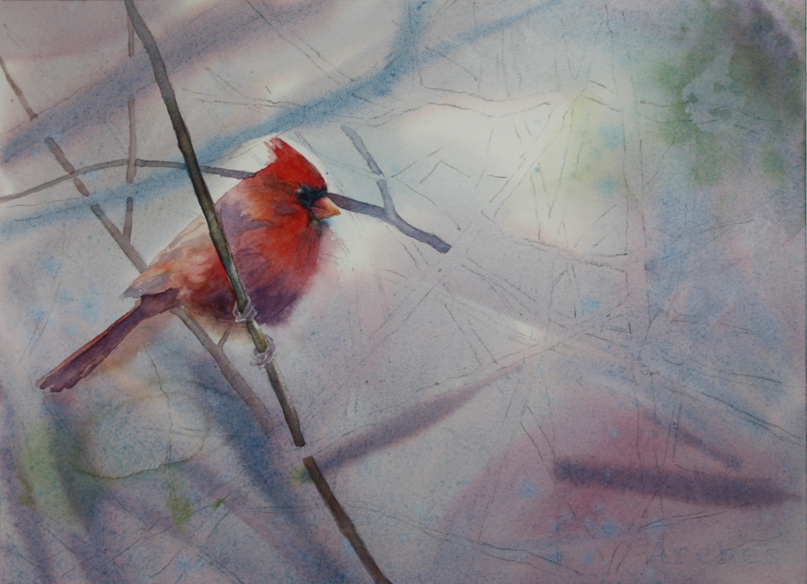
Winter class sessions have begun!  We are focusing on edges...or I guess I could say we are becoming less focused!  Blurring edges and having lost edges are key to interesting watercolors believe it not!  I myself do not do it enough in my work, so I thought we would really get into it!  Having crisper edges near your focal point is a natural draw to the eye.  You see here in the cardinal that you immediately look at it's head....hopefully!  Of course this picture is not finished yet, but that is my goal.

I started this painting with a wet-on-wet wash with cerulean blue mixed with a little perm. alizarin plus a little burnt sienna to take the color down a bit since it is a foggy misty scene.  I added a little green in opposite corners made with ultramarine blue mixed with a little new gamboge.  If you notice I added a bit more alizarin in spots also.  While the wash was still wet I made some branches that are in the very far distance and I want them to be very blurry.  I made that with cerulean blue and cadmium red.....there are areas where I used a little more cerulean in the mix.

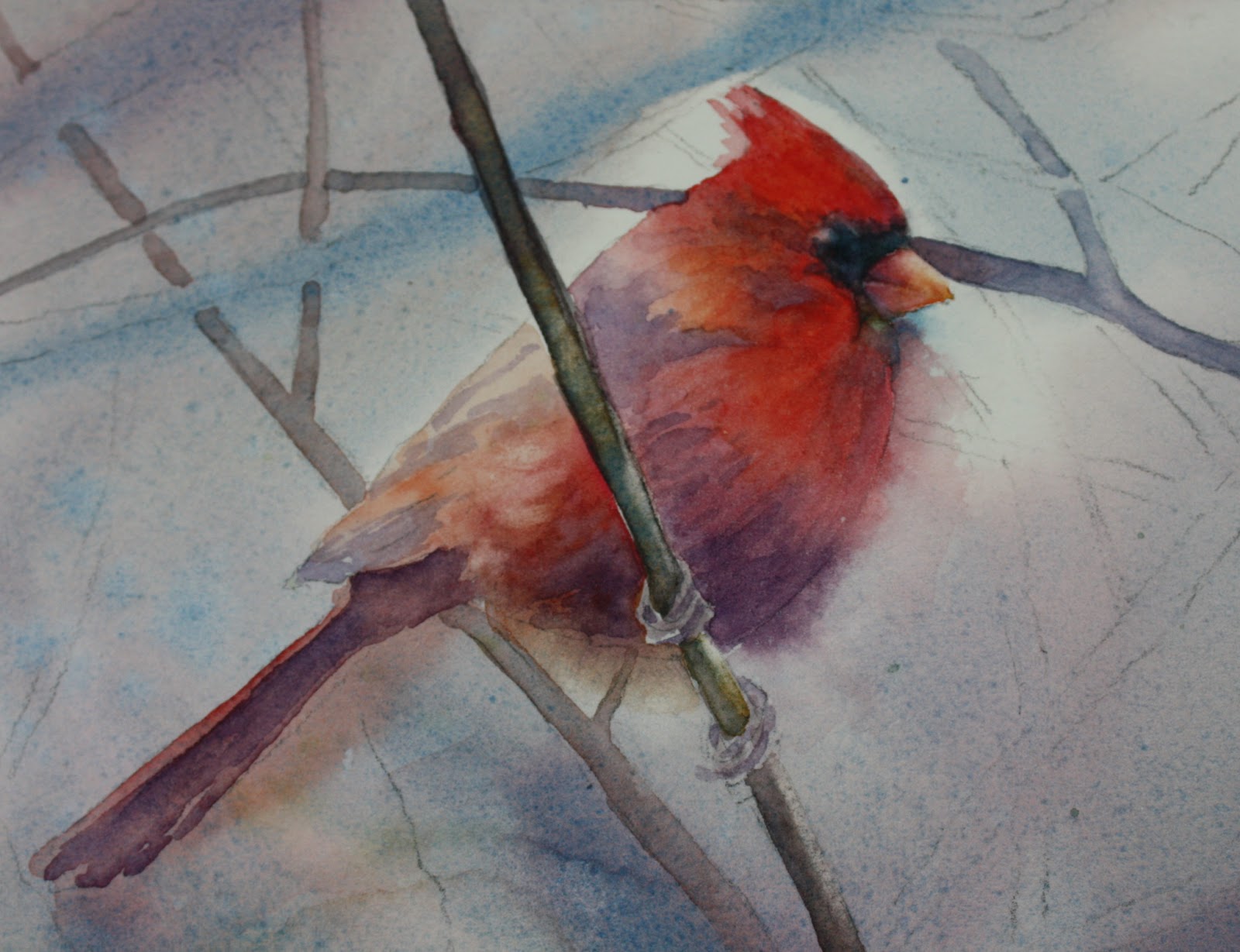
Focusing in on the cardinal, as you can see I softened the edge in the breast area and under the beak.  I think it gives it a misty quality and I do think it keeps the eye from lingering too long where you don't want it to. I used cadmium red and alizarin mixed together at times, but other times I used them both separately.  I also added a touch of new gamboge to the  shoulder area and on top of the head.  I was careful not to get too strong with color towards the back area of the bird.  In order to soften the edge of the breast area I added water outside the outline of the bird so that when I painted the bird itself the color blended outside the line.  You should prethink adding the water outside beforehand....the results are better than if you paint the bird first and then add water on the edge.  Practice that before doing it on your painting....it helps!  As you can see I also added VIOLET!  What else!  I used cobalt blue and alizarin in those areas and changed up to ultramarine on the tail area because it needed to be a little stronger.  It's ok to mix some of the cadmium red with the violet....it blends with the bird and also tones down that violet a bit....don't overdo it though....you don't want the bird to be brown.  The black area of the head I used payne's gray but added some cerulean to it in places.  The beak has some yellow in it and alizarin with a little violet in the area closer to the head.  I've been using new gamboge and alizarin for those colors.  Violet with cobalt and alizarin.

More to come later!

Here it is later and I'm just adding the rest of the branches now.  I noticed so many different colors of the branches in the photo.  There is an ochre color, green, violet with more blue in it, violet with more red in it, and burnt sienna colored branches.  These are the ones I am going to put in.  The branches that have more yellow in it, which is the ochre, also have some burnt sienna added to it while still wet.  I like to vary the color of the branches because indeed the light changes the coloring.  Even the branches near the cardinal have a tinge of red to them .....maybe from the reflection of the bird.....which one of my students actually pointed out to me!  Very good!!!  I love it when my students point things out to me!  Now I should go back and adjust me painting!!!

Ok let's continue......I can't exactly point out all the branches but take notice of the colors and the colors I give you.  So you have the ochre ones, now the green.  I made that with cobalt and new gamboge.  Don't make the green branches too dark.....they don't stand out in the photo and shouldn't be too prominent.  They also shouldn't be too yellow because it's a foggy day.   The violet branches I made with ultramarine blue, alizarin and a little burnt sienna.  After painting them in the violet color, you can drop in some other colors where you see it like burnt sienna or yellow ochre or green.  It gives the branches some variation which is always good.  In some places I added more blue, and in others more red.  Also I made sure that the branches near the birds head weren't too strong in value.  I didn't want the head to look like it was getting speared!  Also, I made most of the branches lighter in value near the outer edges of the paper. 

There are different levels of atmospheric perspective.  Make sure you have branches in the foreground, middle and back of your painting.  The branches in the way back are blurred and the middle ground should be paler than the foreground.  Just make sure you have enough of each level.  When putting the middle ground branches in, don't get too fussy about them......loosely put them in otherwise you will spend a lot of time with it and it shouldn't be that stiff.

Lastly after the branches dry,  I checked to make sure there are dark spots or areas that should be noted and light areas that should be scrubbed.  The tops of many of the branches are highlighted and I scrubbed those out.  You can either use a scrub brush, or use a regular damp brush and blot afterwards.

I spattered my painting also.  I spattered with yellow ochre, greens and violets.  You can take note of those areas on the finished painting.  I used a lot of water in my color to spatter so it makes larger more varied spatters.  I also put in some green leaves that look dried up since it is a winter scene and they wouldn't be nice perky leaves.  Don't overdo it though....I only added a few and they are pale.  Also, I added some extra background in the upper and middle left of the painting because I thought it needed some darker value.  You can do this after the fact - it works just fine.  Just make sure that whatever you paint on one side of a branch, also comes out on the other side, otherwise you will end up with color that stops short.

That's it.....if you have any questions that I didn't cover, please feel free to email me or make a comment on the blog.  Happy painting!


Monday, November 19, 2012

WATERMILL AT EASTERN

This is a well known sight at Eastern University - a very picturesque college campus that my daughter Emily attended.  It was the day of her graduation in May and it was a bright sunny morning.  Below is how I painted it.  (I am going to take another picture of this as I took it at night and don't like the tones of green...they are not too correct....the other photos are more accurate)
   

 I started with some of the background because I wanted to establish some darks and light greens.  I used new gamboge and cobalt blue for the greens in different ratios.  More yellow in some and more blue in others.  I intermingled the two contrasting green in the distant bushes. 


 I didn't make the background grasses too dark at first but put an initial layer of the greens and did some drybrush in the foreground to indicate some light areas in the grass.  Careful not to get too detailed and just indicated some grass near the edges and along the lilies.  I painted the watermill with an initial layer of yellow ochre and then some areas mixed with cobalt blue to make a dull green.  Burnt sienna was used in some stones on the building and the darks were made with ultramarine blue and burnt sienna.  The building is in shadow and I glazed it later on.  The waterwheel itself is dark....I used ultramarine and alizarin with burnt sienna.  I tried to indicate water coming down and I ended up scaping some highlights.  The roof is kind of tricky and I don't know if I like the results.  I saw lots of violets and clay colors in the photo and tried to get those colors.  I used permanent rose and burnt sienna but I would probably glaze it first with a violet and then go back with the rose....if I were to do it over.  The violet I would use cobalt blue and perm. rose.  It's bright, but would eventually tone it down.

The stone walls have an initial wash of violet made with cobalt blue, permanent rose and burnt sienna to tone it down. I played with the ratio of blue and rose.  I also used yellow ochre and cobalt within the stones....especially on the right wall.  I mixed violet in with it a lot.  I also just took some yellow ochre and used that in places. I used some thalo blue (or winsor blue green shade) mixed with a little burnt sienna (again to tone it down) to do some shadows in the stone and along the upper ledge area.  I played with the colors a lot and didn't feel I got it right at this point....went back to it later. 
I put shadows on the birch trees with cobalt blue and a little thalo here and there.  Some violet with cobalt and perm. rose was dropped in on the left birch near the middle.  I made the grasses darker in the foreground and background by using more cobalt in the mix with new gamboge.  It seemed to make it look more shadowed.  I was careful to let some of the other green I initially laid down to show in places in the foreground. The background trees were complicated..... I didn't want them to overpower everything and I wanted it to look like light was coming through.  I guess I achieved that....comments are welcomed of course!  I put in regular trees in the background.  I used a violet mix of alizarin crimson and cobalt to paint the trees initially then shaded them on the right side with a darker mix of alizarin and ultramarine with some burnt sienna.  I went back and glazed over the mill with thalo blue ......lightly of course since it is such a strong color.  I glazed over some of the stone with it as well in the shadowed areas.  The top of the stone walls on the right were glazed with thalo as well.  Well, I think I covered everything.....if you have any questions, please put it in the comments and I'll be glad to answer them!


Thursday, November 15, 2012

"FALLEN LEAVES"


I was inspired to paint the leaves because it's autumn!  I liked the composition of my photo, and I liked the colors of course.  I have included below how I arrived at the finished painting.


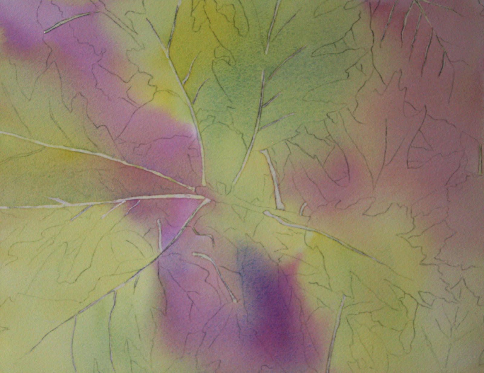
I started by masking out only the main veins down each leaf and just some of the outer veins....not all.  Then I did a preliminary wet-on-wet wash with a large 2" hake brush.  Three colors I used are winsor yellow, a violet mixed by permanent rose and cobalt blue, and a green mixed by winsor yellow and cobalt blue.  If you look at the location of the colors you notice I intentionally put them where those colors of leaves are in the picture.  I made sure I did not overlap too much of the yellow and violet because that would muddy the colors since they are complements to each other.


After the wash dried, I started painting in the green leaves.  I started by laying down winsor yellow and then laying cobalt blue on top in areas I noticed them to be in the photo.  I added some thalo (winsor blue green shade) very lightly in some areas I noticed a brighter green.  There are noticeable spots and darker edges on the leaves so I added them while the leaves were still wet.  I used a very concentrated (less water) amount of paint in violet (perm. rose and ultramarine blue) plus burnt sienna. 

I started adding in the darks at this point.  My reasoning is that I want to establish how dark my darkest darks should be before adding the darker leaves. (Too many dark words!!!)  Sometimes if you don't do this you can get into trouble and your darks can become too dark because you've made your midtones too dark.  Oh my.  I used none other than VIOLET, of course, and some blues to do the deeper background...you thought I was going to say "dark" again didn't you!  I used ultramarine and perm. alizarin crimson with a touch of burnt sienna to get the darker violet and used some cobalt instead to get lighter tones.  I dropped cobalt in here and there to achieve a little light effect because I didn't want all my darks to be the same.  Other areas I added a little more alizarin to the violet to again add some variation, but I also saw that in the picture.  I added the red leaf and painted it first with winsor yellow and then dropped in cadmium red, some violet (cobalt and permanent rose) and some green (cobalt and winsor yellow).  The yellow leaf in the lower right corner started also with the yellow and I just dropped in violet and some green to actually try to muddy it up a little.


Finally I painted the remaining leaves using many of the same colors.  The leaf in the upper right corner which is more brown, I used a mix of burnt sienna, cobalt blue, permanent rose and a little bit of yellow.  Glazing here and there with some violet along the edges to get a shadowed effect.  The stem of the branch is not brown!  It's VIOLET, of course, so I used some cobalt and alizarin and did much tweeking to get it right by dropping in come cobalt directly and scrubbing out some highlights then dropping in more cobalt til I got it right.  The veins I had to fix a little with the paint I used for the leaves to straighten them out and make them a little smaller here and there.  Sometimes I can't get the masking fluid on quite right!  Adjustments can be made if done carefully.  I used a semi-wet brush to just scrub out extra veins...the paint will lift easily and you do need to blot.  Last but not least SPATTER.....I love spatter.  Maybe too much, so I've been told!!!  Leaves do have many spots so I added more!  Why not.....I used a violety brown for that.  If you have any questions, just leave it in the comment section and I will gladly try to answer them......have fun!  I added the original photo at the end so you can see it.....it's kind of blurry...sorry, bad photographer!

        
                Here's the photo......of course I accentuated some of the colors, but that's artistic license!!