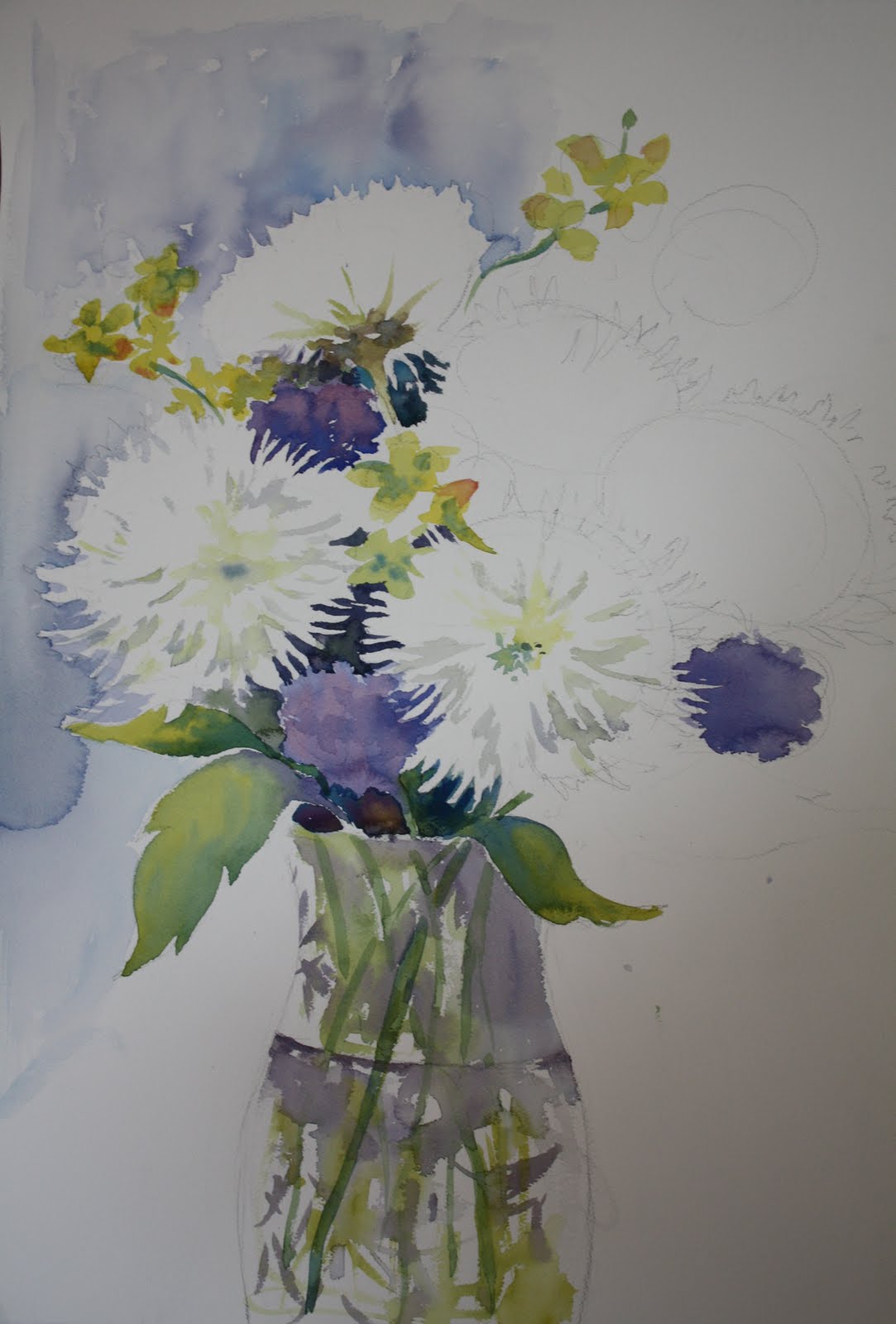
We're working on flowers today and thought I'd post my unfinished class demo. I was working on an easel and I find my work is looser but the paints wash out a bit because they fall and don't hold their color. It's an interesting way to paint and I do it frequently in class so they can see. Thinking I'll keep working on this, but the flowers died! Uh oh.
Tuesday, March 29, 2011
Friday, February 25, 2011
Tuesday, February 22, 2011
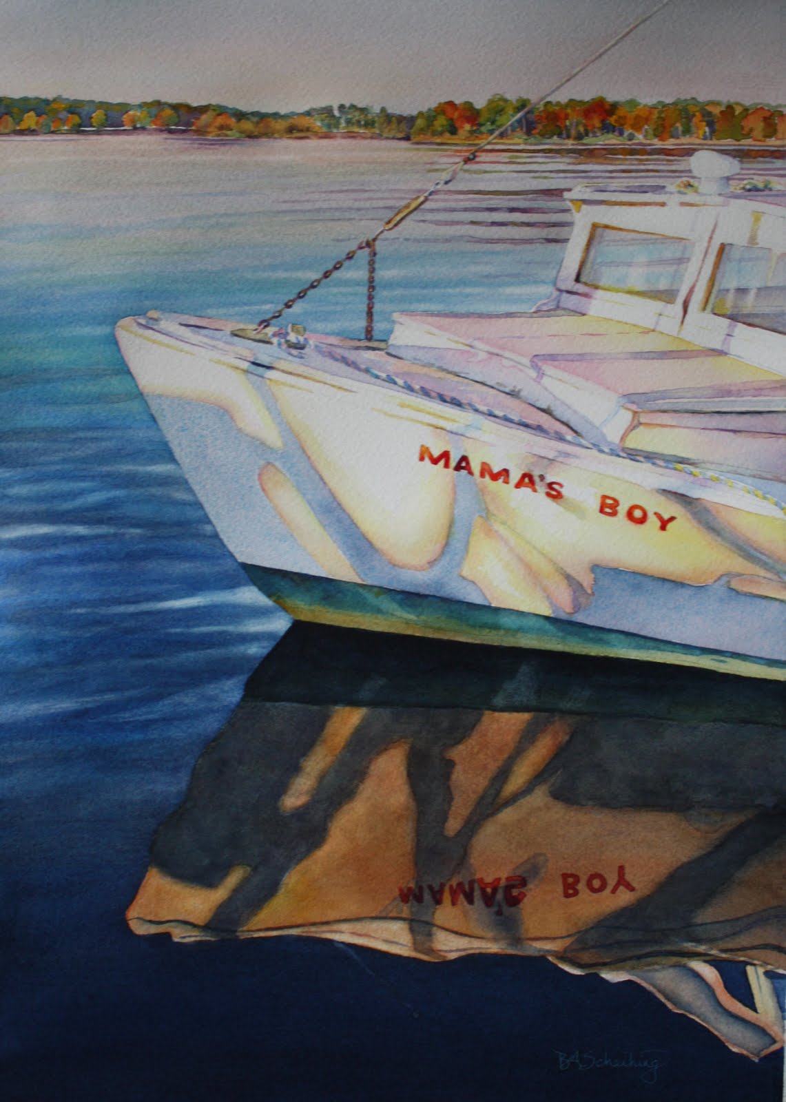
"Mama's Boy"
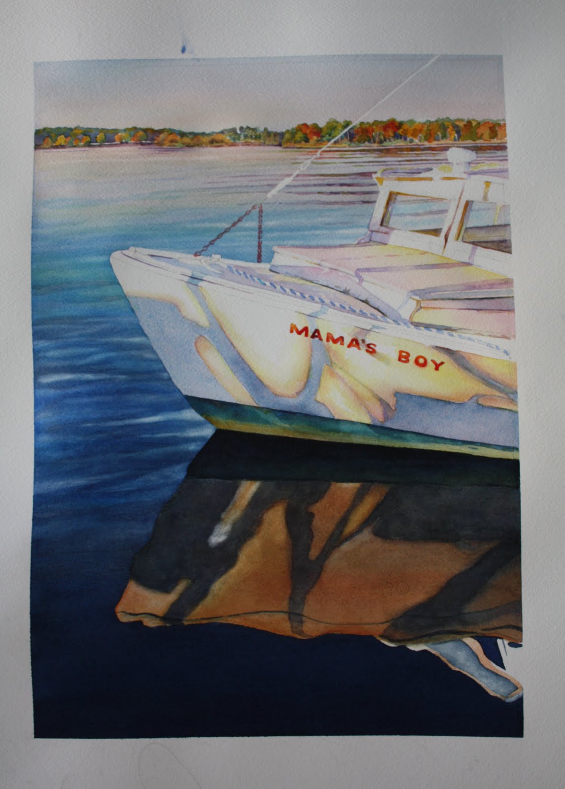
I'm almost done with this painting for our class. For those who are doing this painting along with me and have to be absent, I will list the colors I have used.
Sky: Cerulean blue, Cadmium red, with a very light wash on lower horizon with Winsor Yellow.
Water: Cadmium red, cerulean blue, thalo blue, ultramarine blue, and then for the dark a mix of cadmium red and ultramarine blue. This wash must be laid in a few time to get the dark blue of the water.
Boat relection in water: Dark shadow - mix cadmium red and ultramarine blue for the violet and then mix that with some thalo blue...not too much. After that dries then scrub the edges to blur thenm a bit. After that dries, then lay a wash of yellow ochre mixed with cobalt blue over the whole thing being careful not to smear too much of the dark shadow into the other areas. The very dark shadow area under the boat I used payne's gray mixed with a little yellow ochre.
Boat: Do shadowed areas first with a mix of cerulean blue and alizarin crimson. Again, blur edges. Then add some winsor yellow around the edges of the shadow, being careful to save white areas. Touch in while wet some alizarin crimson and I also used permanent rose to some of the brighter areas. For the bottom of the boat there is a little blue green area that I used thalo blue and some yellow ochre with some darker spots with payn'es gray.
For the decking of the boat, it's mainly the same colors, being careful to save white areas. I used winsor yellow and alizarin and/or permanent rose in the redder areas. My photo I was working with has more pinks and violets in it.
Will give you more info when I'm done which should be very soon. Happy painting and if you have questions, you can email me....:)
Tuesday, December 7, 2010
"The Glorious Gate"
The unfinished class project! Just ran out of time.....sorry class, but here it is for you to look at and finish! I'm expecting to see everyones when we come back for the new winter session.....(: I will post the progress, as I will be working on it as well....hopefully.
Colors for this painting:
Background: payn'es gray and quinacridone gold
Gate: Permanent rose and cobalt blue for the shadows and
glazed over with quinacridone gold.
Flowers: Cobalt blue and permanent rose .....added touches of
thalo blue.
Leaves: colbalt blue and winsor yellow, quinacridone gold
and paynes gray for the darker areas.
Rocks: (background rocks) yellow ochre at first, then glaze over
with cobalt blue and permanent rose.....deep shadow
areas: ultramarine blue and cadmium red. Glaze over
again with cobalt blue to make look shaded. Foreground
rocks have similar colors but no cobalt blue glazing since
are in the light.
Hope this helps...email me or put questions on the blog if you have any! Happy painting. A big snowstorm would help get you started right???
Wednesday, November 3, 2010
Value Study - Gate with Morning Glories
Tuesday, October 26, 2010
We're working on this painting taken at Davidsonville Park near my home. The sky is very pale and the water as well. I combined cerulean blue and cadmium red to get a more gray sky. We used 3 values in the trees made up of winsor yellow and cobalt blue for the light and mid values and for the dark values we used winsor yellow and ultramarine blue. "A Challenge in Green" I call it!! Some were sick of doing it but that's ok, I think there were some valuable lessons learned in this one!
Thursday, October 7, 2010
Starting New Classes at the Senior Centers
Hope those that are joining me in the watercolor classes are coming with enthusiasm to what we will learn this year. I want to focus on color mixing, paint application and composition. No matter what your style, either a tighter realistic or looser impressionistic style, and all those in between (no one style is right, by the way!), those three things matter in producing a nice work of art! We're always learning though and that's the fun part. Looking forward to the semesters ahead!
Subscribe to:
Posts (Atom)