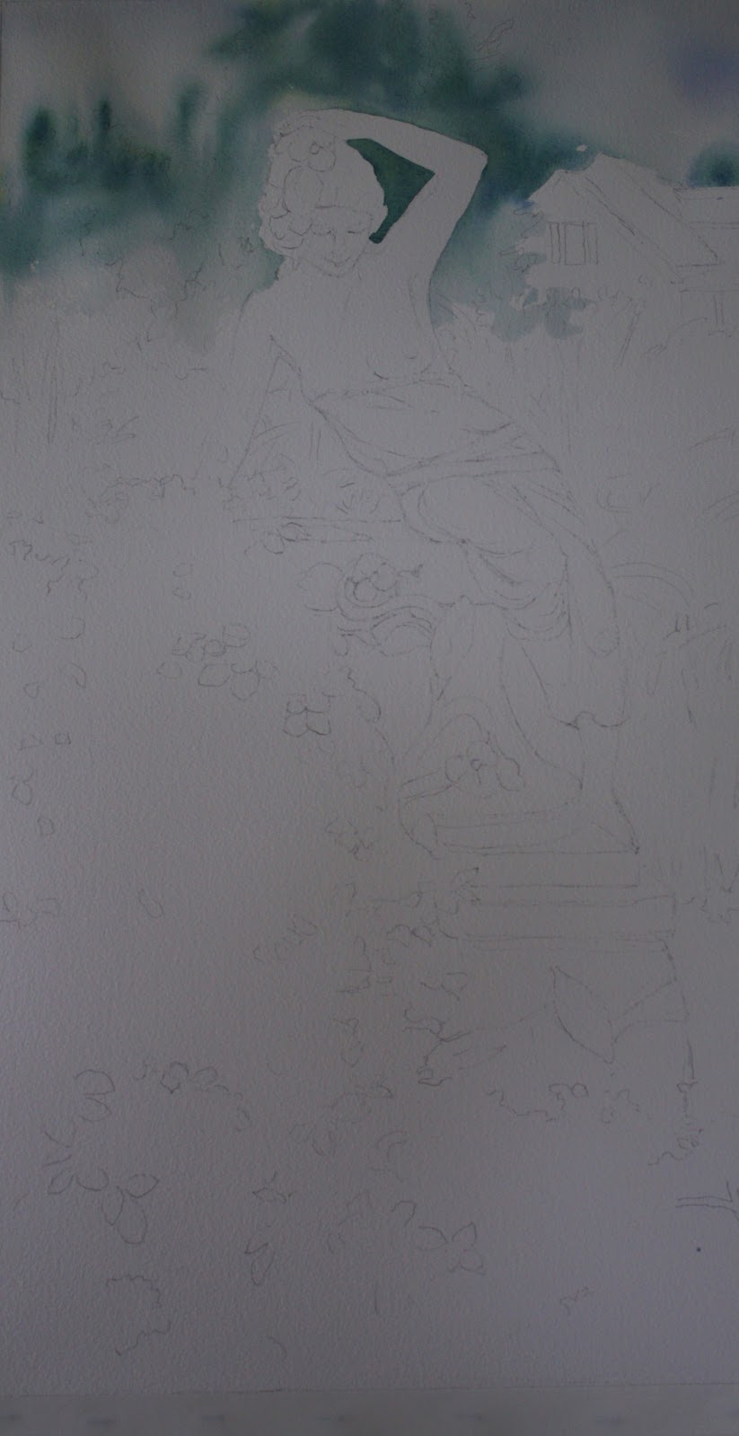
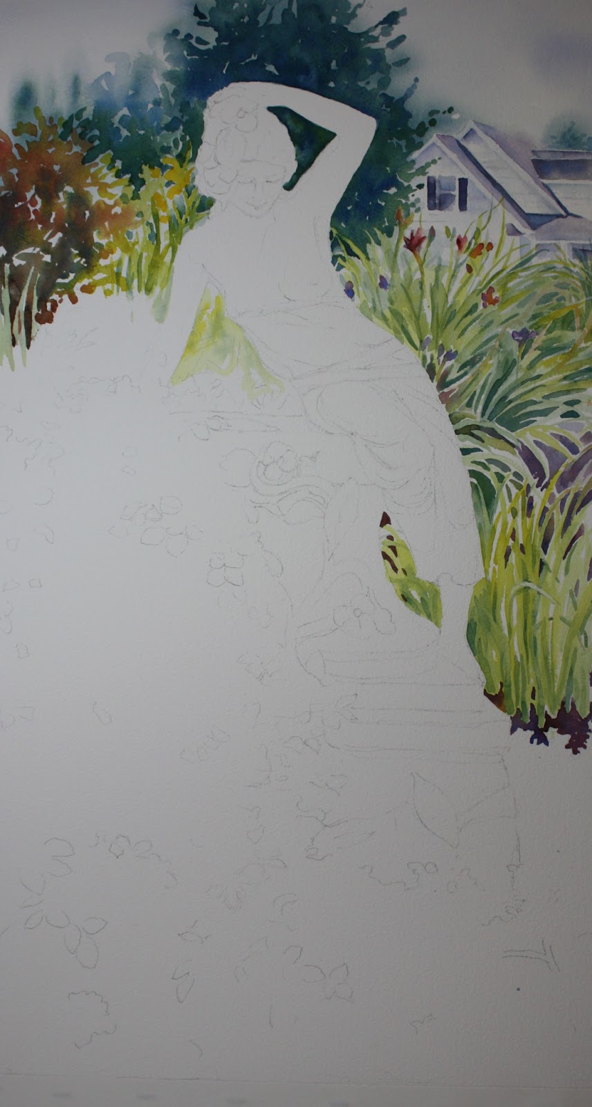
This is how far I have gotten after I poured the background. If you'd like to see the video of how I painted trees in the background, click on this link below:
https://www.facebook.com/pages/Barbara-Scheihing/62952945920
Saturday, January 18, 2014
Saturday, January 11, 2014
VIDEO LINK TO POURING BACKGROUND
** Click the link below to access my video from Facebook on how to pour the background for this painting.
https://www.facebook.com/pages/Barbara-Scheihing/62952945920
Wednesday, November 13, 2013
Still Life With Pewter
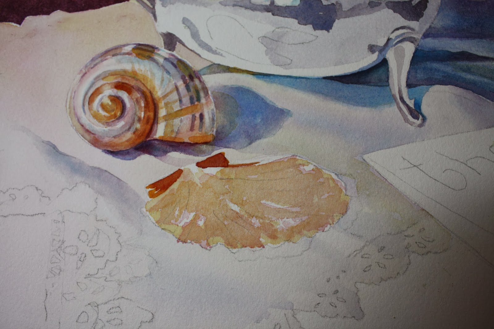
| I painted the table itself with new gamboge more to the left where it is lighter and then burnt sienna and alizarin with cobalt added where the table is more shadowed. |
| Here I made a mix of burnt sienna and perm. rose and added the ridges on the shell, defining them more in some places and blurred others. |
| Here's a closeup of the shells. I glazed over the outer edge with new gamboge. |
We are starting a still life in class and I will complete it within the week. I had some difficulty with the paper in that it was soaking up water and drying so fast I could not keep up with it. It could have been the fact that I had a room heater on because my studio is COLD! It might have gotten the air so dry that the paper reacted. Anyway, I decided to add a sponged texture to the background and it seemed to work ok. Next time I work on the painting the heater is not going to be used and I'll see if that makes a difference. Sometimes the sizing isn't right on the paper....I've had this problem before when it was a different time of year, it might not be the heater.
So I masked around the inside perimeter of the pot and the handle and spout plus the upper layer of the tablecloth. Enough so that I can freely paint the background without getting too much on the other parts of the painting. I used a mix of cobalt blue, alizarin crimson, and burnt sienna. This gave a nice plum color. Initially I did it wet on wet and found I had trouble getting it dark enough after multiple applications. So I decided then after it was dry to do another layer wet on dry. I didn't like the paper drying so fast and then while wet I sponged off color on the left side to cover some of the blotches that formed. I made sure I evenly sponged and continued some on the right very lightly to show to continuation in the texture to make it look more intentional.
After all that dried I took off my masking fluid and masked some areas of the pot I wanted to remain white such as many of the highlights. Then I started to paint the handle which is a rich rosewood. I used burnt sienna and some alizarin crimson. I added cobalt (mixed in and/or applied directly) to shadow and darken some areas. I used more burnt sienna than alizarin....careful not to make it too red. I added a touch of gamboge to the middle area of the handle where it seemed highlighted.
For the pot itself I used the same colors....cobalt, alizarin....some gamboge to grey things down. I will continue as I get more finished.
Wednesday, October 9, 2013
EASTERN SHORE DECEMBER
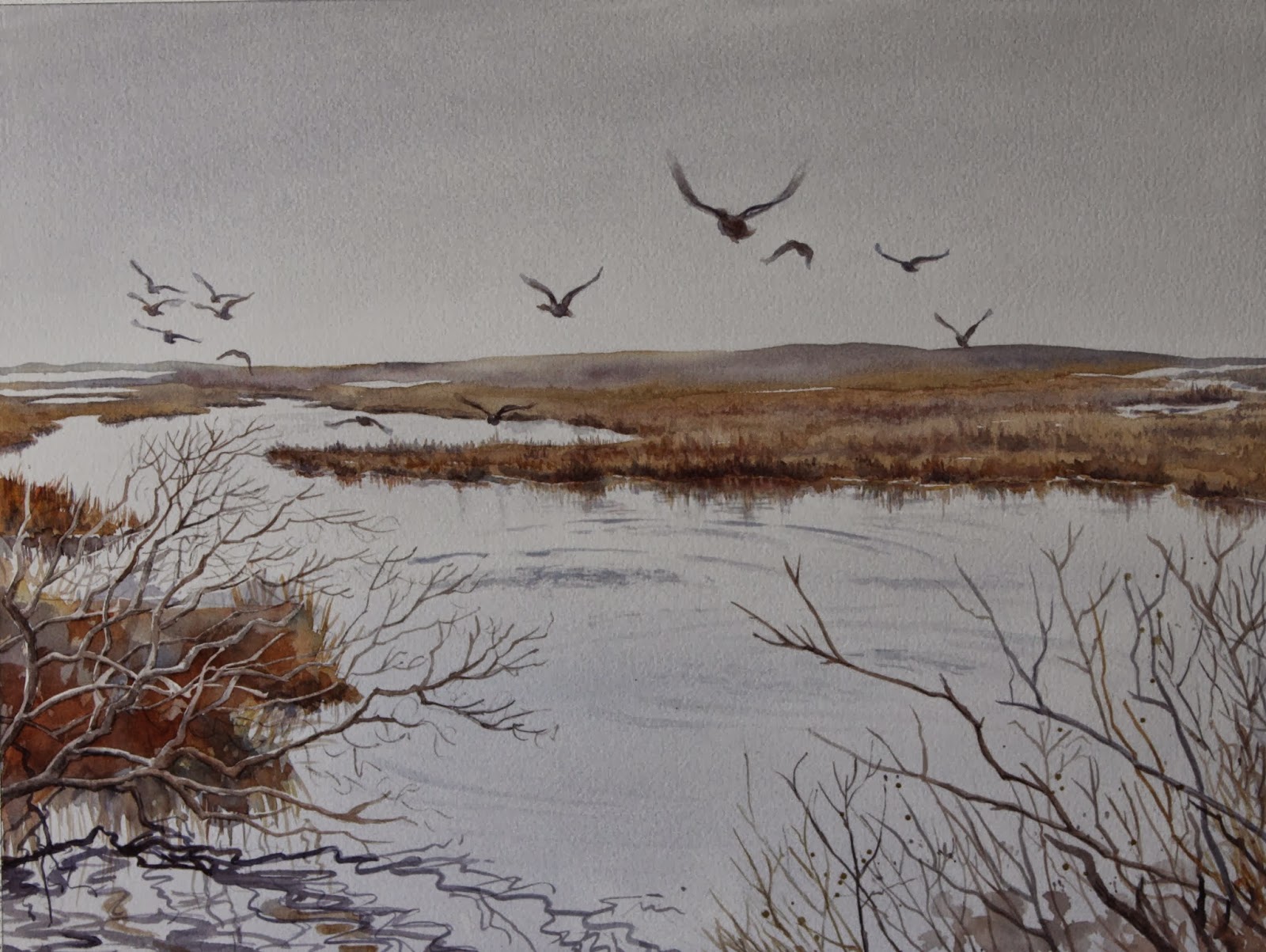
Just wanted to detail some of the colors I used for this painting. I used cerulean blue and cadmium red for the sky and water. The real painting is more of a pale violet than the one showing on the computer. So I made more of a grey violet color. I used the same color for the distant land and then also added raw sienna to grey it down even more. I also used raw sienna and burnt sienna throughout the background. Those are the only colors I used in the painting except I substituted cobalt blue in places where I needed a stronger dark such as in the branches.
Tuesday, October 8, 2013
Water Feature Still Life
We are starting this painting in our new fall classes. It's small but something to get us started. Cathy in my class took this picture at Longwood Gardens. It didn't have the lion fountain just a plain one. I added it in as an afterthought!
I started painting the red flowers with some cadmium red lt. and some alizarin mixed together. I added some violet (cobalt and alizarin) shadows on the flowers on the left....just slightly. Next I painted the yellow flowers with some winsor yellow (or cadmium yellow lt.) then some gamboge. It needed to be a little more orange on the left side so I added some cad. red lt. to the winsor yellow. Next I painted the green leaves on the left in the back. I used cobalt blue and winsor yellow....making sure to vary the greens (warmer and cooler) adding a little more yellow in some and more blue in others. I painted the foliage in the clay pots. Also some cooler and some warmer. The foliage in the 4 pots in the front were painted in one continuous manner connecting each one. The I painted the large pot. Using burnt sienna, cobalt blue and alizarin and making the left side a little darker. The inside of the pot I used burnt sienna and cobalt blue. The clay pots in the front are next. I alternated their colors so as not to make them all look the same and the sun was hitting them all a little differently.....some cooler, some warmer. I used yellow ochre, alizarin, cobalt and burnt sienna. Some pots I used more alizarin (but watered down), some I mixed all the colors together and some I added cobalt for shadow. Next I painted the bricks with a diluted wash of alizaring and burnt sienna. When the bricks dried I painted the shadows under the pots with cobalt, alizarin and a little touch of burnt sienna. It's a light wash so I didn't go heavy on the color. When that dried, I added a darker shadow of the same colors and blended it out with water so there wasn't any hard edge.
For the rock wall, I painted all the rocks first. Some with burnt sienna, some with a mix of burnt sienna and cobalt, adding alizarin at times also and then adding a raw sienna glaze on some. I sprinkled salt on some of the rocks while still wet and scrubbed some to add a slight highlight. After they dried I glazed cobalt blue with alizarin and a little burnt sienna mixed in over the ones on the left to put them in shadow. On the right side I used the side of my brush to skip around and not define the rocks too much with a watered down version of that mix. After all that dried I did glaze a bit of raw sienna over the rocks also. I didn't want all of the rocks to look the same....that's too boring for me. Variation is very important in painting.....when things look all the same, the viewer gets bored.....and so do I frankly! I ended up spattering some color around....and then painted the lion and water. I used the same colors for the lion that I did for the rocks and the water also has some of the violets that the rocks have.
That's it.
Oh, I added the lion by making a stencil of it's head and the water and scrubbing it out.....that simple!
I started painting the red flowers with some cadmium red lt. and some alizarin mixed together. I added some violet (cobalt and alizarin) shadows on the flowers on the left....just slightly. Next I painted the yellow flowers with some winsor yellow (or cadmium yellow lt.) then some gamboge. It needed to be a little more orange on the left side so I added some cad. red lt. to the winsor yellow. Next I painted the green leaves on the left in the back. I used cobalt blue and winsor yellow....making sure to vary the greens (warmer and cooler) adding a little more yellow in some and more blue in others. I painted the foliage in the clay pots. Also some cooler and some warmer. The foliage in the 4 pots in the front were painted in one continuous manner connecting each one. The I painted the large pot. Using burnt sienna, cobalt blue and alizarin and making the left side a little darker. The inside of the pot I used burnt sienna and cobalt blue. The clay pots in the front are next. I alternated their colors so as not to make them all look the same and the sun was hitting them all a little differently.....some cooler, some warmer. I used yellow ochre, alizarin, cobalt and burnt sienna. Some pots I used more alizarin (but watered down), some I mixed all the colors together and some I added cobalt for shadow. Next I painted the bricks with a diluted wash of alizaring and burnt sienna. When the bricks dried I painted the shadows under the pots with cobalt, alizarin and a little touch of burnt sienna. It's a light wash so I didn't go heavy on the color. When that dried, I added a darker shadow of the same colors and blended it out with water so there wasn't any hard edge.
For the rock wall, I painted all the rocks first. Some with burnt sienna, some with a mix of burnt sienna and cobalt, adding alizarin at times also and then adding a raw sienna glaze on some. I sprinkled salt on some of the rocks while still wet and scrubbed some to add a slight highlight. After they dried I glazed cobalt blue with alizarin and a little burnt sienna mixed in over the ones on the left to put them in shadow. On the right side I used the side of my brush to skip around and not define the rocks too much with a watered down version of that mix. After all that dried I did glaze a bit of raw sienna over the rocks also. I didn't want all of the rocks to look the same....that's too boring for me. Variation is very important in painting.....when things look all the same, the viewer gets bored.....and so do I frankly! I ended up spattering some color around....and then painted the lion and water. I used the same colors for the lion that I did for the rocks and the water also has some of the violets that the rocks have.
That's it.
Oh, I added the lion by making a stencil of it's head and the water and scrubbing it out.....that simple!
Thursday, May 23, 2013
Mary's Garden (May Change the Title)
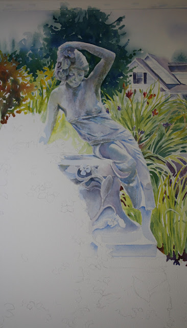
I started a painting that is a little more on the challenging side. It is not finished yet but I can walk you through the stages up to this point.
I didn't use any masking but rather painted around the figure. I first wet all around the upper portion (up to her shoulders) of the painting, carefully going around the figure. I put in a few clouds in the sky with a very light mix of cobalt blue and permanent rose.....more on the cobalt side. I did not wash the whole sky but rather left it white in most parts. Then I wanted to indicate evergreens in the background so I put in a mix of ultramarine blue and winsor yellow in shapes of trees. It is very blurry at this point as you can see.
There is a house in the background that I added for depth and to make it look like a home garden. I tried to not put a lot of emphasis on it so I painted it with cobalt blue but later could see it still stood out too much. That's later. The roof of the house was painted with watered down cobalt blue and a little permanent rose in the mix. Those colors are used throughout the house. The shadows on the roof have much more cobalt in them and I don't think I used any perm. rose at all actually. The shutters are cobalt and burnt sienna with a little perm. rose. I then began to work the evergreen in the back of the statue. Using the same colors of ultramarine and winsor yellow but in a darker mix (less water). I try not to mix the paint too much on my palette. I like to see the individual colors that I use so you will see more blue in areas and more yellows in others. It's my style, so if you don't choose to do that, it's up to you .....but that's what I enjoy about watercolor.....it allows you to do that and it adds beautiful variation within your work. I decided later that I needed to move the tree a little further out to the right of her extended arm covering more of the house. The outline of the tree was following too close to the figure's form. So if you want to do that now you can instead of doing it later like I did. You can see from the first picture I posted where I went with that. I didn't totally darken the tree.....I will go back later for that. I don't want to darken areas too much too early....easier to darken than to lighten! Just want to take note of the negative painting done where the lilies come up into the evergreen. You can draw them in to make it easier for you to see. I just eyeballed it....sometimes it's a little more spontaneous for me. Next I moved over to the left to do the red bush. I used perm. alizarin crimson and raw sienna (you can you yellow ochre). First I made a mix of the two (more alizarin) and I also used the raw sienna separately. I started with the raw sienna toward the top of the bush and then added my mix into it. I wanted the top of the bush to appear a little lighter. I also added green into it towards the bottom of the bush with the same mix as the evergreen. It created a shadowed effect. Also being careful to do negative painting of the lilies in front of the bush. As you move over towards the figure, there are some yellow lilies there. I used winsor yellow for the flower tips and used a cobalt and winsor yellow (more yellow) mix to do the leaves. I added more cobalt to create a darker value (not too dark) within the leaves. Basically the lily leaves all over the painting to the right have 3 values. The light green (cobalt and winsor yellow), medium green...(more cobalt) and a darker value green (ultramarine and winsor).
As we move over to the lilies on the right you will see a variety of color within them. If I did the lilies all one color, I feel it would be quite boring. I also (of course) saw a lot of violet within the leaves. I will post the photo of the garden below. I started figuring out where I wanted the larger lily flowers to go and painted those in with alizarin and a little violet plus a dap or two of winsor yellow. You can darken them or lighten them how you want.....there is not set way to do this. I also added purple iris flowers in there (cobalt and perm. rose). I added the other lily flowers later after I painted some of the leaves so I could make it look like some leaves were going in front of the flowers. Just be careful not to make them look to aligned and even with each other. It's natural to want to do that. After that I started to paint the light value of the leaves as mentioned above. Just quickly stroking in shapes. As you notice as you get to her hip area the leaves go out more horizontally. Change them up so they don't all go in the same direction. You can look at the photo below. I then painted the medium value green. Used that to add stems to flowers and other areas that needed to be darker. Next I worked on some darks within those shapes. Many of the darks appear triangular in shape. Try to look at shape and not the fact you are painting leaves. Squint your eyes at the photo below and notice the values shapes....if you do, it will become a lot easier to see. I decided that many of my leaves had looked too individual so I took the medium value green and just threw it into the leaf area and blobbed it in to mix it up a bit. It helped also to fill in some empty white spaces I had. I added violet in the area down further. A mix of ultramarine and alizarin with a dash of burnt sienna. You can probably see where I put that. Dropping in a little burnt sienna down by the base of the lilies near her foot adds interest.
Now we move on to the statue itself. Fun! I gave her a wash of cobalt blue (watered down....not too dark!!!) in all her shadowed areas first. Being careful not to cover the highlighted areas!! The very outer areas of her arms, the top of her head, her legs and pedestal all have a sort of halo of white around it.....including interior portions. By doing this, it helps to establish the areas you need to paint and the blue is a good base. I used some drybrush techniques as I layered other colors so it looks like stone. I used yellow ochre next in drybrush and also cobalt with perm. rose in it. Some areas I used a little green to create the feeling of moss, like under her arms. That's how far I have gotten. Will add more later!
Sunday, April 21, 2013
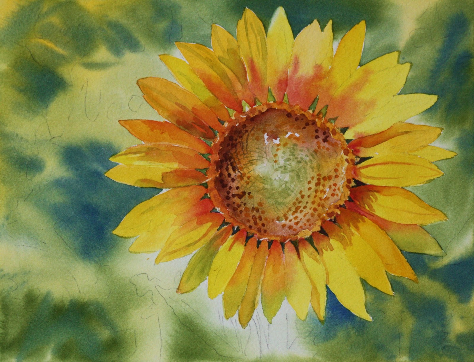
"SUNNY FLOWER"
Subscribe to:
Posts (Atom)