Here is a photo of a bluebird that flew into my yard and landed on the fence post. I was able to take a picture quickly. They are my absolute favorite bird and I wanted to paint it. I chose this for a beginner painting, although as I got into it saw that it wasn't so beginner. However, there are a lot of good techniques in this one and it is excellent for beginners to do.
I am a little hesitant about the background and not sure how it will come out. The values are very similar within the painting but I will give it a shot.
I started painting the blue part of the bird, but I also prepared the rust color for the breast because there are parts like the upper part near the top of the wing where the rust and blue meet and blurs out. I wanted to paint these at the same time. I used a mix of cobalt blue and cerulean blue in whatever ratio you'd like but I used about half and half. I just painted the blue straight on and didn't worry about shading or anything. This I will add later. After the blue was applied, I added the rust color which is raw sienna and alizarin. Do not add too much alizarin. Occasionally I added some yellow ochre in areas and quinacridone rose. There is also a deeper more violet area of the upper breast that I painted by adding cobalt blue to the mixture. It should look like a rusty violet.
After doing the rust color, I added the gray on the underbelly with payne's gray and cadmium red lt. Later on after it dries I scrubbed out some of the gray and added the white feathery feel to it. I dropped in a little cobalt blue in places also.
After that I went back into the blue of the bird and added some darker areas with cobalt and maroon perylene. I touched in some quinacridone rose in some areas as well and at time mixed the rose with the cobalt blue to get a violet. The gray I used for the underbelly I also added to parts of the tail and the wing and to the right of the eye.
I put in the eyeball and beak. I used payne's gray for the eye and for the beak but also added cobalt blue above in the middle of the beak, being careful to leave a highlight on the top.
After doing this part of the bird, I started the background. I wanted to do the background before putting any more darks on the bird because I wasn't sure yet how dark to make it.
I used sap green mostly for the background. I dropped in cobalt blue to a few areas you can see and also yellow ochre. I added a little cobalt to the sap green when I needed a little darker green. When the background was not too wet, I added some branches with the same colors. It's important for the paper to not be too wet or else it will blur too much. Timing is everything and it's not easy! Best to practice.
After doing the background I darkened up the bird a bit. Then I did the fence post. A drybrush technique was used here. I used payne's gray and cadmium red lt. Using the side of the brush I made this textural effect. While wet, I dropped in a bit of burnt sienna. I used cobalt blue and burnt sienna for the iron rod the bird is standing on. There are touches of cadmium red lt. in there too.
This is the finished painting. I still haven't decided about the background and I think I am just going to leave it and say it is a bluebird study! I am anxious to see what the class does with it.....a lot of times I get good ideas from them!!!
I decided the background needed fixing and the bird needed darkening a bit, so here is the newer finished version. I also darkened the fence post a bit. Hopefully the bird stands out a bit better. I lightened up around it's head also by scrubbing a little with Mr. Clean Magic Eraser. That stuff is amazing!
Wednesday, October 21, 2015
DAISIES - Intermediate Classwork October 2015
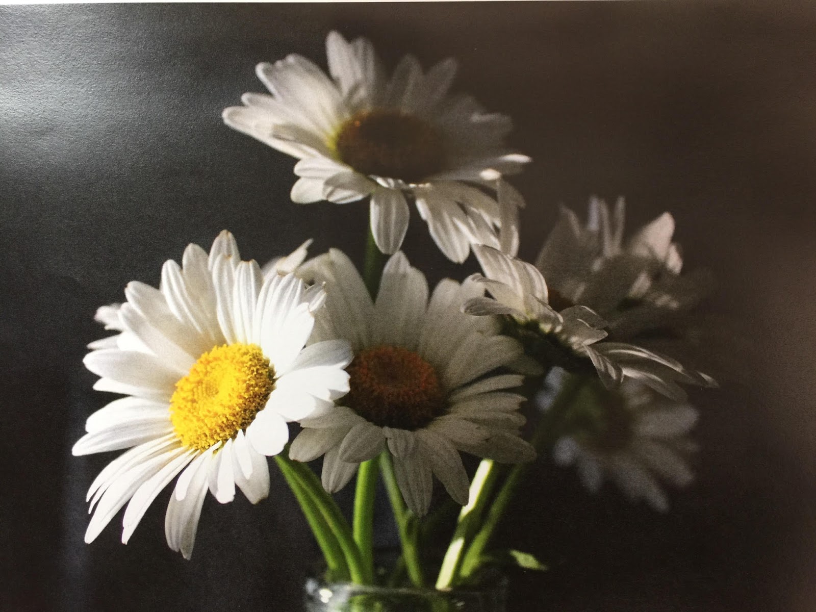
I thought this picture I took of daisies came out pretty, so I decided to paint them and thought they would make a good class project.
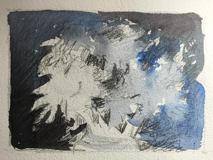
First I did a very rough thumbnail sketch with pencil and watercolor on top just to determine the values and whether this would make a pleasing painting.
Then I started painting the background first, but before I did that I wet the flowers with plain water because I wanted the background to be a soft edge against some of the flowers on the right. I used payne's gray mixed with cobalt blue. Sometimes I added more cobalt to look more blue and other times I used more payne's gray. You can tell in the picture when I did that.
While the background was still wet I painted the shadow side of the flowers (cobalt blue with a touch of payne's gray) in the middle and the right. If the background started to dry (which it did) I gave it a spritz of water and that caused droplets which I like, but this is my demo picture and my actual one I finished didn't have this effect.
I was not super careful with getting all the petals correct and worked quickly. I didn't want this picture to be so exact and tight.
I then painted the flower centers. I started with the very left flower. That center should be the brightest and it doesn't have any blue glaze over it like the others do so the colors should come out a little brighter. I painted the whole center with cadmium yellow and cadmium yellow light, and pulled the color through to some of the petals where I saw some yellow in them. I added some cadmium red light around the edges of the centers to give it more warmth and then I touched in some cobalt blue around the bottom edge. I did that same procedure with the other centers but looking at the photo for differences in shape and color for each one. Also I started to add the darks of the background in between some of the petals and the stems.
Then I did the stems which I used the cobalt blue and cadmium yellow light to achieve. One of the stems is very white which I liked and left alone except to give it a very light wash of cadmium yellow light. I basically made a very light green and painted that first on the stems. (From this photo it doesn't look very light but it is) I then made the green a little darker by adding more blue and then painted the darker side of the stem when almost dry but wet enough to make a soft edge. This takes a little patience to wait for the right timing to paint that in. If you mess up, you can always just scrub out a highlight. This works as well and makes a soft edge.
There are shadows on the petals and I painted those with cobalt blue and maroon perylene. I used the same colors and the background to fill in the glass vase and made sure the stem colors were carried down into it. Keep a highlight around the rim and just a few other highlights in there but it is mostly observing the glass and see what you see. There are no tricks to doing glass really....just paint what you see!
First I did a very rough thumbnail sketch with pencil and watercolor on top just to determine the values and whether this would make a pleasing painting.
Then I started painting the background first, but before I did that I wet the flowers with plain water because I wanted the background to be a soft edge against some of the flowers on the right. I used payne's gray mixed with cobalt blue. Sometimes I added more cobalt to look more blue and other times I used more payne's gray. You can tell in the picture when I did that.
While the background was still wet I painted the shadow side of the flowers (cobalt blue with a touch of payne's gray) in the middle and the right. If the background started to dry (which it did) I gave it a spritz of water and that caused droplets which I like, but this is my demo picture and my actual one I finished didn't have this effect.
I was not super careful with getting all the petals correct and worked quickly. I didn't want this picture to be so exact and tight.
I then painted the flower centers. I started with the very left flower. That center should be the brightest and it doesn't have any blue glaze over it like the others do so the colors should come out a little brighter. I painted the whole center with cadmium yellow and cadmium yellow light, and pulled the color through to some of the petals where I saw some yellow in them. I added some cadmium red light around the edges of the centers to give it more warmth and then I touched in some cobalt blue around the bottom edge. I did that same procedure with the other centers but looking at the photo for differences in shape and color for each one. Also I started to add the darks of the background in between some of the petals and the stems.
Then I did the stems which I used the cobalt blue and cadmium yellow light to achieve. One of the stems is very white which I liked and left alone except to give it a very light wash of cadmium yellow light. I basically made a very light green and painted that first on the stems. (From this photo it doesn't look very light but it is) I then made the green a little darker by adding more blue and then painted the darker side of the stem when almost dry but wet enough to make a soft edge. This takes a little patience to wait for the right timing to paint that in. If you mess up, you can always just scrub out a highlight. This works as well and makes a soft edge.
There are shadows on the petals and I painted those with cobalt blue and maroon perylene. I used the same colors and the background to fill in the glass vase and made sure the stem colors were carried down into it. Keep a highlight around the rim and just a few other highlights in there but it is mostly observing the glass and see what you see. There are no tricks to doing glass really....just paint what you see!
Wednesday, January 28, 2015
Seagull Along The Shore
| We are starting this painting in class. |
First I masked out the seagull. Then I was able to do a wash over the whole picture. I started wet on wet and used cerulean blue with a little quinacridone rose in it. Be careful not to add too much rose! While still wet I dropped in some color for the sand underneath. I used a mix of cadmium red and raw sienna.....for some darker areas I mixed in some cerulean blue to tone it down a bit. Then I added some quinacridone rose in places in the upper left of the seagull and a bit to the right bottom. If your painting is not dark enough, proceed to do the wash over again until you get the value you want. Be careful not to make it too dark or else the bird will get lost. You have to make the value of the bird darker than the water and if the water is too dark, the bird would have to be way too dark to show.
Now we can add some of the ripples in the water after everything has dried. I used the same colors of cadmium red and raw sienna and did add a little bit of cerulean blue to it. I made it really watery and applied the paint very loosely. By holding the brush handle further down the handle and not as close to the ferrule, you can obtain a looser stroke. Also be careful of the angle of the ripples. If they slant to much upward then it starts to look like rain!
I made the color a little less watery for the reflection of the seagull ....it's a darker shade there. I also added a bluer ripple of cerulean blue and burnt sienna. Don't make it too dark, though.
I put in the bluish shadow of the seagull using Thalo blue. The darker blue lines in the shadow I mixed thalo blue with some maroon perylene. When it was dry, I lifted the highlights out with a slightly wet brush and blotting.
Now it's time to work on the seagull. You can remove the masking and put the details of the bird on the paper by transferring the details with tracing paper.
There is reflective light from the water and sand showing on the underside of the bird. I painted the breast of the bird wet on dry using ultramarine blue mixed with quinacridone rose and raw sienna. Drop in yellow ochre and quinacridone rose in place where you see reflected light such as under the beak area and just above the legs. I went over this a few times to get the right value. After it was dry, I wiped out a few highlights with my brush above the left leg. After it all dried, I scrubbed with a soft brush the hard edge formed between the shadow and the white part of the bird. If you feel you would like to add some Thalo blue to parts you can. I did but very lightly in areas on top of the head.
Now to finish the rest of the seagull. Once you add the nice gray and black details of the back feathers, it will start to look like a seagull! I achieved the gray by mixing thalo blue and cadmium red in equal amounts. You might have to adjust one color or another to get the gray you think is correct. I would make sure it is not on the red and more on the blue side. There is a touch of violet shade on certain feathers though and you can adjust for that. The dark black is achieved by just mixing a stronger mix of the color. There are darker shadows under some of the feathers ....take note! This is the fun part! Any feathers you missed going around that are white, you can put in with some gouache. The beak is very hard to explain how to paint. I used raw sienna in the darker areas and used a dark to get the blacker areas using burnt sienna and ultramarine blue. Be careful to keep the highlighted areas of the beak white. You will have to zoom to get the details. The eye is also hard to explain. Zoom in and you will notice the eye is yellow ochre with some dark running through it.
The legs I did with raw sienna, ultramarine blue and quinacridone red mixed to get a dark, but also used raw sienna separate where it was highlighted. There is a light side.....zoom and you will see it.
Final details I added some white gouache to pull up some white feathers on the back and head area.
Sunday, December 7, 2014
"THAW" - Classwork
Wet on wet I painted the sky with a mix of cobalt teal and cerulean blue, concentrating the most color in the center. Then I painted some low lying clouds while still wet with a violet mix of cerulean and permanent rose. I carried this below the mountain line.
While the paper was still wet, I added some distant trees with a strong mix of cerulean and maroon perylene. Don't make it too strong that it is very dark....remember the atmospheric conditions are cloudy and you wouldn't see it so dark, but by keeping less water on your brush you can keep the paint from spreading too much.
There are also some green distant trees that I added with sap green and a little cerulean blue.
I let the paper dry and then added the rest of the background trees, being careful not to get too detailed and let the colors mix.....I wanted it to appear foggy. The rusty color is alizarin and burnt sienna with a little cobalt in it. I also used a violet with with the same colors except more cobalt and less burnt sienna. The darker violet I used ultramarine instead of the cobalt. The pine trees are sap green with a little cadmium red. I added some cobalt to shade one side.
Thursday, May 15, 2014
PAINTING THE SKIRT, BASKET AND LEGS
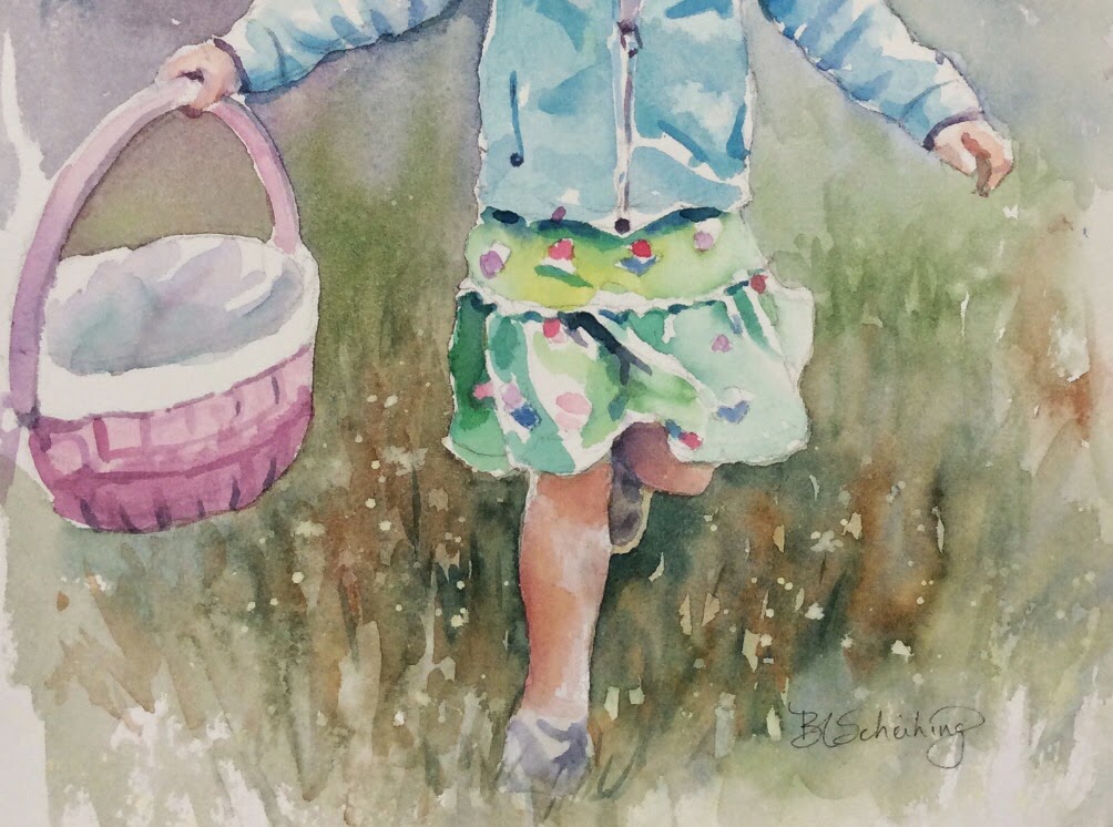
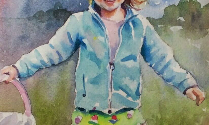
I chose to play down the colors in the clothes as you might notice. I find that we tend to try to achieve the same color intensity in the clothing when we are doing portraits. Depending on what you want to focus on, of course, it's best to play down these areas. The face is where you mostly want your focus to be directed. If I were to paint the basket the hot pink it is in reality, I immediately shift my focus and things become out of whack. The skirt is therefore mostly light in tone except where the folds and creases are and some darker shadowing on the left side. I randomly painted the flowers in her skirt first....very undetailed. I think you can figure out what colors you can use here. Then I painted around them to do the skirt and I used cobalt teal and winsor yellow. Some areas of the skirt I added more yellow, some I added more teal......all watered down a good amount. The darker folds of the skirt I added some ultramarine to that mix and I made it slightly stronger (used less water). There is a little scalloped edge separating the top and bottom of the skirt. I darkened under that scalloped edge.
The basket is pretty straight forward. I initially painted it a light wash of perm. rose and a tiny bit of cobalt. The interior of the basket is a little darket violet (added more cobalt), however I added a touch of winsor yellow to it to dull it down. Not too much. I even threw in a little cobalt teal to it. It is VERY light.....don't be heavy handed with it.....remember we are downplaying this area. After this dries, I made a little heavy mix of the initial violet I used to paint the basket and put in some minute details.....adding a little more cobalt to darken towards the bottom. You might have to add a little yellow to tone down that violet shadow if you don't already have it in your mix.....don't make that shadowed violet too violety....(my word).
OK....the legs.....they are done the same way as the face. They have a bit more yellow tone, so add a bit more raw sienna. The leg that is tucked under though has violet tones in it. I mixed a violet and put that just under the skirt area. (perm. rose and ultramarine) I accentuated some of the bone and muscle area by concentrating color in those areas....such as the calf and knee and leaving some white showing.
The shoes are very understated. They are just a violet with yellow in it to tone it down. Pick a violet...it will work.
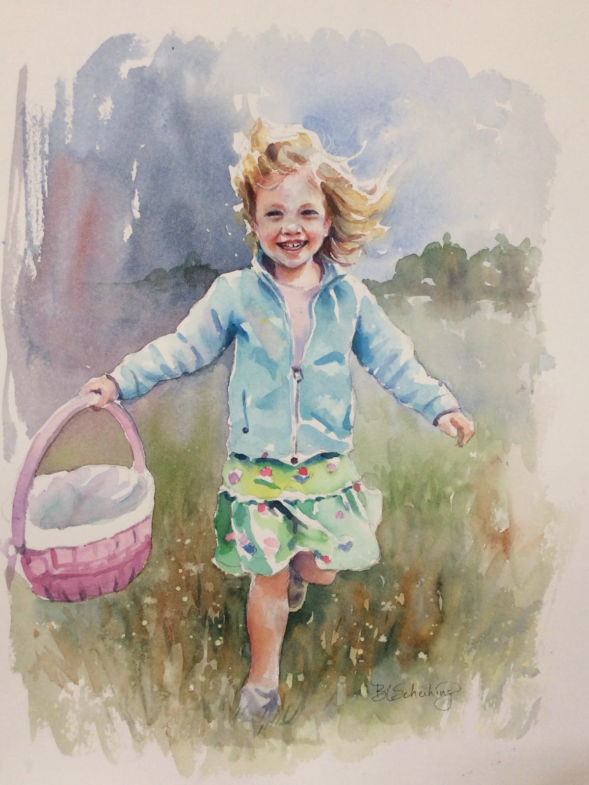
Now that those areas are finished we can darken the face and add background. I think I forgot to talk about the lips! All the shadows, facial features that need to be darkened I did. The lips are alizarin watered down. Add violet to deepen it toward the edges of her smile. It's always lighter where the lips get fatter. I ended up putting a little white highlight on the lower lip with gouache.
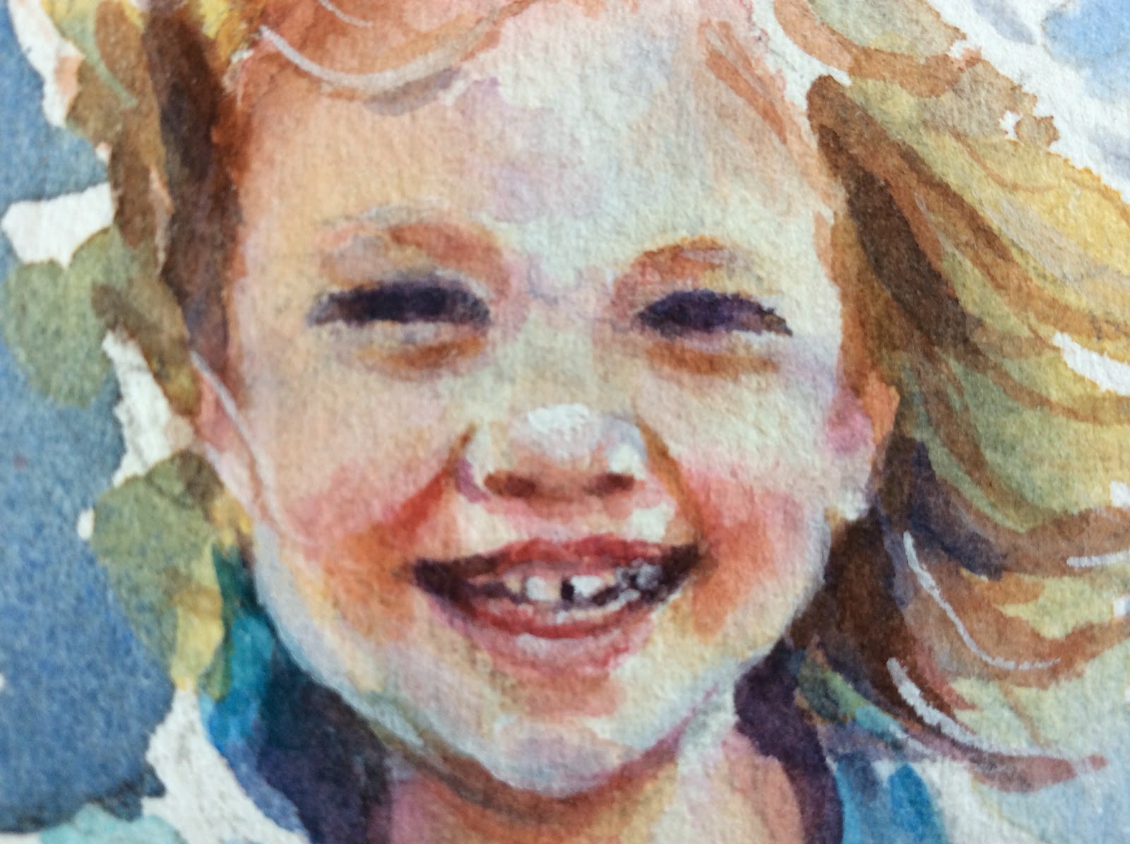
Here's a closer view of her features. I darkened the upper eyelids with more of the skin tone. Put a few more blue in places. Glazed the skin with raw sienna in areas on the left side of her face, sides of her mouth, cheeks. Also glazed areas with perm. rose after that dried. The bridge of the nose has a shadow on it. I used raw sienna, let that dry and used cobalt. Some of these glazes have to dry in between. You can't add wet on wet sometimes because the colors will just get lost. This is not a very large picture so that makes it more difficult.
The background was finished after that. I decided to put in a row of trees very loosely. I used sap green and cobalt with burnt sienna in places. Very light wash.....not a focal point and it's also in the near distance. I painted it wet on dry but then took some water and brought it down past the horizon line. Then I darkened the grass area around her feet. I made it look like there were flowers around by just not painting and negatively painting in some roundish shapes. I put in sap and cobalt with raw sienna and burnt sienna....all individually running it around on the paper. You might want to practice that before attempting. It takes a loose hand. That's it!!!
The basket is pretty straight forward. I initially painted it a light wash of perm. rose and a tiny bit of cobalt. The interior of the basket is a little darket violet (added more cobalt), however I added a touch of winsor yellow to it to dull it down. Not too much. I even threw in a little cobalt teal to it. It is VERY light.....don't be heavy handed with it.....remember we are downplaying this area. After this dries, I made a little heavy mix of the initial violet I used to paint the basket and put in some minute details.....adding a little more cobalt to darken towards the bottom. You might have to add a little yellow to tone down that violet shadow if you don't already have it in your mix.....don't make that shadowed violet too violety....(my word).
OK....the legs.....they are done the same way as the face. They have a bit more yellow tone, so add a bit more raw sienna. The leg that is tucked under though has violet tones in it. I mixed a violet and put that just under the skirt area. (perm. rose and ultramarine) I accentuated some of the bone and muscle area by concentrating color in those areas....such as the calf and knee and leaving some white showing.
The shoes are very understated. They are just a violet with yellow in it to tone it down. Pick a violet...it will work.
Now that those areas are finished we can darken the face and add background. I think I forgot to talk about the lips! All the shadows, facial features that need to be darkened I did. The lips are alizarin watered down. Add violet to deepen it toward the edges of her smile. It's always lighter where the lips get fatter. I ended up putting a little white highlight on the lower lip with gouache.
Here's a closer view of her features. I darkened the upper eyelids with more of the skin tone. Put a few more blue in places. Glazed the skin with raw sienna in areas on the left side of her face, sides of her mouth, cheeks. Also glazed areas with perm. rose after that dried. The bridge of the nose has a shadow on it. I used raw sienna, let that dry and used cobalt. Some of these glazes have to dry in between. You can't add wet on wet sometimes because the colors will just get lost. This is not a very large picture so that makes it more difficult.
The background was finished after that. I decided to put in a row of trees very loosely. I used sap green and cobalt with burnt sienna in places. Very light wash.....not a focal point and it's also in the near distance. I painted it wet on dry but then took some water and brought it down past the horizon line. Then I darkened the grass area around her feet. I made it look like there were flowers around by just not painting and negatively painting in some roundish shapes. I put in sap and cobalt with raw sienna and burnt sienna....all individually running it around on the paper. You might want to practice that before attempting. It takes a loose hand. That's it!!!
HAIR AND BACKGROUND
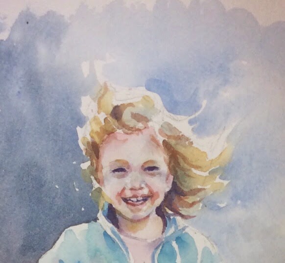
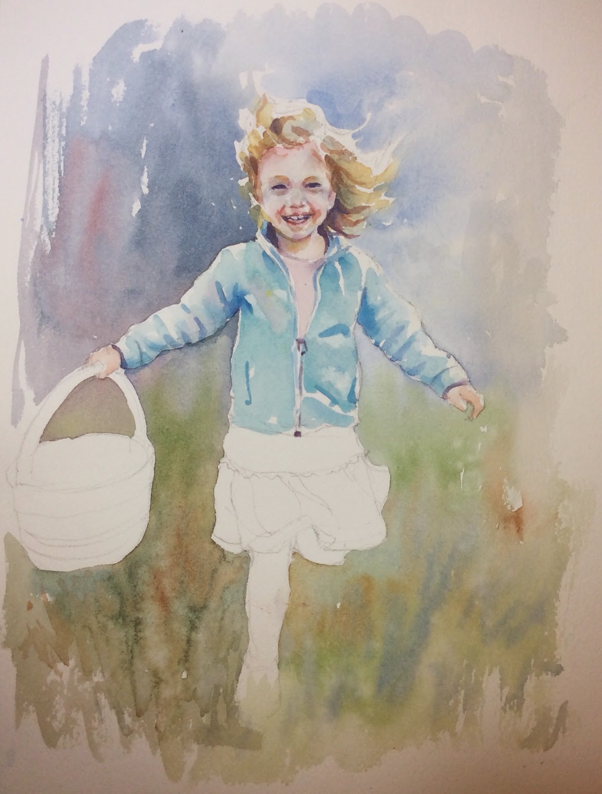
This is how it looks after doing the beginning wash. As I made my way around the girl I started incorporating the land color of sap green and throwing in some burnt sienna and cobalt in areas. You can see the brush strokes I used. This is the initial layer. I darkened it all later.
Subscribe to:
Posts (Atom)