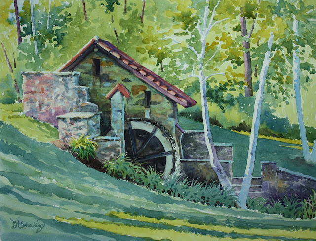
This is a well known sight at Eastern University - a very picturesque college campus that my daughter Emily attended. It was the day of her graduation in May and it was a bright sunny morning. Below is how I painted it. (I am going to take another picture of this as I took it at night and don't like the tones of green...they are not too correct....the other photos are more accurate)
I started with some of the background because I wanted to establish some darks and light greens. I used new gamboge and cobalt blue for the greens in different ratios. More yellow in some and more blue in others. I intermingled the two contrasting green in the distant bushes.

I didn't make the background grasses too dark at first but put an initial layer of the greens and did some drybrush in the foreground to indicate some light areas in the grass. Careful not to get too detailed and just indicated some grass near the edges and along the lilies. I painted the watermill with an initial layer of yellow ochre and then some areas mixed with cobalt blue to make a dull green. Burnt sienna was used in some stones on the building and the darks were made with ultramarine blue and burnt sienna. The building is in shadow and I glazed it later on. The waterwheel itself is dark....I used ultramarine and alizarin with burnt sienna. I tried to indicate water coming down and I ended up scaping some highlights. The roof is kind of tricky and I don't know if I like the results. I saw lots of violets and clay colors in the photo and tried to get those colors. I used permanent rose and burnt sienna but I would probably glaze it first with a violet and then go back with the rose....if I were to do it over. The violet I would use cobalt blue and perm. rose. It's bright, but would eventually tone it down.
 |
| The stone walls have an initial wash of violet made with cobalt blue,
permanent rose and burnt sienna to tone it down. I played with the ratio
of blue and rose. I also used yellow ochre and cobalt within the stones....especially on the right wall. I mixed violet in with it a lot. I also just took some yellow ochre and used that in places. I used some thalo blue (or winsor blue green shade)
mixed with a little burnt sienna (again to tone it down) to do some
shadows in the stone and along the upper ledge area. I played with the
colors a lot and didn't feel I got it right at this point....went back
to it later. |
 |
| I put shadows on the birch trees with cobalt blue and a little thalo here and there. Some violet with cobalt and perm. rose was dropped in on the left birch near the middle. I made the grasses darker in the foreground and background by using more cobalt in the mix with new gamboge. It seemed to make it look more shadowed. I was careful to let some of the other green I initially laid down to show in places in the foreground. The background trees were complicated..... I didn't want them to overpower everything and I wanted it to look like light was coming through. I guess I achieved that....comments are welcomed of course! I put in regular trees in the background. I used a violet mix of alizarin crimson and cobalt to paint the trees initially then shaded them on the right side with a darker mix of alizarin and ultramarine with some burnt sienna. I went back and glazed over the mill with thalo blue ......lightly of course since it is such a strong color. I glazed over some of the stone with it as well in the shadowed areas. The top of the stone walls on the right were glazed with thalo as well. Well, I think I covered everything.....if you have any questions, please put it in the comments and I'll be glad to answer them! |