Wednesday, October 21, 2015

BLUEBIRD - Class Project October 2015

Here is a photo of a bluebird that flew into my yard and landed on the fence post.  I was able to take a picture quickly.  They are my absolute favorite bird and I wanted to paint it.  I chose this for a beginner painting, although as I got into it saw that it wasn't so beginner.  However, there are a lot of good techniques in this one and it is excellent for beginners to do.

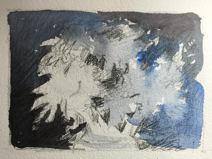
I am a little hesitant about the background and not sure how it will come out.  The values are very similar within the painting but I will give it a shot.

I started painting the blue part of the bird, but I also prepared the rust color for the breast because there are parts like the upper part near the top of the wing where the rust and blue meet and blurs out.  I wanted to paint these at the same time.  I used a mix of cobalt blue and cerulean blue in whatever ratio you'd like but I used about half and half.  I just painted the blue straight on and didn't worry about shading or anything.  This I will add later.  After the blue was applied, I added the rust color which is raw sienna and alizarin.  Do not add too much alizarin.  Occasionally I added some yellow ochre in areas and quinacridone rose.   There is also a deeper more violet area of the upper breast that I painted by adding cobalt blue to the mixture.  It should look like a rusty violet.

After doing the rust color, I added the gray on the underbelly with payne's gray and cadmium red lt.   Later on after it dries I scrubbed out some of the gray and added the white feathery feel to it.  I dropped in a little cobalt blue in places also.

After that I went back into the blue of the bird and added some darker areas with cobalt and maroon perylene.  I touched in some quinacridone rose in some areas as well and at time mixed the rose with the cobalt blue to get a violet.  The gray I used for the underbelly I also added to parts of the tail and the wing and to the right of the eye. 

I put in the eyeball and beak.  I used payne's gray for the eye and for the beak but also added cobalt blue above in the middle of the beak, being careful to leave a highlight on the top.


After doing this part of the bird, I started the background.  I wanted to do the background before putting any more darks on the bird because I wasn't sure yet how dark to make it.

I used sap green mostly for the background.  I dropped in cobalt blue to a few areas you can see and also yellow ochre.  I added a little cobalt to the sap green when I needed a little darker green.  When the background was not too wet, I added some branches with the same colors.  It's important for the paper to not be too wet or else it will blur too much.  Timing is everything and it's not easy!  Best to practice.

After doing the background I darkened up the bird a bit.  Then I did the fence post.  A drybrush technique was used here.  I used payne's gray and cadmium red lt.  Using the side of the brush I made this textural effect.  While wet, I dropped in a bit of burnt sienna.  I used cobalt blue and burnt sienna for the iron rod the bird is standing on.  There are touches of cadmium red lt. in there too.

This is the finished painting.  I still haven't decided about the background and I think I am just going to leave it and say it is a bluebird study!  I am anxious to see what the class does with it.....a lot of times I get good ideas from them!!!

 I decided the background needed fixing and the bird needed darkening a bit, so here is the newer finished version.  I also darkened the fence post a bit.  Hopefully the bird stands out a bit better.  I lightened up around it's head also by scrubbing a little with Mr. Clean Magic Eraser.  That stuff is amazing!

DAISIES - Intermediate Classwork October 2015

I thought this picture I took of daisies came out pretty, so I decided to paint them and thought they would make a good class project.

First I did a very rough thumbnail sketch with pencil and watercolor on top just to determine the values and whether this would make a pleasing painting.

Then I started painting the background first, but before I did that I wet the flowers with plain water because I wanted the background to be a soft edge against some of the flowers on the right.  I used payne's gray mixed with cobalt blue.  Sometimes I added more cobalt to look more blue and other times I used more payne's gray.  You can tell in the picture when I did that. 

While the background was still wet I painted the shadow side of the flowers (cobalt blue with a touch of payne's gray) in the middle and the right.  If the background started to dry (which it did) I gave it a spritz of water and that caused droplets which I like, but this is my demo picture and my actual one I finished didn't have this effect.
I was not super careful with getting all the petals correct and worked quickly.  I didn't want this picture to be so exact and tight.
 I then painted the flower centers.  I started with the very left flower.  That center should be the brightest and it doesn't have any blue glaze over it like the others do so the colors should come out a little brighter.  I painted the whole center with cadmium yellow and cadmium yellow light, and pulled the color through to some of the petals where I saw some yellow in them.  I added some cadmium red light around the edges of the centers to give it more warmth and then I touched in some cobalt blue around the bottom edge.  I did that same procedure with the other centers but looking at the photo for differences in shape and color for each one.  Also I started to add the darks of the background in between some of the petals and the stems.


Then I did the stems which I used the cobalt blue and cadmium yellow light to achieve.  One of the stems is very white which I liked and left alone except to give it a very light wash of cadmium yellow light.  I basically made a very light green and painted that first on the stems.  (From this photo it doesn't look very light but it is)  I then made the green a little darker by adding more blue and then painted the darker side of the stem when almost dry but wet enough to make a soft edge.  This takes a little patience to wait for the right timing to paint that in.  If you mess up, you can always just scrub out a highlight.  This works as well and makes a soft edge. 

There are shadows on the petals and I painted those with cobalt blue and maroon perylene.  I used the same colors and the background to fill in the glass vase and made sure the stem colors were carried down into it.  Keep a highlight around the rim and just a few other highlights in there but it is mostly observing the glass and see what you see.  There are no tricks to doing glass really....just paint what you see!