Thursday, December 1, 2016

Roses In A Pickle Jar

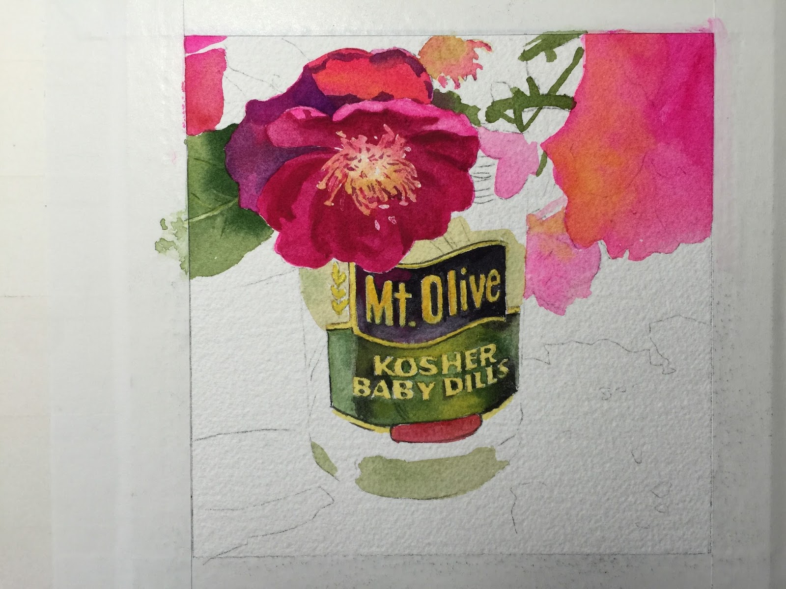
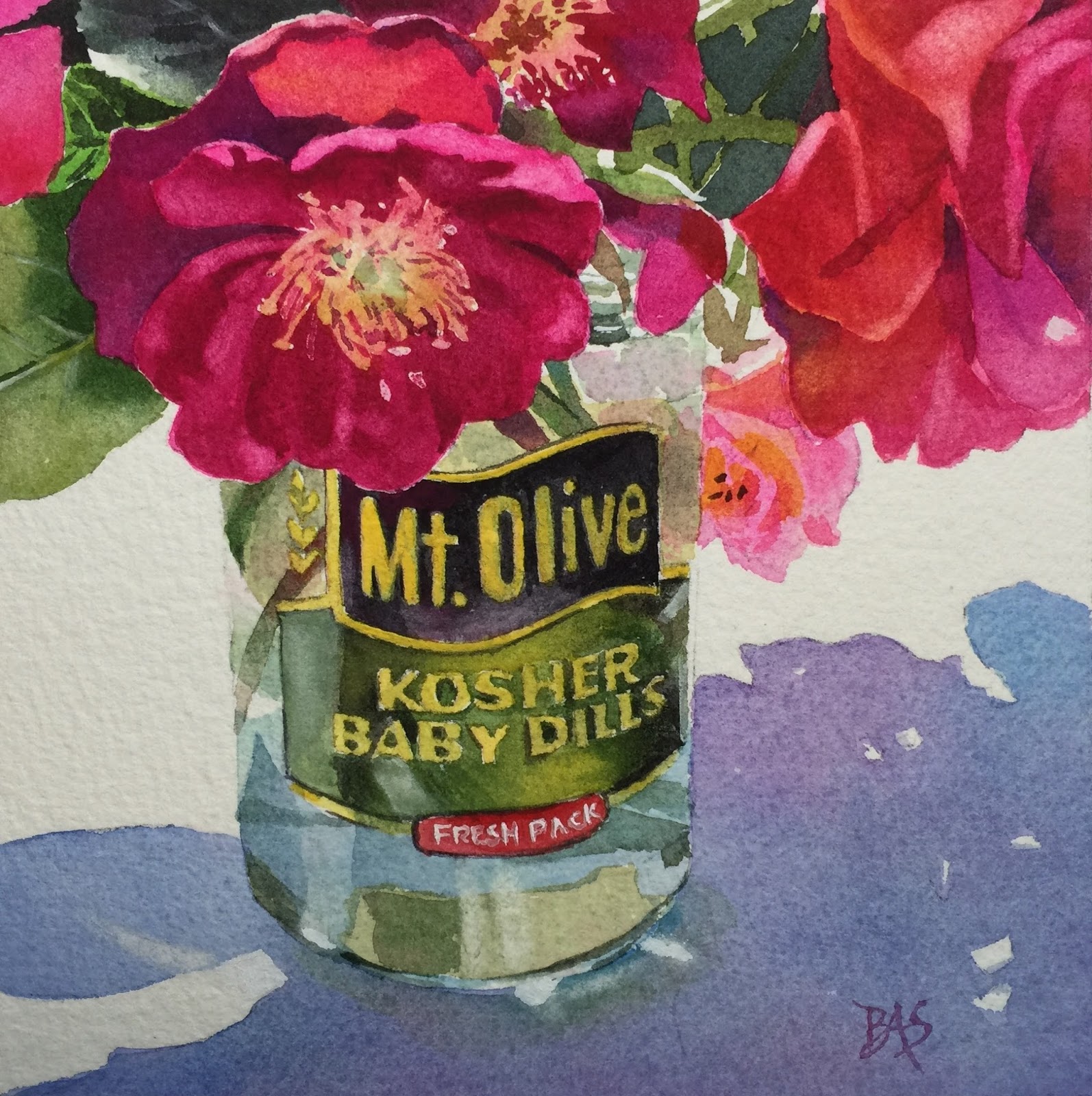
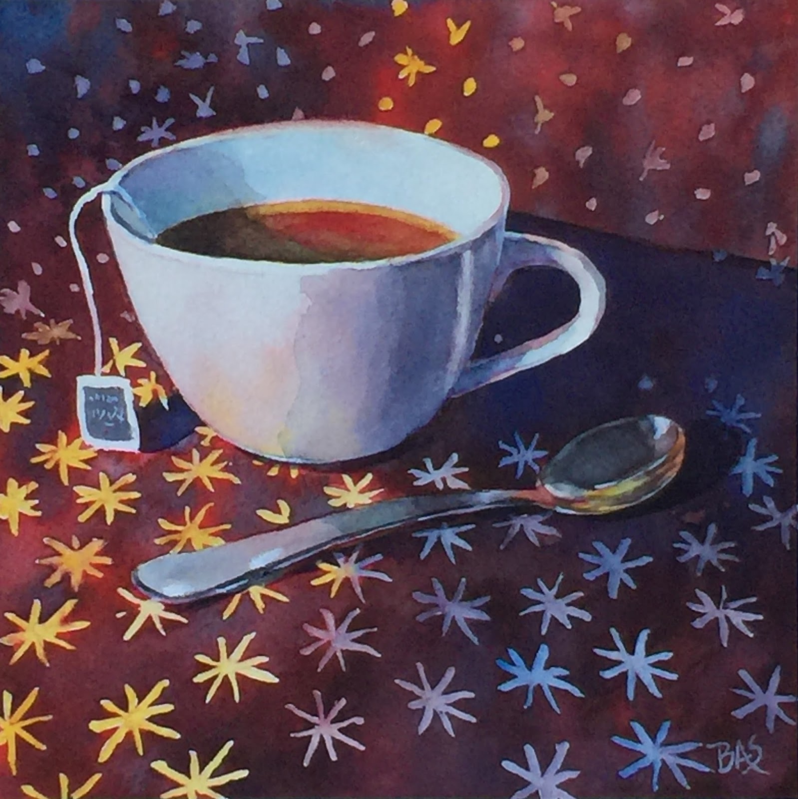
This became a class project by request, but I only have one picture of the painting in process and not a complete step-by-step. The colors for the roses are quinacridone rose, opera rose, winsor yellow, winsor red and a violet made with thalo blue and winsor yellow.

Some of the rose petals are warmer and some cooler.   The warmer ones I mixed the quin rose with winsor yellow.  The other cooler areas I used just quin. rose and/or opera rose.

You can see where i added winsor yellow to the pink areas to warm them up.  The leaves and stems are painted with sap green.  Again, where it is warmer I added winsor yellow and cooler I added ultramarine blue.  I used the sap green alone in many cases.  Sometimes I added thalo blue dropped in a few areas.

The black label is with neutral tint (black) and it is darker towards the top and I added quin. rose to the bottom portion with more water and lighter.

The green label is sap green.  I added winsor yellow in the middle portion and neutral tint (black) in the outer areas along the side.  I painted the label straight out and then later when dry, lifted out highlights.  After lifting out the highlights, when it dried, I gave it a glaze of thalo blue.

The shadow on the table is with ultramarine blue, quin rose and some sap green along the base of the jar.  I also added in some thalo blue with the ultramarine and dulled down the intensity of the blue with a little green.....not too much.

Sunday, September 4, 2016

"UnBEETable"

I can't get enough of looking at all the fruits and vegetables at the markets and grocery stores....they are paintings in waiting.  These beets attracted my eye!  For sale on the link below.


Monday, August 22, 2016

Jar Of Roses

I am starting to sell my work on DailyPaintworks and it's a great site for selling artwork.  There are many talented artists on there selling their paintings, so give it a browse around and let me know what you think.

Wednesday, June 1, 2016

KOI FISH Class Project


Took these pictures at a local garden center but trying to compose a drawing is difficult with moving fish! So I used 2 different photos to try to generally get what I wanted.  
The first thing I did was do the water.  I wet all the water and I used ultramarine blue for the top part of the picture.  Then I gradually changed the color of the water by adding orange to it.  I also dropped in orange and also raw sienna especially towards the bottom area.  After that dried I worked on the fish.  I began painting it first with gamboge or you can use a bright yellow.  Then while it was wet I used perinone orange (a Daniel Smith color) although you can use any bright dark orange or make one using permanent rose and winsor yellow or any bright cool yellow. Being careful not to get the orange on the upper top part of the fish so the yellow shows through.  
  I mixed a violet color with ultramarine + quinacridone rose and used it to make the darker marks on the fish.  When the violet goes on top of the orange, it will tone it down quite a bit so don't worry that the violet is too bright!  As I used the violet on the beginning part of the tail, I dropped a little orange into it.  I also used ultramarine on the end of the tail and dropped some orange into it.
I put the orange on the fins but I also used a scrubber brush to soften and extend the fins so they would look more translucent.  I added some violet into the fins to continue the translucent look.  This violet has some orange in it so that it wasn't so bright!  

The flower is sunlit.  Keeping that in mind I gave it an initial very light wash using opera rose, but also leaving a few areas white.  After that dried, I used the same color only less water but also added a bit of ultramarine to purple it up a bit.  I made it even darker on the shadowed side of the flower.

The center part of the flower I used gamboge and glazed the right side where it is shadowed with some of the pink.  Now for the lily pads.  There are 2 lily pads without the striped effect, although they are both done the same.  I used sap green and added raw sienna to it and also dropped it in in places.  The green of the lily pads is not bright.  But, I also saw a little thalo blue in it so, I dropped some of that in too.
The maroon stripe effect on the other lily pads is from using maroon perylene with some ultramarine in it.  There are little bud type things in the centers of the lily pads.  I just used a little raw sienna on them or in some cases left them white and gave them a shadowed side.
Finishing touches.......added some yellow to the fins.  Added roots in the water connecting the lily pads....just ran my brush with some of the lily pad color through the water freehand.  Added scales with the violet color and some orange ones too.  Added a touch of white highlight with gouache to the lily pad edges and places where I needed some white to the fins.  The bubbles were added with gouache.  After doing the circles, I scrubbed a little inside the circle to make it look lighter.  

Hope you enjoyed painting the Koi Fish!