Thursday, December 7, 2017

NEW STROKES

A new chapter is always exciting when reading a book.....and so in life a new chapter can be just as exciting or even better.  I have always wanted to be a teacher.  As a child I would play teacher in the basement and have a whole class set up with a big blackboard that I had asked for as a Christmas present one year.  It was my best time!  It was my little girl cave.  But I coupled that love with art.  I vividly remember in one of my elementary classes there was a certain pen that one of my teachers used, and I searched unceasingly in the stores for the same one so I could mark up my play papers in my made up classroom.  I could never find that pen, but I loved the certain way it put the ink down and marked the paper.  It was a constant search for me.  The same went with the art that I loved as a child and as I grew up.  I loved and still love the way certain brushes create their mark on the paper or canvas.....it's what drew me and continues to draw me to it......the quick strokes that remained untouched after being carefully or randomly applied.  So, I felt teaching and art went so well together for me and it always will, but I needed to move on from teaching for a while.  I need to branch out and find a new way to stroke the paper without needing to always find projects to teach that could keep me from experimenting and doing things without having an order in which to teach it.  I found that when I had to document and write down every aspect of how to do a painting in order to teach it, it became too stuck in the same mode.  I will still love to go back to teaching, but with a freedom that doesn't require me to remember what color I used here or there, because really, painting isn't and shouldn't be that ordered....at least for me.  I like to mush color around on my palette to make a new color I would never have thought of using, and not knowing what I might come up with is part of the fun.  I loved teaching, but the fun wasn't there anymore.  The best part is the relationships I've had over the years with my students.  Seeing the joy in creating something they didn't think they could do was better than any stroke of my brush!  Seeing a valueless painting turn into one with depth and atmospheric perspective is exciting!  Some never knew what values were.....but when they were shown, it was like a light bulb going on and it couldn't be turned off!  It's great, and I so enjoyed opening new doors for people and their painting abilities!  I hope they take that and run with it, just like I want to run through the new door God will be opening for me.  Who knows, but I believe we shouldn't remain stagnant....always learning, always growing, always serving.....it's good for you. 

Here's to new strokes!


Sunday, November 12, 2017

HOUSE BOAT

I took this photo near Greenbury Point in one of the coves down there and found this adorable house boat which was hand built.  The colors of the boat, the flowers, the water and the flag all attracted me to want to paint this.

Here's how I started:

Make sure you have your colors mixed before you wet the paper.  I wet the whole background except for the mast, the flag and the boat.  I wet the bottom of the boat.  Then made 2 mixes of thalo blue and ultramarine blue.  One with more water and one with less water (stronger).   Then I made a mix of an olive green color for the upper part of the water with ultramarine blue and yellow ochre (M. Graham brand).  Then with the lighter mix of blue I painted the sky down to the horizon line and then started with the olive green and then worked down with the stronger blue, through the bottom of the boat.  When it was slightly drying, I pulled off the paint in a downward stroke with a flat brush from the bottom part of the boat.  Make sure you start out with a wet brush that you take the excess water off with a paper towel so it's dry and then pull it down on the paper.  Keep wiping off the excess water from the brush.  I also pulled off some paint with a sideward motion to make horizontal light in the water under the boat.  Next when all that dries, I painted the bottom of the boat with a mix of ultramarine turquoise and quinacridone violet (both Daniel Smith).  Then, taking the same blue I used for the sky, I painted the shadowed areas of the boat.  You can see there are only a few areas I left white.  Make sure the rim of the boat stays white.

After all that dries I started the trees in the background.  I did this wet on dry.  The colors I used were:  sap green (M. Graham), yellow ochre, ultramarine blue, quinacridone violet and winsor red.  I made 3 values of color.  I mixed yellow ochre with sap green to make a light green, I used just sap green alone, then I mixed a darker value with sap green, ultramarine and a little winsor red.  Now I have 3 values....a light, mid tone and dark.  I started painting in the upper left corner with the lighter green.  Into many of these greens I dropped in other colors like yellow ochre, quinacridone violet or a little winsor red wherever I saw those colors in the photo.  Be careful to leave some of the sky holes so the blue sky shows through.  Also I added tree trunks and some branches while wet.  Don't worry if it bleeds into the greens...that's a good think.  Not all the trunks should be hard edged.  I used ultramarine blue and burnt sienna with some quinacridone violet for the trunks.  I moved in sections at a time, putting all the colors of values in the first section (about a 4" section starting on the left) and moving to the right.  Don't add too many dark values yet, but I did put in some as I moved to the right side.  I avoided painting the grasses behind the boat.  Then I painted the windows of the boat.  I used the same dark as the bottom of the boat for the 2 right windows. I added a darker shadow at the top. The two very far left windows I painted with the olive green from the water behind it.  The third window I painted yellow ochre with some raw sienna in it and I dropped some burnt sienna onto the top with a touch of ultramarine blue in it to darken it a bit.  If you look at the photo, it is darker at the top.

Next I painted a yellow glaze over the body of the boat with a light wash of yellow ochre.  I also dropped in a bit of quinacridone rose to parts of it.  I painted it over some of the door moldings and over the window moldings with the yellow ochre.  I gave the outer rim of the boat a little bit of it in some parts....not everywhere.  I gave the left end of the boat a light glaze of it but very light.

I waited for all that to dry before I added more of the details on the boat.  Next move on to the water.  I started under the boat by adding the shadows the same color as the bottom part of the boat.  Then I dropped in a bit of olive green to it where I saw the color changing.  As you move out to the left the shadow color gets more olive green.  I added touches of thalo blue to it.  Also added quinacridone violet where I saw it.  Squiggle the brush around to create these shadows in the water, don't try to be too careful!  The looser the better and try to use a good amount of water!


Painting the back part of the water, I glazed over it with some thalo blue and dropping in more of the olive green.  Also dropped in quinacridone violet.  After it's dry you can pull out some of the highlights/reflections from the grasses and pilings with a semi wet brush.  After that I glazed over the back grasses with a thin yellow ochre.  When that dried I masked out the tops of the grasses just dabbing randomly.  When the background is dry now add the darker darks.  You can put those in and then soften some areas so not all edges are hard.  I also dropped some other colors into those darks.  When painting the grasses/dead branches on the right I did some negative painting loosely.  When that is dry I added the darks to those grasses and added some olive green into it also.  The dark I used was the same I used on the tree trunks.

Getting back to the details on the boat, I added some yellow ochre and raw sienna on the wood trim.  I added a bright yellow highlight on some areas along the edge near the long windows.  I used yellow ochre with a touch of a brighter yellow.  I painted the flowers with quinacridone violet for the ones on the left but wet them first and kept the very tops unpainted to show a highlight.  I used the dark from the tree trunks with a little ultramarine blue in it to add the shadow underneath the pink flowers.  When that dried I did the more golden flowers.  I used quinacridone gold with some perinone orange in it.  I used burnt sienna for the shadow areas.  When that dried I did the container using burnt sienna with some ultramarine blue in it and a touch of winsor red. 

There are dark stripes at the top of the bottom of the boat and at the base.  I used a darker version of the boat color.

I painted the flag using just ultramarine for the blue area and winsor red for the stripes.  Later I used a razor blade to pick out a few of the stars.

I also used a razor blade to put in the lines coming from the mast, scraping them carefully and not too hard.  I also scraped out the little canopy and the line coming from the buoy.  I painted the buoy with a black paint. 


Thursday, November 2, 2017

Maryland Blue Crab

I am working on a crab painting and decided to do it like an illustration.  It's a fun way to display an object you like and put words and descriptions to it.  Later I plan on making a copy of it and mounting it to a wooden board.  They make great gifts inexpensively.

To start this painting I used 3 main colors for the background.  Yellow ochre and ultramarine blue mixed with some thalo blue.  I wet the whole paper first and then just added those colors where I felt I wanted to and gave it some balance.  Later while slightly wet I spattered with some sap green and some of the blue I used.  To give it more texture I spattered with just water when the paper began to dry a little bit.  


After that all dried, and you can see the spattered water better on this next photo, I started working on the lettering.  I decided I wanted it multicolored and I used winsor red, thalo blue mixed with ultramarine, yellow ochre (M. Graham brand - it's lighter and less opaque than the Winsor Newton brand)  and some sap green.  I decided to do the letters "Blue Crab" in blues and green...(thalo mixed with ultramarine and dropping in yellow ochre to get a green)

Painting the crab I started with the main big shell.  I started by painting the top with raw sienna halfway down and then stopping and adding an olive green color that I created combining ultramarine blue + raw sienna.  I also added some watery ultramarine blue toward the eyes where it gets a little bluer and lighter in value.  Using perinone orange (Daniel Smith) I added that on edges and on those end points that I call jewelry!  The backfin I painted by laying down raw sienna first and then painting over it while wet with thalo blue.  While almost dry I outlined the edges in perinone orange.  The claws will be done in the same way using the same colors.  I will use more straight out thalo blue for most of the claws.


Finished crab painting. 

Wednesday, May 31, 2017

BOYS WADING - A Winslow Homer Study and Reproduction


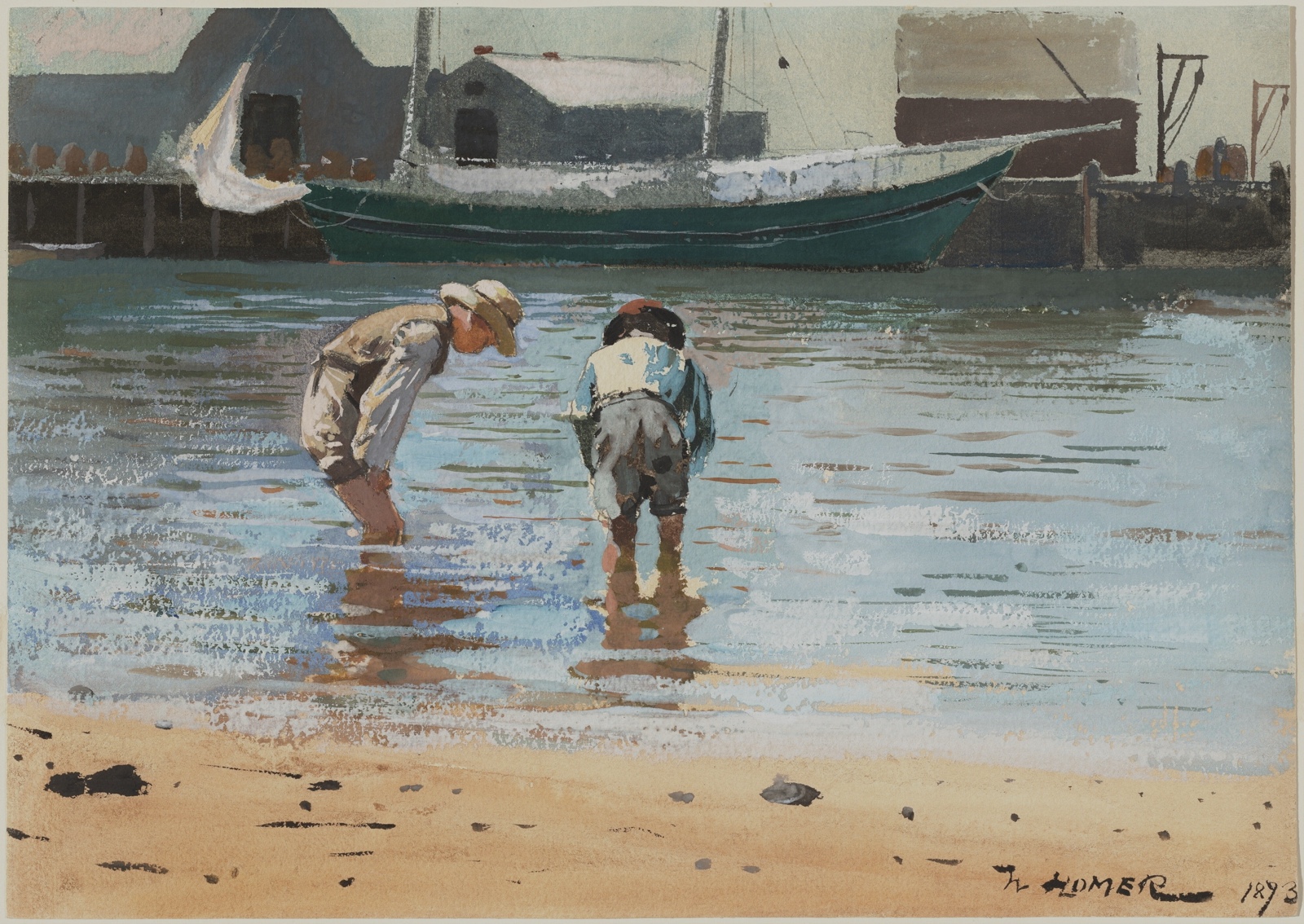
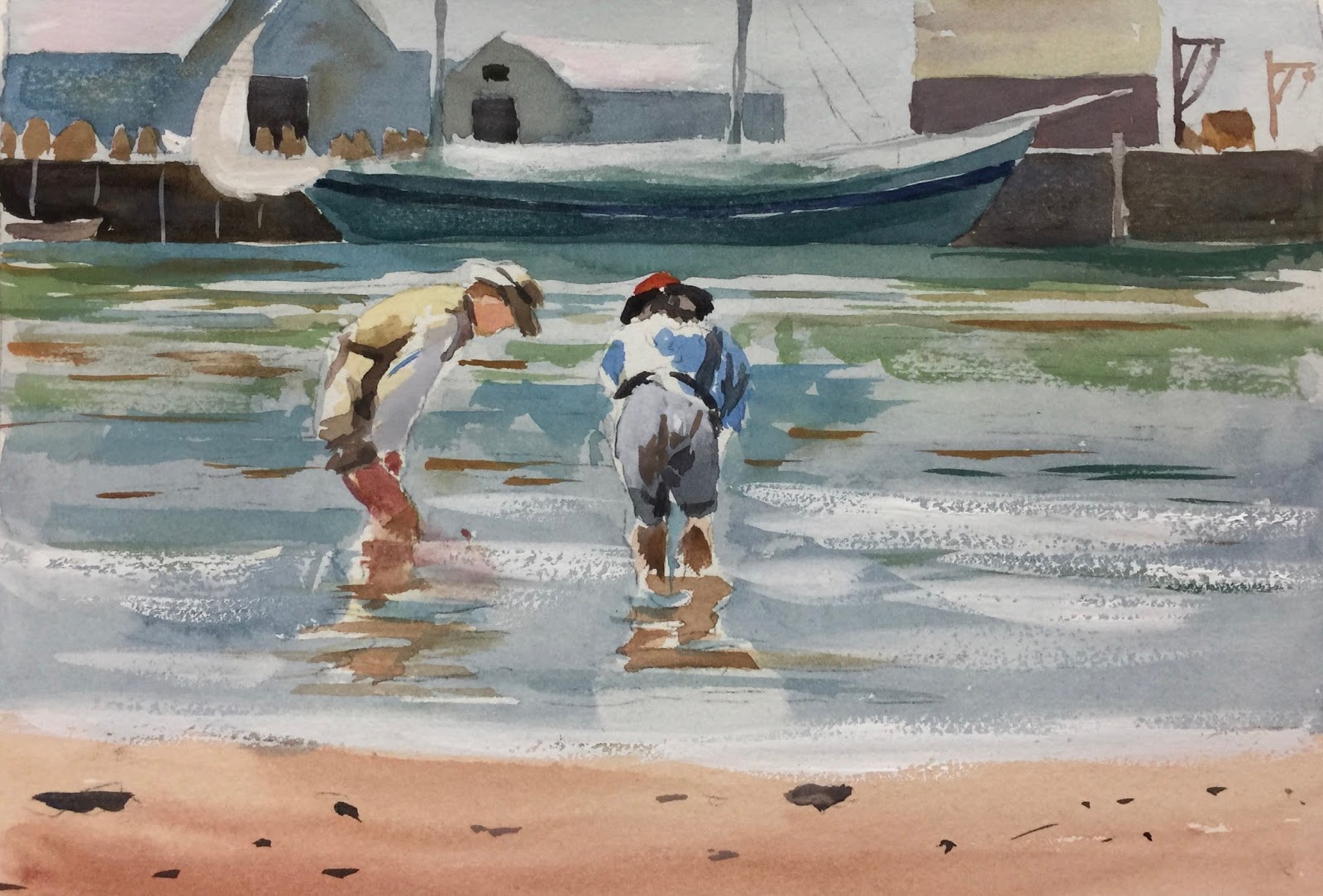
 This is Winslow Homer's painting, not mine!  ⇧


We as a class are looking at the work of Winslow Homer, and we decided to try reproducing this painting done with watercolor and gouache.  It's interesting to try and study master's works and figure out color and technique.  We didn't have the very rough paper he worked on nor do I have or use the colors he probably used, but we are trying it out the best we can and making up colors as we go along.


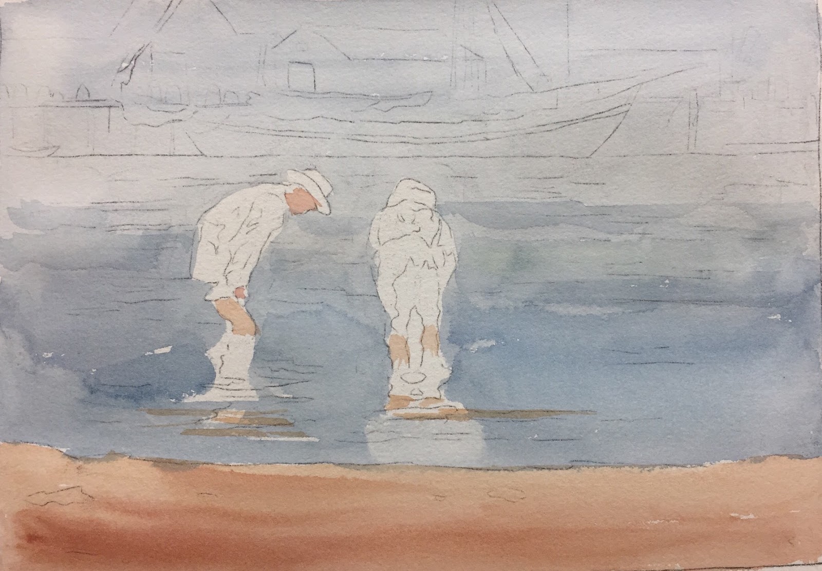
By analyzing the background and sky, I decided that Homer must have painted everything in the blue background first, all the way through down to the water and stopping at the sand, leaving the boys and part of their reflection the white of the paper.  Any other white in the painting was done with gouache.  Many students in my class went on a field trip to the National Gallery and saw this up front and close without any glass!  They sent me photos they took of this painting but with transferring it through the internet and the color differences in computer screens, it certainly changed the colors which in the beginning looked more grayed down.  The more teal colors did not seem to be there, but some of it was incorporated into our painting because many not only didn't remember certain colors in this particular painting, they didn't know we were going to paint this so they weren't really looking at the boat in the background for instance.  It might have had some teal in it and I chose to do it that way because it offset the blue of the boathouses behind it nicely.

So, I started the background blue with ultramarine + ultramarine blue (Daniel Smith) + burnt sienna.  Keeping it on the blue side, not green.   For the sand I used raw sienna + winsor red and added a little burnt sienna.  I painted the boys' skin but keeping in mind later I would put some shading in them.  I used the color of the sand for their legs but for the face I used raw sienna + quinacridone rose.


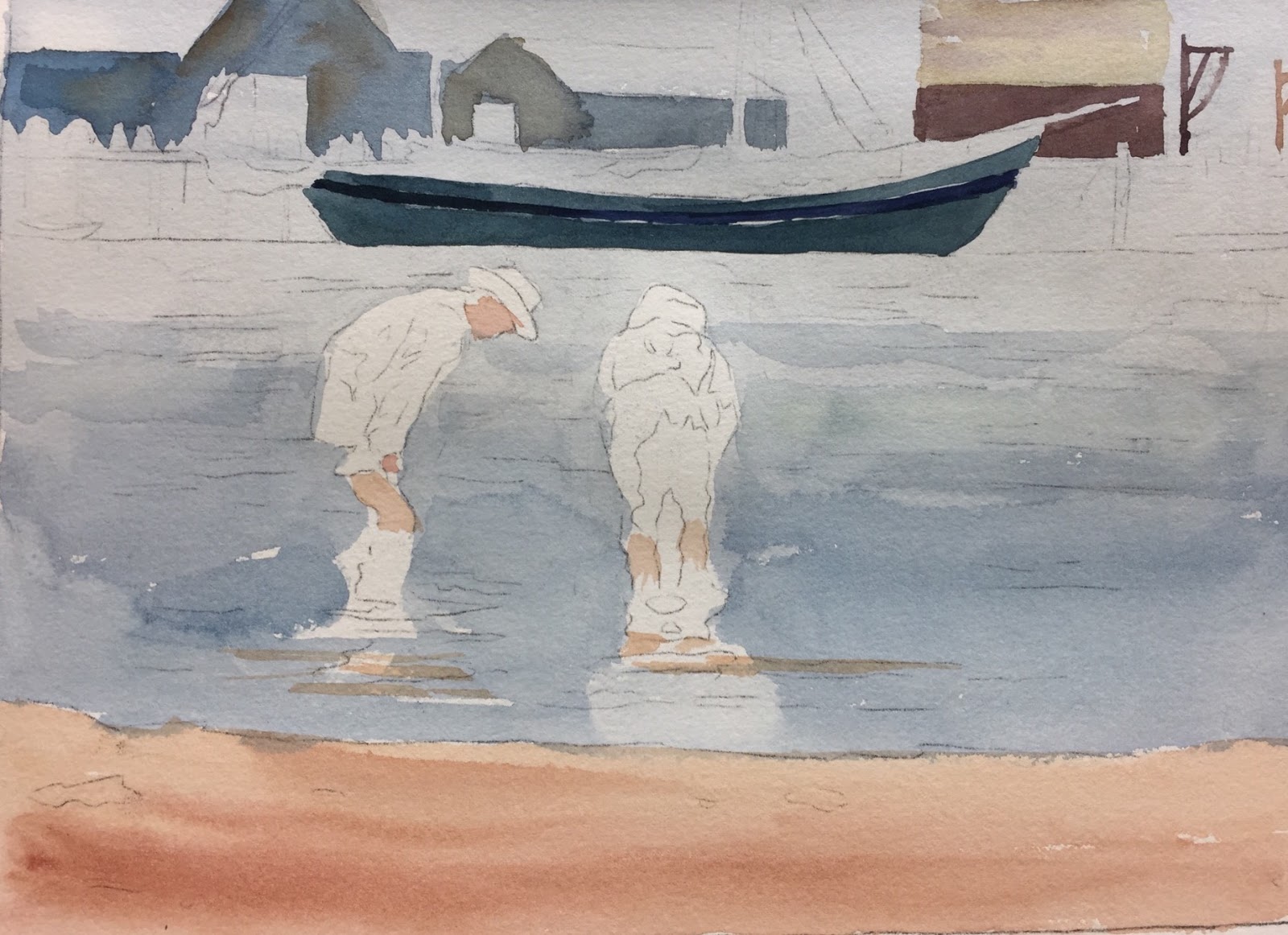
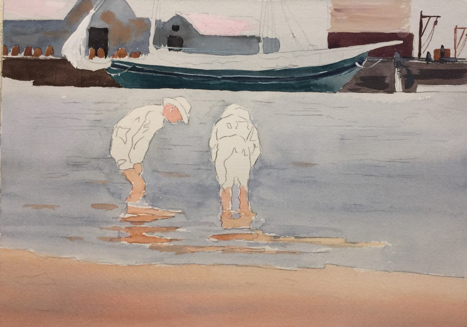
The background boathouses were painted roughly using ultramarine + thalo + burnt sienna and deciding we should add some titanium white to the mix because it looks like the colors were more opaque and also more atmospheric, helping to push them in the background more.  I dropped in some burnt sienna also roughly.  Both blue boathouses were done in the same way.  Then the other brown boathouse I used quinacridone burnt scarlet (Daniel Smith) + ultramarine + burnt sienna. I used that same color but added raw sienna to paint the pylons.  I then painted the boat.  I used the same colors as the sky and water but I used more ultramarine turquoise in it and added a little white to give it a more opaque look.  I did not paint the stripe on the side so the color would stand out more.  


    I painted the bulkhead on both sides of the boat.  Homer probably used burnt umber, but I don't use that color so I made it using ultramarine blue + burnt sienna + neutral tint.


Starting on the boys I put the blue on the shirt on the boy on the right with ultramarine + thalo blue + titanium or Chinese white.  Adding the white adds the opaqueness that I feel was done by Homer.  His shorts I used neutral tint + white + burnt sienna plus a little quinacridone gold.  The white on his shorts I did later with some white gouache, which wouldn't be how I would normally paint it.  Homer used gouache frequently in his earlier paintings.  For his red hat I used winsor red + gamboge then used a dark for the rim with burnt sienna + ultramarine blue.  I used this dark also for the shadows in his shirt and pants.

To start the boy on the left I used raw sienna to map out the underlying highlights.  For the deeper shadows, I used the same colors I used for the bulkhead but added some other colors.  I used black + white + quinacridone burnt scarlet + quinacridone gold.  It seems like a lot of colors, but it seemed to get the color I was looking for......I'm sure there was an easier way, oh well!  The dark apron, I just used the bulkhead color.  I also used the bulkhead color but more diluted for the shadow side of his hat.  (If you don't want to mix all these, I also experimented with just black + burnt sienna + white and that seemed to work).


I started to paint the water in the background near the boats.  I used ultramarine turquoise + ultramarine blue + burnt sienna + white.  Dont used too much burnt sienna.  I used this color to paint the center of the water under the big boat.  As you go to the right use more burnt sienna and as you go to the left add some thalo blue.  The water is pretty hard to describe.  I used a lot of the colors I already used in the painting and maybe adding raw sienna or sap green to add the different colors affected by the sand and the sky.


Use white gouache to make the foam of the waves and the sail in the background.  The rocks in the front I used burnt sienna + ultramarine....nothing too detailed as you can see.  The lighter side of object I believe Homer just added white.

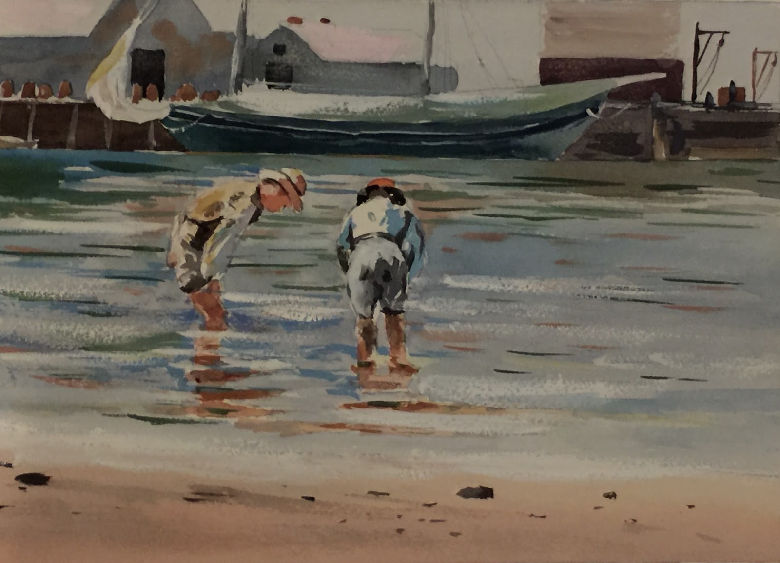
Here is the finished painting, although I would probably darken the boy's shorts on the right and a few other things.  We ended up taking sandpaper and sanding some of the buildings in the background.  It just slightly lightens it up and pushing them back a bit.  Hope you had fun doing a Winslow Homer!

Wednesday, May 24, 2017

Sunny Side Up

Eggs in the sun!  This is the photo I took ⇧..... A fun project but challenging.  Thought we would paint these in the beginner class....not sure they like me!


We started painting one of the whole eggs, but first masked out the highlight on it.  Wet on dry, I used raw sienna + quinacridone rose and added winsor yellow to the sunlit side of the egg, adding a band of violet as I worked down the egg with ultramarine + quinacridone rose.  Using the same initial colors but just adding more rose, I painted the bottom of the egg.  After the egg dried I painted the harder line shadow on the the left side with a darker violet of ultramarine blue + winsor red.


I approached the other eggs in the same way and using the darker violet to get the deeper shadows.


Next I started painting the interior of the bowl.   I made a base color of the green bowl mixing Thalo Green (Daniel Smith) and Winsor Red.  To this base color I made a sunlit side by adding Winsor Yellow to it which I painted to the left of the eggs in the bowl.  At the same time I mixed the red clay color along the rim with Winsor Red + Thalo Green, and while the yellowish green color was still wet, I added the red to the rim.  I added a little Quinacridone Rose to middle area of the rim and then I continued with the rest of the rim to the right with the base color of the green.  When this dried, I painted the shadowed part of the interior of the bowl to the right of the eggs, covering the deep shadow part of the egg.  I used the base color green and I added Ultramarine Blue to the mix.  After painting it in, I dropped in some Raw Sienna close to the egg.  After this dried, I needed to make the egg show through the shadow.  To do this I used Gamboge (M.Graham) and painted it in where the egg is in shadow.  I saw that it needed some pink so I added some Quinacridone Rose.  I painted the dark to the left side of the eggs with the same color as the dark on the right side.

I then started to paint the base of the bowl.  I painted the light color on the whole base of the bowl with base color plus some thalo blue.  I painted a very light wash with this color.  When that dried I painted the shadowed side.  I used the same color with more thalo in it, plus adding some Quin. Rose at the bottom.  I then painted the reddish base with the same red and the rim and mingling the colors.


Now the big shadow!  It's a very large area so you have to work fast even though it is done wet on wet, if it's anything like today with 48% humidity, your paper will dry fast.  I used ultramarine blue + thalo blue + a little winsor red.  However, when you get closer to the eggs, you have to drop in some quinacridone rose and winsor yellow.  Near the single egg I just dropped in quinacridone rose.  Near the bowl I dropped in a little sap green but not too much.  If you are not happy with the shadow, you can do it over again, but you have to dry the paper completely with a hair dryer.  Then rewet it all and do the same thing again.  I did it twice to get a stronger color and it also smooths out some blotches.


Here is the finished painting, although it is a demo picture and a little sloppy, but I actually like all the wiggly edges!  I'm actually getting used to painting on an easel sideways!  The last thing to paint is the inside of the broken shells.  I used ultramarine + winsor red but on the bottom one I put some of the color that is in the shadow underneath it.    I added a shadow on the broken shell, and I added some shadow underneath on the table.  And it's done!

Thursday, May 4, 2017

CHESTERTOWN FOUNTAIN


We are starting a painting of a fountain that many are familiar with in Chestertown, MD.  The photo came out very blue so we are going to change it a bit.

We started painting the initial washes laying in general mid value colors.  At the top I added some ultramarine for the little patches of sky.  There are a lot of sky holes in the photo and I didnt want to add all those.  Then I added some greens for the trees with some raw sienna and sap green, making sure more of the raw sienna was used around the fountain and more of the sap on the outer sides of the paper.  I used some winsor yellow with the raw sienna near the bottom of the fountain.  I used some perinone orange a little further down towards the base of the fountain also.  I put some dark greens in also near the edges of the paper with sap green and ultramarine.  The foreground I used raw sienna + quinacridone rose for the lighter areas and then ultramarine blue for the shadowed areas.  All this done wet on dry but all the colors were put in at once letting them blend together.  I painted the fountain in the shadowed areas only and leaving the highlights white.  I used ultramarine blue and ultramarine turquoise.  I used a little raw sienna at the base.  For the man I used ultramarine blue + winsor red and painted him mostly in shadow except for a few areas on the top of his arm and back of his head.


I have added the tree trunks using ultramarine blue + maroon perylene + raw sienna.  After mixing these colors I first put a wash of raw sienna on the tree and then dropped in the darker tree color.  As the trees get closer to you they are darker.  The ones that are receding I used a lighter wash.  Leave some leaf room by skipping the trunks in a few places.  You can see it here.  Don't get too detailed with the branches....you don't have to tell the viewer everything!  I continued the color of the tree trunk on the left through the shadow on the ground.  I also added in the bench on the right.  I used burnt sienna + ultramarine blue being careful to leave a little highlight on the top of the bench.


I started to work on the man scooping debris out of the fountain.  He already had a shadow wash of violet on him so I just mixed a skin color of raw sienna + quinacridone rose and put that on his face and hands.  I gave him a gray sweatshirt just by swirling colors on my palette together.  I put a little thalo blue on his shoulders as a bit of reflection from the sky which I actually noticed in the photo.  I continued to do his pants while his sweatshirt was still wet to blend them together a bit.  I used burnt sienna + ultramarine for his pants.  I added his hair with this color also, leaving a bit of highlight on the top of his head.  I then did the bucket with the same color only I added neutral tint to it to do the interior.  I did his scoop with ultramarine at the bottom portion because the upper part is metal.  After the man's clothing dried a bit, I added some shadows to his shirt with some violet dark that I had on my palette.

I started then to add the third value to the fountain using the same colors except with some raw sienna in the mix of ultramine + ultramarine turquoise.  By just looking at the photo and squinting I pulled out the darkest darks and painted those but exaggerating them a bit since the photo isn't very good.  Try not to get too detailed since your eye will tell it is a fountain and unless you are doing a photo realistic painting, don't put yourself through the torture!!  You are just giving the impression of a statue/fountain.

I also added some darks and light leaf areas to the trees.  I kept the dark leaves to the left and added lighter ones to the right.  For the dark I used hookers green + ultramarine.  I used sap + winsor yellow for the lighter areas.


Tuesday, April 11, 2017

Steep Hill Blueberry Farm - Class Painting

I painted this barn that is on a blueberry farm called Steep Hill on a beautiful sunny cool August day in Fayette, Maine. I brought my paints and sat in the shade to paint their barn which I have seen every time we come and have always wanted to paint it.  I knew I didn't have much time to paint and had to paint pretty fast because I knew it wouldn't take long for everyone to pick the berries so we could go back to the cabin to make a pie!  This is our very favorite place to go.  There is nothing like a summer in Maine on the lake.

So I started by wetting the paper in the sky area and the left side of the painting up to where you see the the violet part which is the rock wall.  I used a diluted wash of ultramarine blue for the sky areas and also put in a very light green above the barn for the distant trees while still wet.  The light green I made with sap green and winsor yellow.  I then added a darker green into the lighter green with sap green with a little ultramarine in it.  You can see where I added the greens near the trees all wet into wet.  I added raw sienna as the background brush behind the trees.  I let that all dry, then I painted the trees.  I used a few colors:  raw sienna, bluer violet (ultramarine + winsor red), (brownish blue)burnt sienna + ultramarine.  I started with the raw sienna, then while wet, I added the violet on the left side of the tree, being careful to save the raw sienna on the right side.  I added in the brownish blue on top of the violet also while wet.  When the tree was dry I added a darker brownish blue in spots.

I then started to paint the rocks and roof of the barn.  I used ultramarine + raw sienna with much more blue.  One thing I want to point out.  The M. Graham brand of paint has a different color version of raw sienna than Winsor Newton.  It is darker and not so light yellow.  I get a whole different color than those that have mixed ult. blue with the Winsor Newton brand raw sienna.  Some students who used it got a green color and that's not right.  It should be a blueish gray color.  I just put that in very haphazard and blending out the bottom with water.  I put it on the roof very roughly and then touched in some winsor red a bit.  This is where I stopped for now.


Then I worked on the barn.  I used the same color as the base color of the rocks for the front of the barn which is ultramarine and M. Graham's raw sienna.  You can drop in a little raw sienna in places too to vary up the color.  When it started to dry slightly I dragged the back of my thumbnail and scraped it to look like barn siding.  The left side of the barn I used the same color but I added a stronger bit of raw sienna to make it look more golden.


Now I added some darks.  The trees behind the barn I used M. Graham's Hookers Green mixed with ultramarine blue and some burnt sienna.  I loosely painted them in and went down near the flag, adding water to soften.  I also put a little raw sienna into that along the outer edges too to vary the color and make it look a little more sun struck.  I used this same green to do the trees on the left but watered it down and also added winsor yellow to some of the leaves.  All this is done very loosely with scribbly strokes.  Holding the brush away from the ferrel helps.  I also added this green to the grasses along the barn, adding strokes of raw sienna also.  When this dried slightly, I added the darker green around as you can see in the photo.  I also added darks for the front opening doorway of the barn and the left side of the trees using ultramarine + winsor red + burnt sienna.  It creates a deep violet.  The barn opening I painted using this violet halfway down and then  throwing in a strong mix of raw sienna.  I also added this violet along the roof edges as a shadow and in the windows.


Here is a little closer up of the rocks and grasses.  I started adding the darker sides of the rocks with a flat brush with ultramarine blue + winsor red + raw sienna.  That's the 2nd value of dark on the rocks.  Then a deeper value was added by adding burnt sienna to that mix I used for the 2nd value.  I laid in some sap green over some of them also to look a little mossy.  I added the greens and violets on my palette to put in the forground grasses and front grass.  I really just mushed everything together.  A very technical term!  Feel free to drop in different colors here and have fun....but don't go overboard!  I also did some spattering but that's not visible in this photo.  You can go back up to the top picture to see the finished painting.