|
| I painted the table itself with new gamboge more to the left where it is lighter and then burnt sienna and alizarin with cobalt added where the table is more shadowed. |
 |
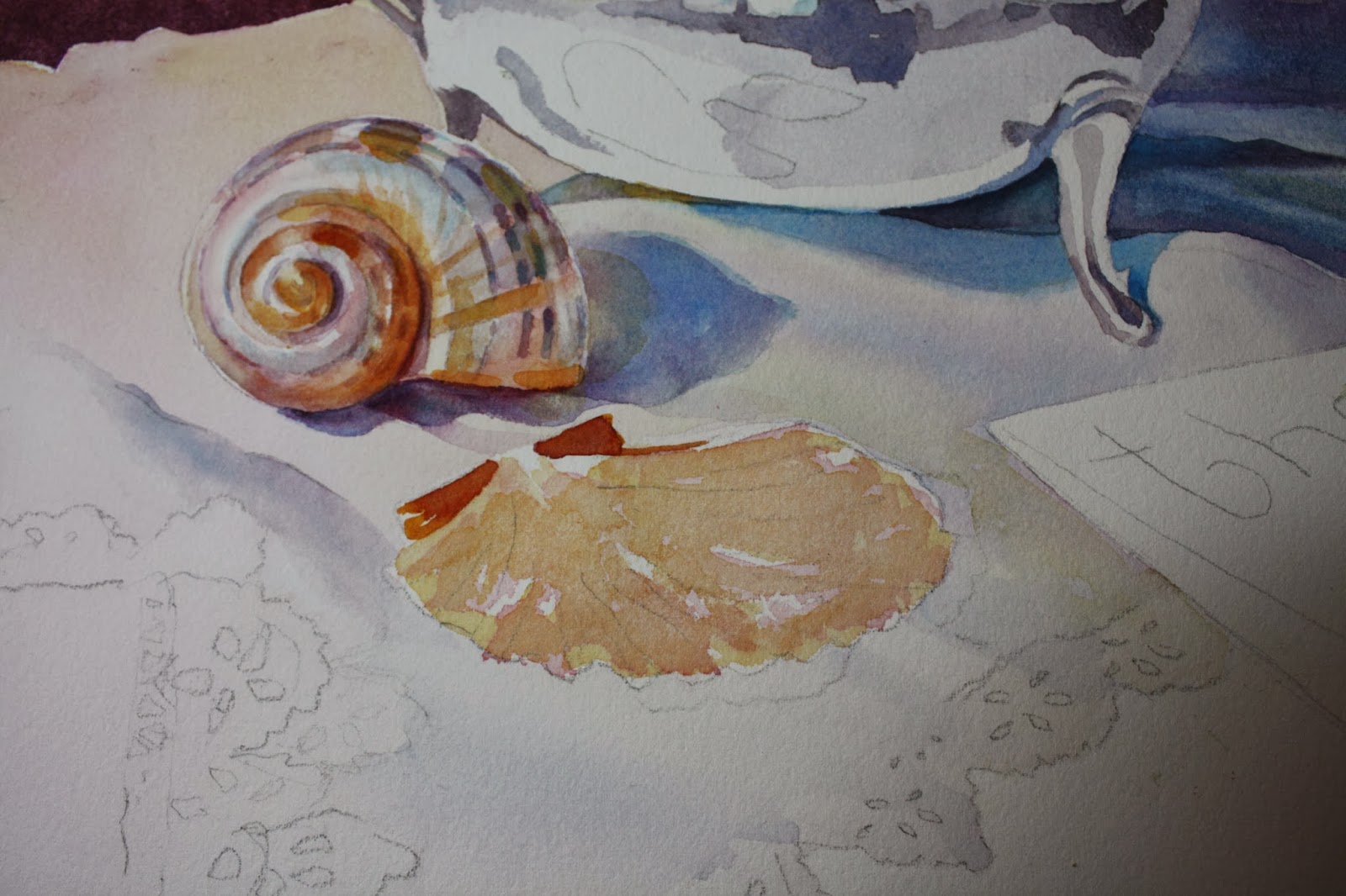
| I added a darker violet (cobalt and alizarin) to the darker shadowed areas of the fan shell. I scrubbed out some ridges and reglazed over some of the shell with perm. rose. I kept scrubbing areas and reglazing them to build some layers and getting the patter right. I put in the shadow being careful to lighten the shadow when the fabric was raised up underneath the shell. I then started the area under the fabric. I will skip over this part for now and come back to it later. |
 |
| Here I made a mix of burnt sienna and perm. rose and added the ridges on the shell, defining them more in some places and blurred others. |
 |
| Here's a closeup of the shells. I glazed over the outer edge with new gamboge. |
 |
| You can see the shell detail here.....if you click on the picture and then click it a second time after that you can see it up close. It looks like it has a shine. You should skip the area you want the shine to appear or you can scrub it out, however it will be more effective if you skip over painting it. If you skip over painting it, then you will probably need to soften the edges by scrubbing them slightly. I added the shadow on the shell with cobalt and dropped in a violet with cobalt and perm rose. I dropped in a little thalo to the shadow also. I added new gamboge where the shadow is closer to the shell. I also started the fan shell. I did a light glaze of burnt sienna over most of the shell but left some white areas showing. |
 |
| I started to add some reflections in the pot.....such as from the handle. The rosewood handle is reflected in the pot on the right side. It's just the same colors I used in the handle which is burnt sienna and alizarin crimson. I added some darks in the pot on the spout. That is the same mix we used in the pot only darker......cobalt, alizarin and some new gamboge to tone down the violet. As you can see I started the shell. I can only tell you the colors I used as it would be very hard to describe how I painted it. I used new gamboge, burnt sienna, perm. rose and/or alizarin depending on how dark I want to make my reds and some cobalt blue. There are a lot of rounded edges in shells and to make them look that way you have to be able to graduate the colors so they look like they bend. If you start dark, then you can eventually get lighter with a water wash or if you start light you can eventually get darker. There are lots of dark indentations and shadows. That's were you need a stronger concentration of paint. |
 |
I felt there was a warm glow on the cloth towards the back on the left so I glazed over the cloth with a mix of new gamboge and permanent rose. This color can also be found in the pot and you can see where I added it above in the next photo. |
 |
| I moved away from the pot for awhile and started the fabric. I worked wet on wet in sections starting on the right side under the handle. I'm using a mixture of cobalt blue, a little permanent rose and a little new gamboge. I want to paint the areas that are shaded stronger color and leave parts that I want to be lighter and letting it bleed into the lighter areas. When it dries I make a stronger mixture of those colors and put in the darker folds. |

We are starting a still life in class and I will complete it within the week. I had some difficulty with the paper in that it was soaking up water and drying so fast I could not keep up with it. It could have been the fact that I had a room heater on because my studio is COLD! It might have gotten the air so dry that the paper reacted. Anyway, I decided to add a sponged texture to the background and it seemed to work ok. Next time I work on the painting the heater is not going to be used and I'll see if that makes a difference. Sometimes the sizing isn't right on the paper....I've had this problem before when it was a different time of year, it might not be the heater.
So I masked around the inside perimeter of the pot and the handle and spout plus the upper layer of the tablecloth. Enough so that I can freely paint the background without getting too much on the other parts of the painting. I used a mix of cobalt blue, alizarin crimson, and burnt sienna. This gave a nice plum color. Initially I did it wet on wet and found I had trouble getting it dark enough after multiple applications. So I decided then after it was dry to do another layer wet on dry. I didn't like the paper drying so fast and then while wet I sponged off color on the left side to cover some of the blotches that formed. I made sure I evenly sponged and continued some on the right very lightly to show to continuation in the texture to make it look more intentional.
After all that dried I took off my masking fluid and masked some areas of the pot I wanted to remain white such as many of the highlights. Then I started to paint the handle which is a rich rosewood. I used burnt sienna and some alizarin crimson. I added cobalt (mixed in and/or applied directly) to shadow and darken some areas. I used more burnt sienna than alizarin....careful not to make it too red. I added a touch of gamboge to the middle area of the handle where it seemed highlighted.
For the pot itself I used the same colors....cobalt, alizarin....some gamboge to grey things down. I will continue as I get more finished.