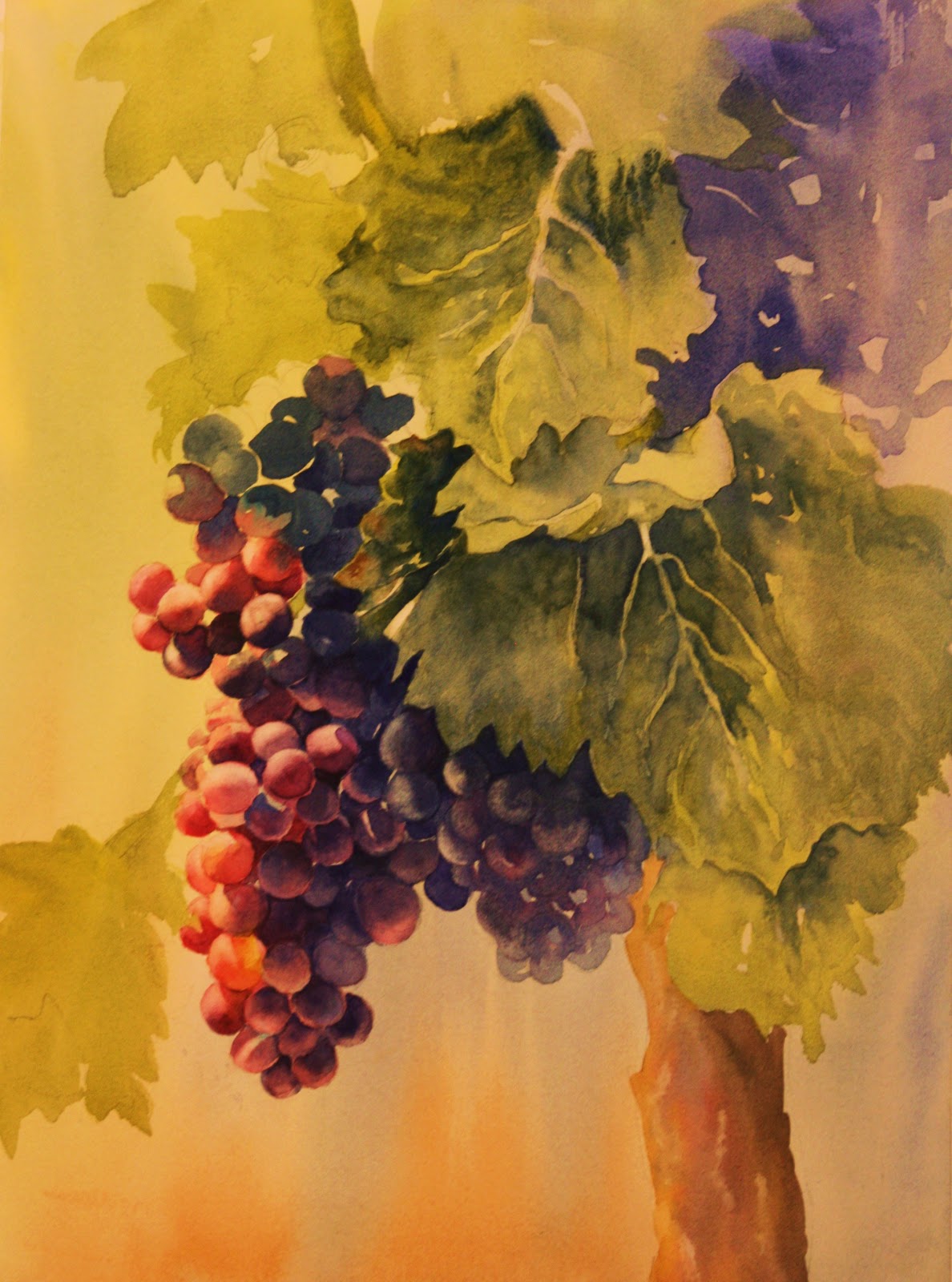
Getting started, I first wet the paper and put in broad strokes of color with my cat's tongue brush of cobalt blue and ultramarine on the top, then burnt sienna on the bottom and let it drip down. I while it was in the process of drying I laid in the shapes of the grapes and leaves and trunk not worrying about bleeding or blending. I was actually trying to make it do that and wished it would have done it a little more. I have to confess I had the space heater on because my room was cold and I just told my class not to have that on while painting because it dries the paper too fast! Should've listened to myself!

I layered with deeper color and put in shadowed areas. Colors I used for the grapes were ultramarine blue, burnt sienna and a touch of perm. rose or perm. alizarin in the darker ones. The leaves I used ultramarine blue and winsor yellow.....I added very little burnt sienna to areas I thought needed toning down. The trunk I used yellow ochre on the left side and ultramarine blue and burnt sienna on the right shadowed side. I then dropped in a violet mix down the center and touched in some alizarin..
Here I just did more of the same......concentrating on beefing up the values. It also decided the background needed more also so I made it darker on the right on the trunk and put some blues under the grapes to make the distant grapes disappear more. I spattered also......I'm a little too addicted to spattering.....and I probably overdid that AGAIN. Once I start flinging the paint I can't stop.
In the finished painting, I decided the top area was too much so I cropped it. I also didn't like how I painted that stem on top so I took a big 2" brush and laid in some winsor yellow and dropped in cobalt and ultramarine to mush it together....sort of obliterating the top left side.....I guess it was successful, but have my doubts....I discovered halfway through the painting why I was having so much trouble getting the paint to move and blend.....I had filled my ultramarine blue well up with student grade paint while in class because I ran out of my professional grade paint.....and low and behold I was totally frustrated. I had also used that to mix my greens and everything else....I couldn't figure out what was wrong ......just a true test of using student grade is NOT beneficial. When I switched it was a WORLD of difference! Only wished I had noticed it sooner.