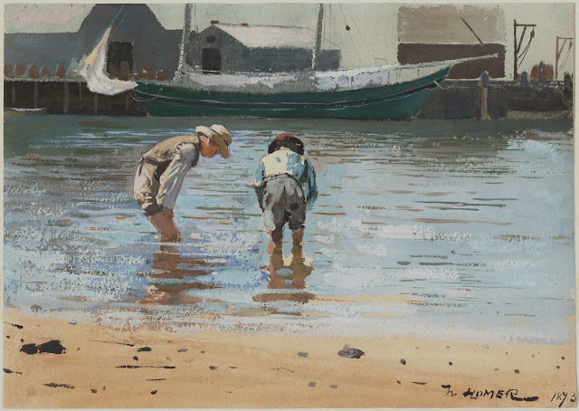
This is Winslow Homer's painting, not mine! ⇧
We as a class are looking at the work of Winslow Homer, and we decided to try reproducing this painting done with watercolor and gouache. It's interesting to try and study master's works and figure out color and technique. We didn't have the very rough paper he worked on nor do I have or use the colors he probably used, but we are trying it out the best we can and making up colors as we go along.
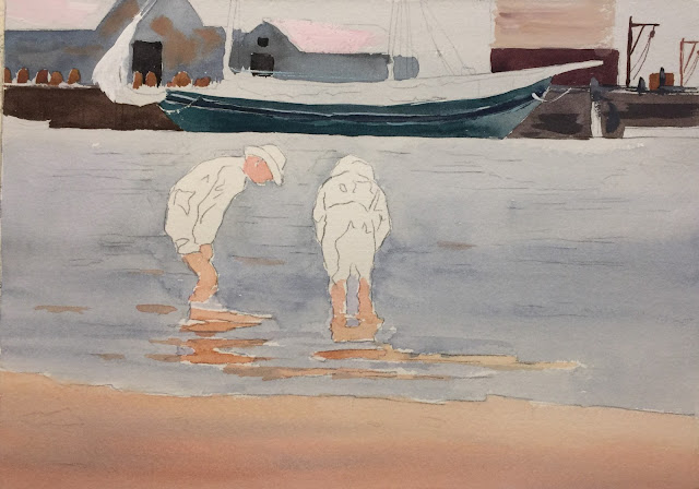
By analyzing the background and sky, I decided that Homer must have painted everything in the blue background first, all the way through down to the water and stopping at the sand, leaving the boys and part of their reflection the white of the paper. Any other white in the painting was done with gouache. Many students in my class went on a field trip to the National Gallery and saw this up front and close without any glass! They sent me photos they took of this painting but with transferring it through the internet and the color differences in computer screens, it certainly changed the colors which in the beginning looked more grayed down. The more teal colors did not seem to be there, but some of it was incorporated into our painting because many not only didn't remember certain colors in this particular painting, they didn't know we were going to paint this so they weren't really looking at the boat in the background for instance. It might have had some teal in it and I chose to do it that way because it offset the blue of the boathouses behind it nicely.
So, I started the background blue with ultramarine + ultramarine blue (Daniel Smith) + burnt sienna. Keeping it on the blue side, not green. For the sand I used raw sienna + winsor red and added a little burnt sienna. I painted the boys' skin but keeping in mind later I would put some shading in them. I used the color of the sand for their legs but for the face I used raw sienna + quinacridone rose.
The background boathouses were painted roughly using ultramarine + thalo + burnt sienna and deciding we should add some titanium white to the mix because it looks like the colors were more opaque and also more atmospheric, helping to push them in the background more. I dropped in some burnt sienna also roughly. Both blue boathouses were done in the same way. Then the other brown boathouse I used quinacridone burnt scarlet (Daniel Smith) + ultramarine + burnt sienna. I used that same color but added raw sienna to paint the pylons. I then painted the boat. I used the same colors as the sky and water but I used more ultramarine turquoise in it and added a little white to give it a more opaque look. I did not paint the stripe on the side so the color would stand out more.
I painted the bulkhead on both sides of the boat. Homer probably used burnt umber, but I don't use that color so I made it using ultramarine blue + burnt sienna + neutral tint.
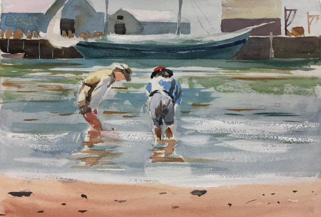
Starting on the boys I put the blue on the shirt on the boy on the right with ultramarine + thalo blue + titanium or Chinese white. Adding the white adds the opaqueness that I feel was done by Homer. His shorts I used neutral tint + white + burnt sienna plus a little quinacridone gold. The white on his shorts I did later with some white gouache, which wouldn't be how I would normally paint it. Homer used gouache frequently in his earlier paintings. For his red hat I used winsor red + gamboge then used a dark for the rim with burnt sienna + ultramarine blue. I used this dark also for the shadows in his shirt and pants.
To start the boy on the left I used raw sienna to map out the underlying highlights. For the deeper shadows, I used the same colors I used for the bulkhead but added some other colors. I used black + white + quinacridone burnt scarlet + quinacridone gold. It seems like a lot of colors, but it seemed to get the color I was looking for......I'm sure there was an easier way, oh well! The dark apron, I just used the bulkhead color. I also used the bulkhead color but more diluted for the shadow side of his hat. (If you don't want to mix all these, I also experimented with just black + burnt sienna + white and that seemed to work).
I started to paint the water in the background near the boats. I used ultramarine turquoise + ultramarine blue + burnt sienna + white. Dont used too much burnt sienna. I used this color to paint the center of the water under the big boat. As you go to the right use more burnt sienna and as you go to the left add some thalo blue. The water is pretty hard to describe. I used a lot of the colors I already used in the painting and maybe adding raw sienna or sap green to add the different colors affected by the sand and the sky.
Use white gouache to make the foam of the waves and the sail in the background. The rocks in the front I used burnt sienna + ultramarine....nothing too detailed as you can see. The lighter side of object I believe Homer just added white.
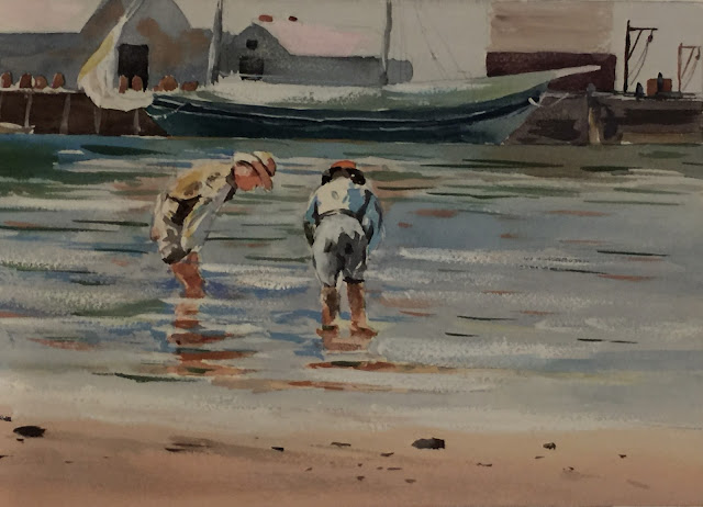
Here is the finished painting, although I would probably darken the boy's shorts on the right and a few other things. We ended up taking sandpaper and sanding some of the buildings in the background. It just slightly lightens it up and pushing them back a bit. Hope you had fun doing a Winslow Homer!


