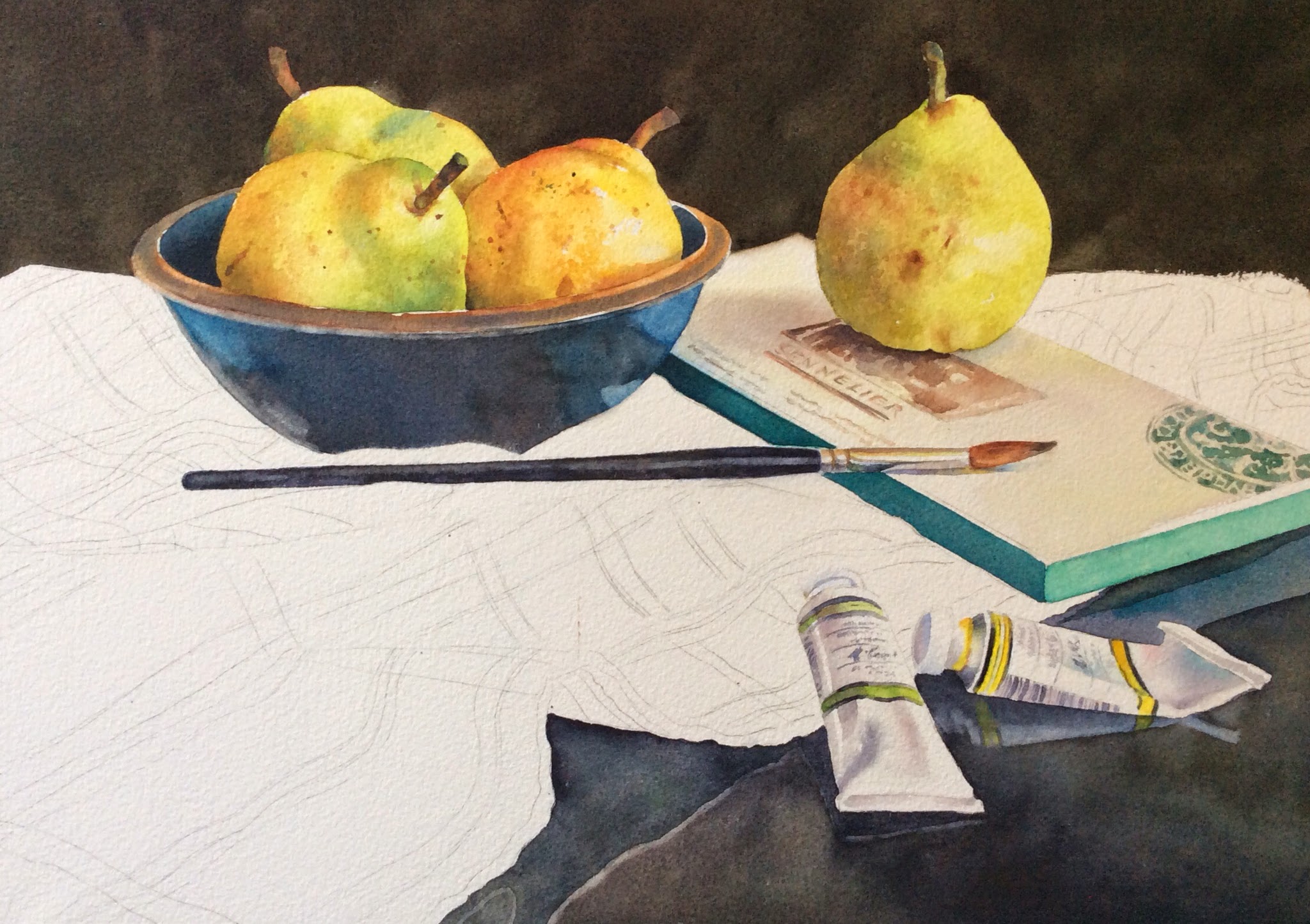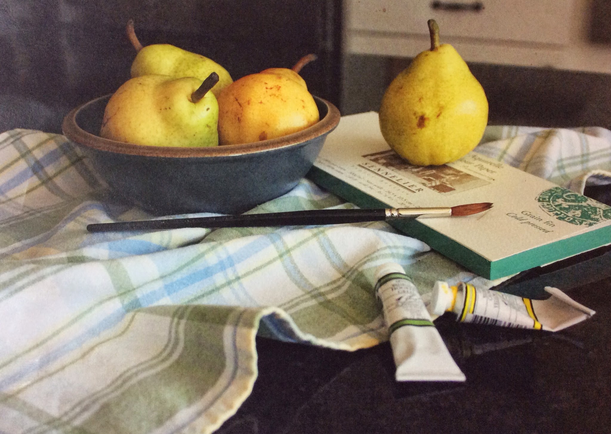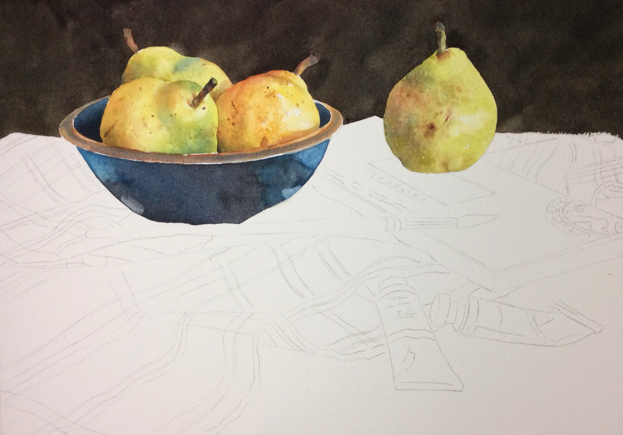
I'm sorry I didn't photograph the the start of this painting.....I got so involved with it that I plum forgot! Or I pear forgot! Well anyway, I started with the pears. There is one pear that is a little different in color, more yellow. The ones that are more green I started with a light green glaze of sap green and winsor yellow, or azo yellow in M. Graham paints. I darkened them in the shadowed areas by dropping in cobalt blue. I mixed in some perm. alizarin at times to dull down the color a bit. Then the more yellow pear I mixed azo yellow with a little alizarin and glazed with that. You can use cadmium red instead of alizarin also.I added green where I saw it and more red where I saw it on the left side. I used burnt sienna to put in the nicks and spots. I spattered a bit with it also, being careful to cover the other areas of the painting with paper towels torn up to fit around the pears. I spattered when the pears were wet and also when they dried. I also dappled them with a very light paint with my brush to put in added texture. The colors I used were just slightly darker then the areas I dappled.
Then I did the background. I painted wet on wet with a mix of maroon perylene and hookers green or you can use sap green. It makes a blackish muddy green color when the maroon perylene is added.
Then I painted the bowl. I used cobalt teal mixed with a little ultramarine blue and painted that in the light areas on the right and left sides and then filled in the rest of the bowl with that same color with burnt sienna added to it. It should make a deeper dark blue. That's it so far...more later.