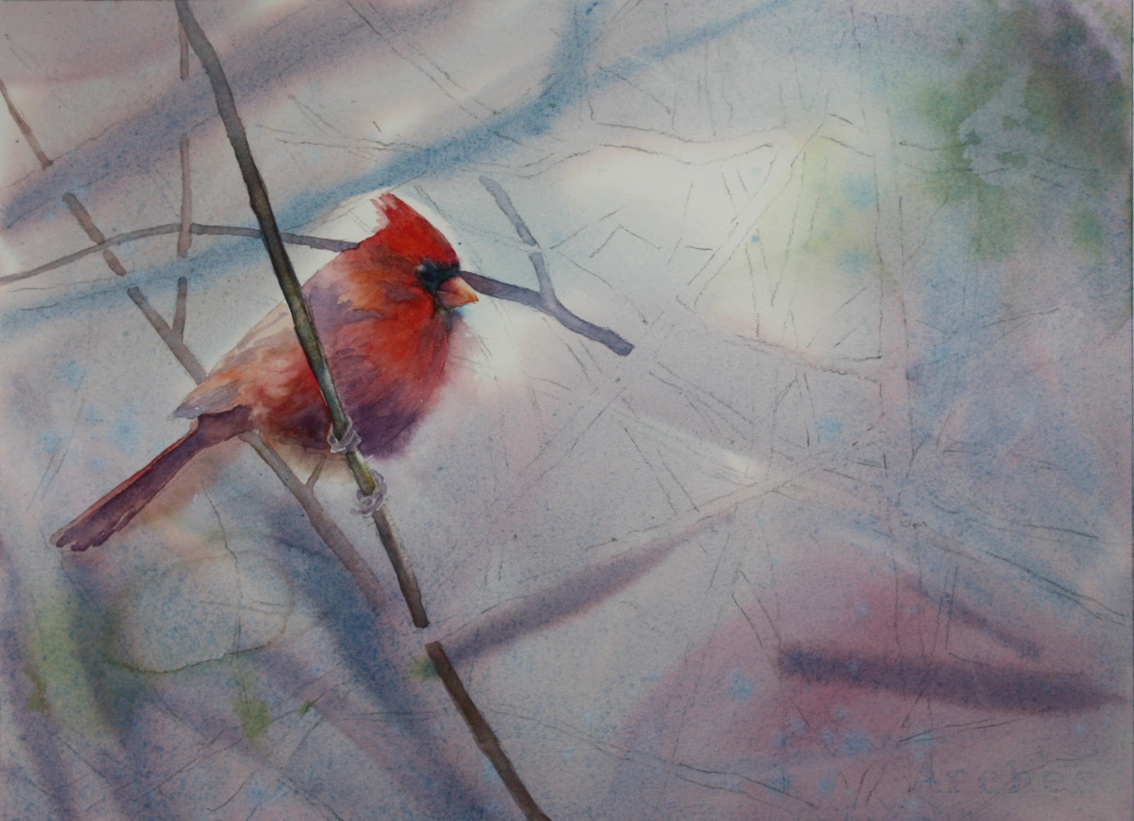
I started this painting with a wet-on-wet wash with cerulean blue mixed with a little perm. alizarin plus a little burnt sienna to take the color down a bit since it is a foggy misty scene. I added a little green in opposite corners made with ultramarine blue mixed with a little new gamboge. If you notice I added a bit more alizarin in spots also. While the wash was still wet I made some branches that are in the very far distance and I want them to be very blurry. I made that with cerulean blue and cadmium red.....there are areas where I used a little more cerulean in the mix.
More to come later!
Here it is later and I'm just adding the rest of the branches now. I noticed so many different colors of the branches in the photo. There is an ochre color, green, violet with more blue in it, violet with more red in it, and burnt sienna colored branches. These are the ones I am going to put in. The branches that have more yellow in it, which is the ochre, also have some burnt sienna added to it while still wet. I like to vary the color of the branches because indeed the light changes the coloring. Even the branches near the cardinal have a tinge of red to them .....maybe from the reflection of the bird.....which one of my students actually pointed out to me! Very good!!! I love it when my students point things out to me! Now I should go back and adjust me painting!!!
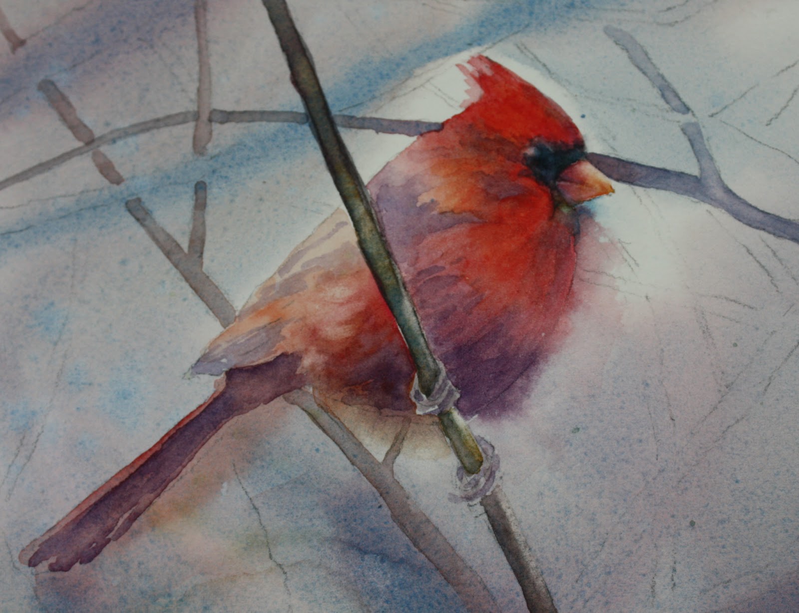
Ok let's continue......I can't exactly point out all the branches but take notice of the colors and the colors I give you. So you have the ochre ones, now the green. I made that with cobalt and new gamboge. Don't make the green branches too dark.....they don't stand out in the photo and shouldn't be too prominent. They also shouldn't be too yellow because it's a foggy day. The violet branches I made with ultramarine blue, alizarin and a little burnt sienna. After painting them in the violet color, you can drop in some other colors where you see it like burnt sienna or yellow ochre or green. It gives the branches some variation which is always good. In some places I added more blue, and in others more red. Also I made sure that the branches near the birds head weren't too strong in value. I didn't want the head to look like it was getting speared! Also, I made most of the branches lighter in value near the outer edges of the paper.
There are different levels of atmospheric perspective. Make sure you have branches in the foreground, middle and back of your painting. The branches in the way back are blurred and the middle ground should be paler than the foreground. Just make sure you have enough of each level. When putting the middle ground branches in, don't get too fussy about them......loosely put them in otherwise you will spend a lot of time with it and it shouldn't be that stiff.
Lastly after the branches dry, I checked to make sure there are dark spots or areas that should be noted and light areas that should be scrubbed. The tops of many of the branches are highlighted and I scrubbed those out. You can either use a scrub brush, or use a regular damp brush and blot afterwards.
I spattered my painting also. I spattered with yellow ochre, greens and violets. You can take note of those areas on the finished painting. I used a lot of water in my color to spatter so it makes larger more varied spatters. I also put in some green leaves that look dried up since it is a winter scene and they wouldn't be nice perky leaves. Don't overdo it though....I only added a few and they are pale. Also, I added some extra background in the upper and middle left of the painting because I thought it needed some darker value. You can do this after the fact - it works just fine. Just make sure that whatever you paint on one side of a branch, also comes out on the other side, otherwise you will end up with color that stops short.
That's it.....if you have any questions that I didn't cover, please feel free to email me or make a comment on the blog. Happy painting!