Sunday, December 7, 2014

"THAW" - Classwork

We are painting this picture in class.  It is a fairly simple winter scene and the first thing we are painting is the sky.


Wet on wet I painted the sky with a mix of cobalt teal and cerulean blue, concentrating the most color in the center.  Then I painted some low lying clouds while still wet with a violet mix of cerulean and permanent rose.  I carried this below the mountain line.

While the paper was still wet, I added some distant trees with a strong mix of cerulean and maroon perylene.  Don't make it too strong that it is very dark....remember the atmospheric conditions are cloudy and you wouldn't see it so dark, but by keeping less water on your brush you can keep the paint from spreading too much.

There are also some green distant trees that I added with sap green and a little cerulean blue.

I let the paper dry and then added the rest of the background trees, being careful not to get too detailed and let the colors mix.....I wanted it to appear foggy.  The rusty color is alizarin and burnt sienna with a little cobalt in it.  I also used a violet with with the same colors except more cobalt and less burnt sienna.  The darker violet I used ultramarine instead of the cobalt.  The pine trees are sap green with a little cadmium red.  I added some cobalt to shade one side.

Thursday, May 15, 2014

PAINTING THE SKIRT, BASKET AND LEGS

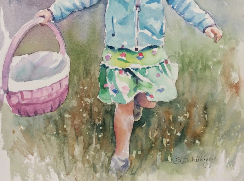
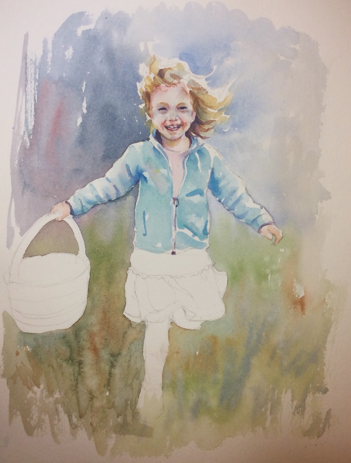
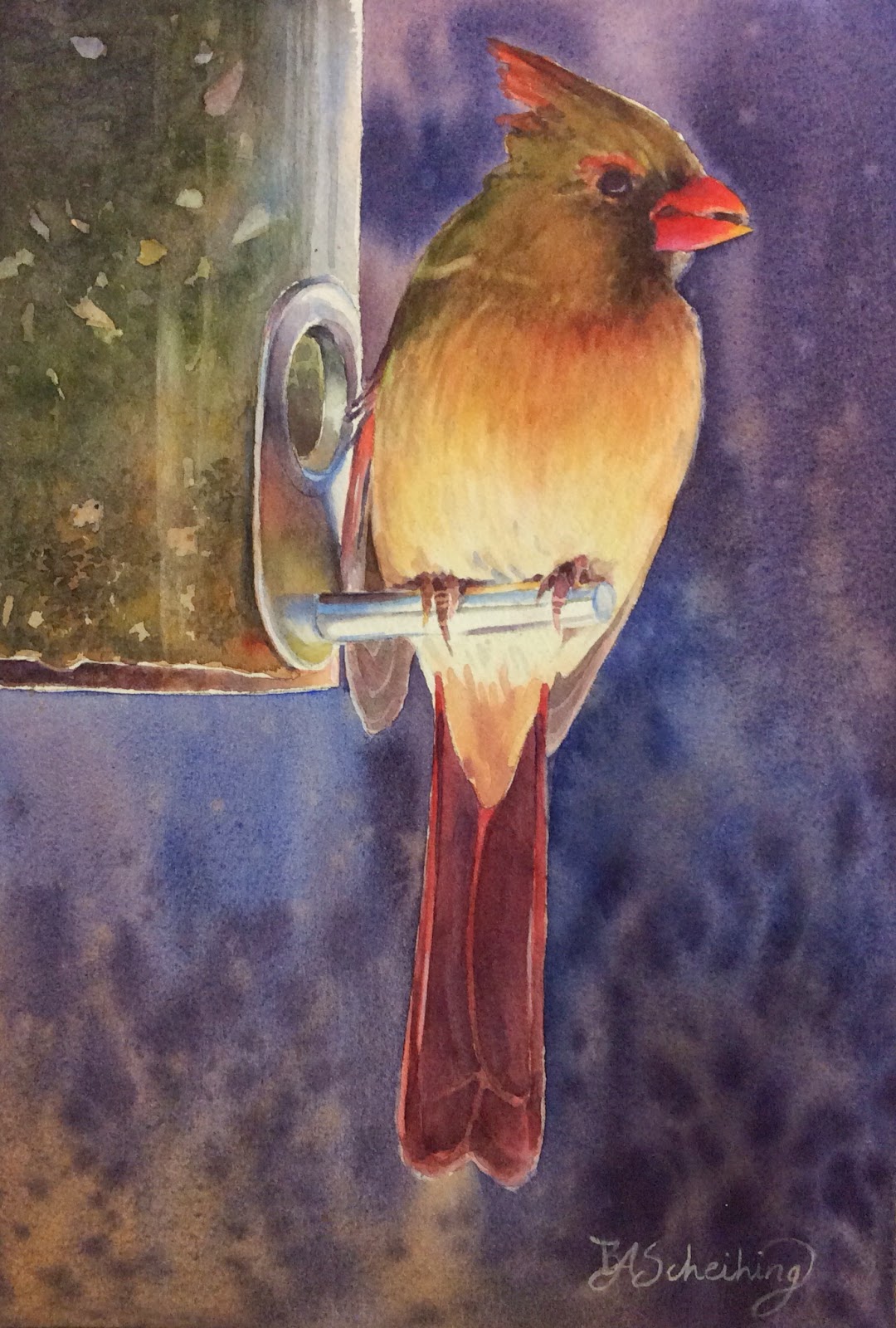
I chose to play down the colors in the clothes as you might notice.  I find that we tend to try to achieve the same color intensity in the clothing when we are doing portraits.  Depending on what you want to focus on, of course, it's best to play down these areas.  The face is where you mostly want your focus to be directed.  If I were to paint the basket the hot pink it is in reality, I immediately shift my focus and things become out of whack.  The skirt is therefore  mostly light in tone except where the folds and creases are and some darker shadowing on the left side. I randomly painted the flowers in her skirt first....very undetailed.  I think you can figure out what colors you can use here.  Then I painted around them to do the skirt and  I used cobalt teal and winsor yellow.  Some areas of the skirt I added more yellow, some I added more teal......all watered down a good amount.  The darker folds of the skirt I added some ultramarine to that mix and I made it slightly stronger (used less water). There is a little scalloped edge separating the top and bottom of the skirt.  I darkened under that scalloped edge.

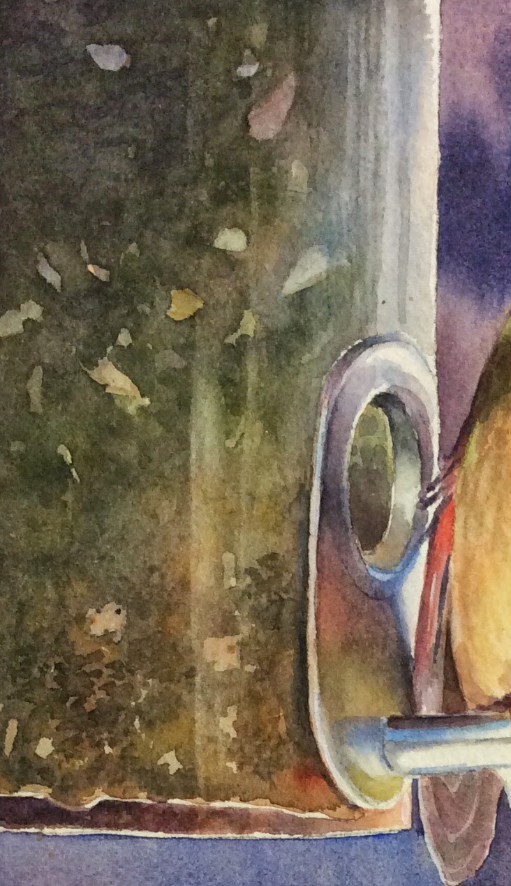
The basket is pretty straight forward.  I initially painted it a light wash of perm. rose and a tiny bit of cobalt.  The interior of the basket is a little darket violet (added more cobalt), however I added a touch of winsor yellow to it to dull it down.  Not too much.  I even threw in a little cobalt teal to it.  It is VERY light.....don't be heavy handed with it.....remember we are downplaying this area.  After this dries, I made a little heavy mix of the initial violet I used to paint the basket and put in some minute details.....adding a little more cobalt to darken towards the bottom.  You might have to add a little yellow to tone down that violet shadow if you don't already have it in your mix.....don't make that shadowed violet too violety....(my word).

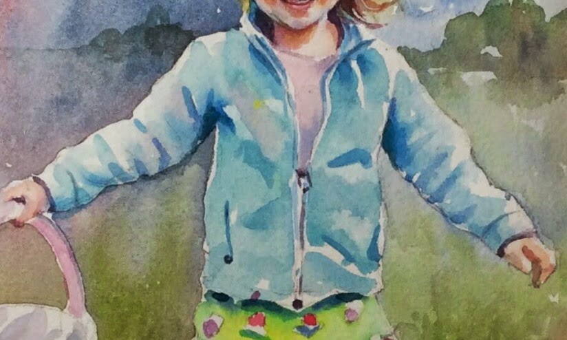
OK....the legs.....they are done the same way as the face.  They have a bit more yellow tone, so add a bit more raw sienna.  The leg that is tucked under though has violet tones in it.  I mixed a violet and put that just under the skirt area. (perm. rose and ultramarine)  I accentuated some of the bone and muscle area by concentrating color in those areas....such as the calf and knee and leaving some white showing.

The shoes are very understated.  They are just a violet with yellow in it to tone it down.  Pick a violet...it will work.

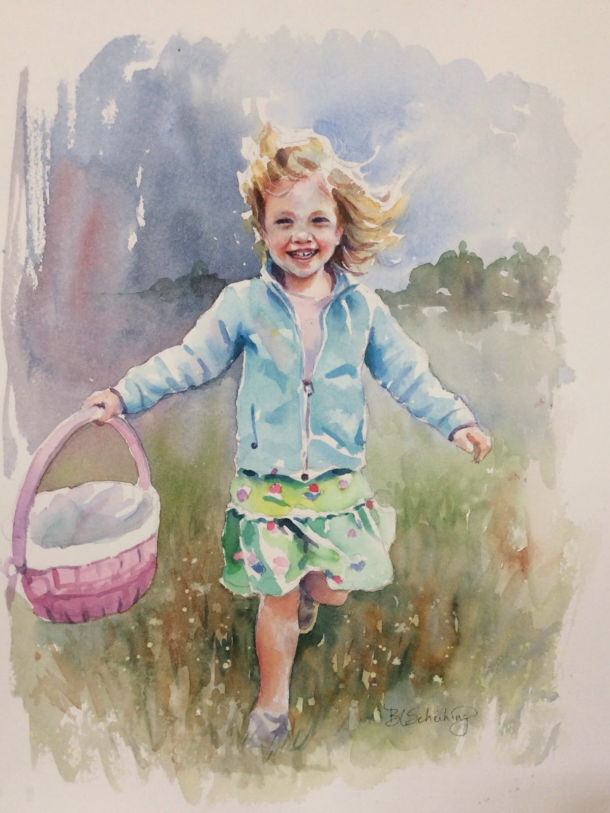
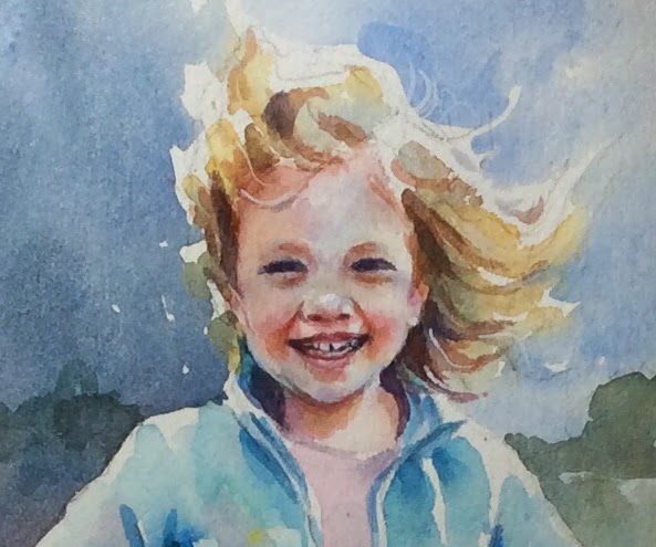
Now that those areas are finished we can darken the face and add background.  I think I forgot to talk about the lips!  All the shadows, facial features that need to be darkened I did.  The lips are alizarin watered down.  Add violet to deepen it toward the edges of her smile.  It's always lighter where the lips get fatter. I ended up putting a little white highlight on the lower lip with gouache.

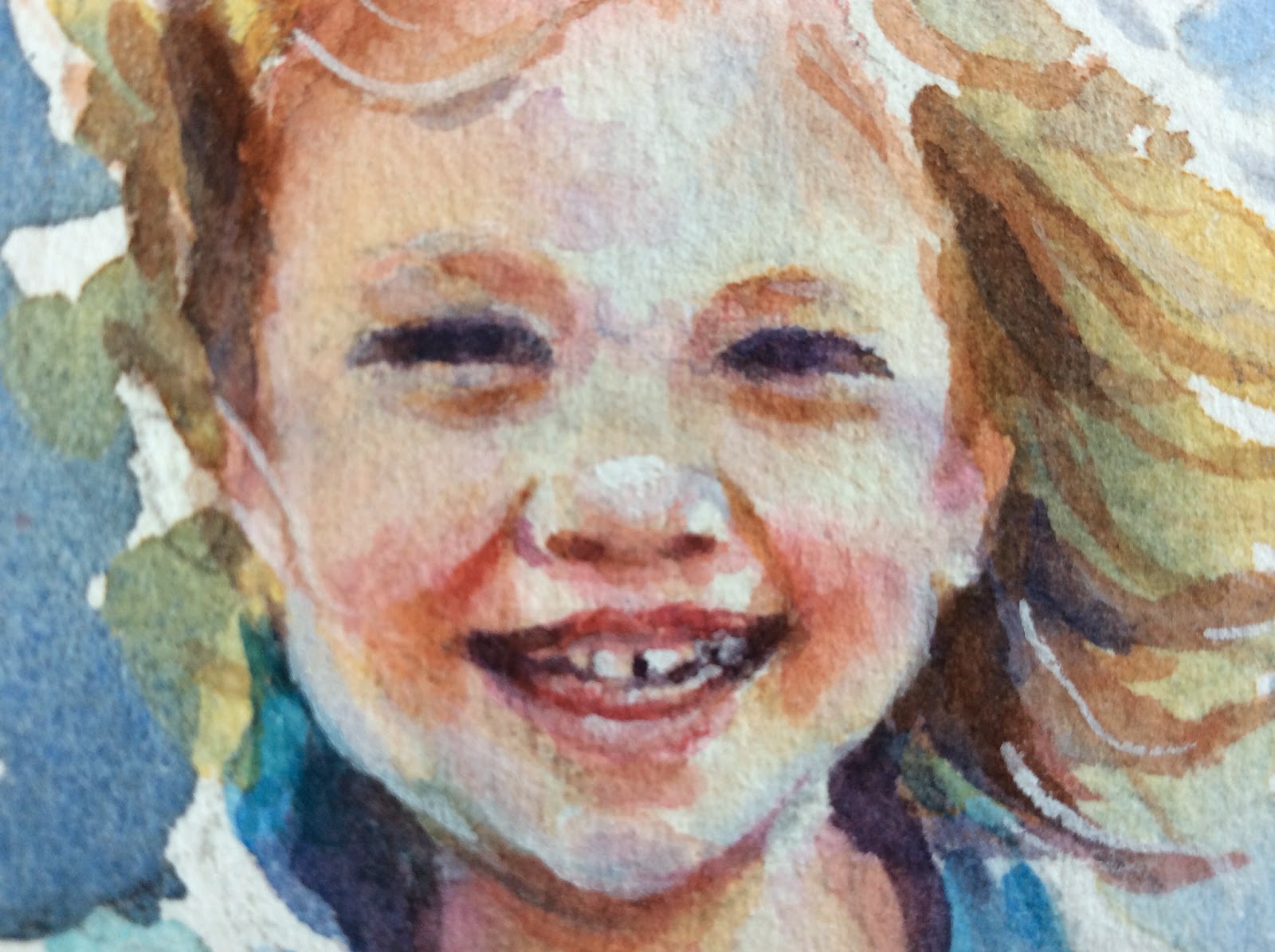
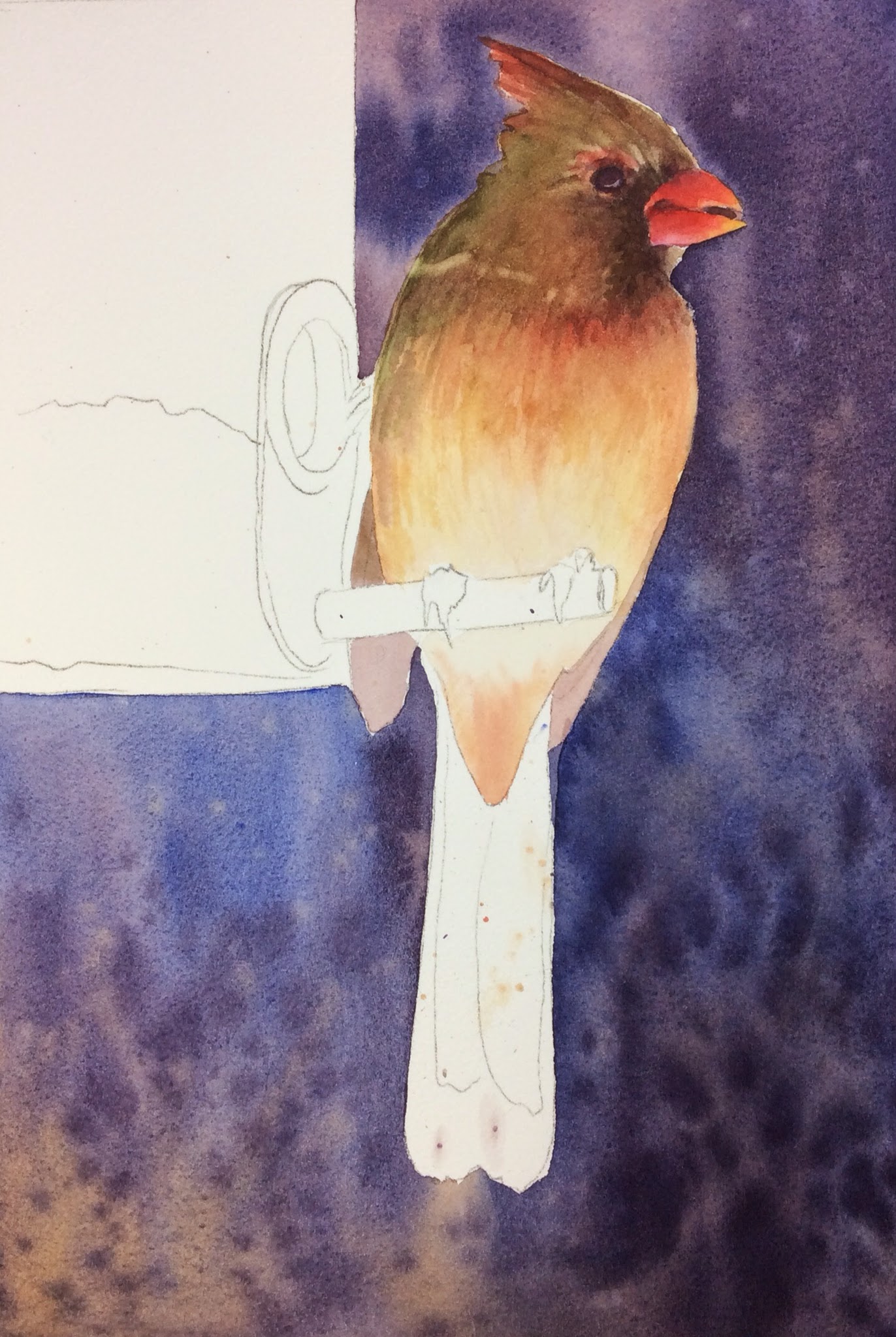
Here's a closer view of her features.  I darkened the upper eyelids with more of the skin tone.  Put a few more blue in places.  Glazed the skin with raw sienna in areas on the left side of her face, sides of her mouth, cheeks.  Also glazed areas with perm. rose after that dried. The bridge of the nose has a shadow on it.  I used raw sienna, let that dry and used cobalt.  Some of these glazes have to dry in between.  You can't add wet on wet sometimes because the colors will just get lost.  This is not a very large picture so that makes it more difficult.

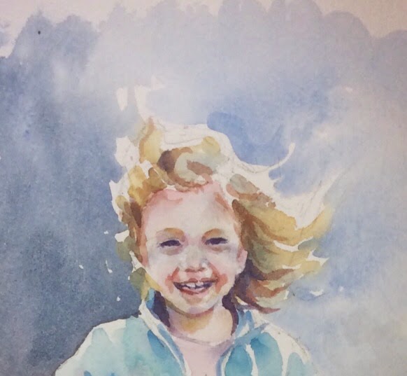
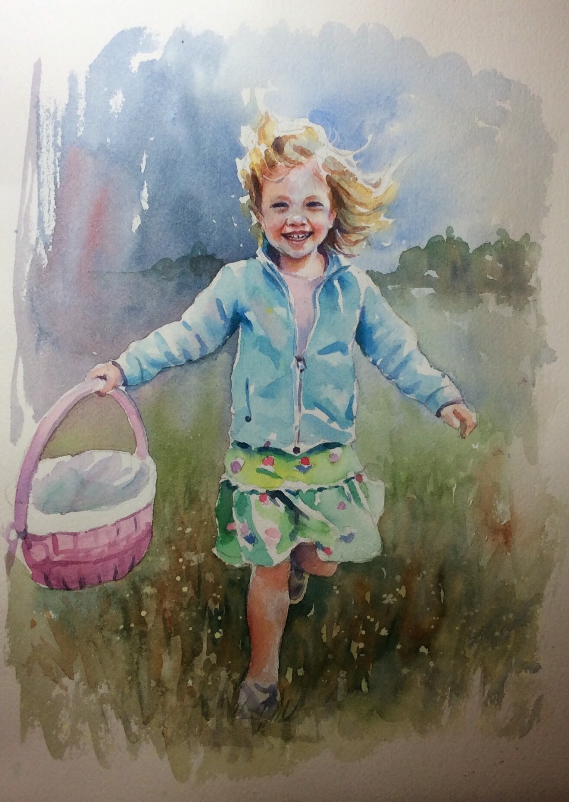
The background was finished after that.  I decided to put in a row of trees very loosely.  I used sap green and cobalt with burnt sienna in places.  Very light wash.....not a focal point and it's also in the near distance.  I painted it wet on dry but then took some water and brought it down past the horizon line.  Then I darkened the grass area around her feet.  I made it look like there were flowers around by just not painting and negatively painting in some roundish shapes.  I put in sap and cobalt with raw sienna and burnt sienna....all individually running it around on the paper.  You might want to practice that before attempting.  It takes a loose hand.  That's it!!! 

HAIR AND BACKGROUND

                                                          These are my initial washes.
      This is how it looks after doing the beginning wash.  As I made my way around the girl I started incorporating the land color of sap green and throwing in some burnt sienna and cobalt in areas.  You can see the brush strokes I used.  This is the initial layer.  I darkened it all later.
Here's a closeup of the jacket.  The shirt I just used a violet and darkened around the inner edges by adding more blue to the violet.

Tuesday, May 13, 2014

CLOSE UP

You can get a really close look at the face this way.  The neck I did the same initial color as the face . Then added shadows with a deeper mix of raw sienna and perm. rose with some burnt sienna just under the chin.  Also made a little violet with the perm. rose and cobalt to add on the very left side of the neck  and the very right.   Same dark I used for the eyes and mouth, I used alongside the neck near the jacket.  Once the face and neck were almost done, I wanted to work down to the jack and shirt.  Then I went back and did the background and hair at the same time to incorporate the hair into the background.  This takes some forethought......always think about incorporating parts of your painting into other parts and think it out beforehand and how you are going to approach that the best.

The jacket is thalo blue diluted quite a bit.  The darker shadowed areas of the jacket like the creases and under the arms I added some raw sienna to it.  There are some pink and violet tones in it and I put some perm. rose in spots.  The same dark I used for the eyes, I used watered down in the dark shadowed areas like the dark between the cuff and the hand, parts of the zipper.

"ON THE HUNT"

I love the picture that my husband's cousin's daughter took of her daughter at an Easter egg hunt and knew I had to paint it.  It's not my photo, but I thought it would be a good project for class and I got permission to use it.


Here is the photo.


I started painting her face.  The 3 colors I used for her skin tone is permanent rose, raw sienna, and cobalt blue. I mainly mixed the perm. rose and raw sienna until I was happy with the color.  Some areas of her face are more yellow, some more pink.  The cobalt was used for shadow areas on her forehead and lower jaw.  I kept white highlights on the right side of her face near her eye.   Letting this dry I added crease lines. Be careful not to add blue in the crease lines of her mouth or under eyes.  Especially on children, this makes them look older. The crease lines should be a deeper pink with a little cobalt added to the perm. rose.  You can now paint some rose on the cheeks.  I glazed over the face where I felt it needed more yellow tones later.  It's not necessary to totally complete the face.  I did put in the eyebrows with  a light color of burnt sienna, perm. rose and raw sienna.  They are not painted all the way across, just halfway from the inner corner.
Working on the mouth and eyes, I used the same colors to get the dark.  The eyes are little slits.  I used ultramarine blue,  burnt sienna and a little perm. rose.  That color I used for the dark corners of inside the mouth and around some of the teeth.  Don't describe every tooth!  Just a few.  

Thursday, April 24, 2014

METAL ON BIRD FEEDER

The metal part of the feeder has all the colors in it the we used for the bird.  It's metal, so it is reflecting all those colors.  I painted the metal wet on wet and only wetting that outer part....taking it in sections, since there are some light areas I want to protect.  I chose not to mask out anything.  You don't want to paint the white edges on the left...keep that white, although there is some color in it.  I can't really tell you how to paint this, but the colors I used were .....for the dark, ultramarine and maroon perylene (more on the blue side), the green which is sap and maroon again, and I used alizarin for the red reflection. There is a reflection of the perch in there that I later scrubbed out and when dry, I painted some cobalt into it. There is a very bright highlight next to the bird that I didn't wet in the beginning....keep that white.  After I initially did my wet into wet wash, I let it dry and deeper color where it needed it.  Then painted the rest in.

PAINTING THE BIRD FEEDER

The bird feeder was a little tricky to figure out.  I decided a few layers was necessary to achieve the depth and variety of the seeds.   I started by drawing in a few larger seed shapes but didn't overdo it....around 7-9 shapes. Then I wet the whole area but not the seeds I just drew in, or the metal hole area, and not the very bottom where there is a white dividing line. Also I stopped with the water at the very right edge to keep the white highlight. Using burnt sienna, I painted the upper portion and stopped 3/4 of the way to the right and used a light wash of cobalt blue the rest of the way towards the right where there are highlights on the plastic....leaving the unwet area alone to keep the white highlight.  Towards the bottom, it gets a little more golden, so I laid in some raw sienna with burnt sienna in parts.  I even put a little cadmium red in the lower right corner.  After that dries, I painted the seeds I drew in with various colors, some raw sienna and some burnt sienna and one or two I made cobalt.  I let that dry and worked on the NEXT LAYER.  This time working wet on dry I got a little stronger with my color.  I introduced the olive green color I used on the bird....the sap green mixed with a little maroon perylene.  I started painting with the green mixture at the top corner and used negative painting to add in more seed just very randomly so that the underlying color would remain and create the seed color.  Again don't go overboard, the brain will be able to tell this is bird seed and you definitely shouldn't try to over work this or add every seed shape!  Insane! Keep it simple.  As I worked toward the right I started to add in the cobalt again but kept that green in it too.  The blue shows up subtly.  I kept working the green color all the way down, also introducing raw sienna again towards the bottom.

LAST  LAYER -  (don't forget to let each layer dry before doing the next one) I used the same green, only I introduced neutral tint to it.  I wanted the seed to look more black, but the black was too strong so I mixed the green into it to soften it down.  It seemed to do the trick.  Again, I tried to paint with a little texture, showing a little of the background I used before....it should be subtle changes in color, not too obvious.  Subtle is good!  Some areas I painted a little stronger than others.  The upper left seems a little darker so I used stronger color there.  I painted over the bird seed I drew in to glaze it and make it recede a little, but here I diluted my black mixture a bit so as not to completely lose the seed shapes altogether.  I kept using the black mix all the way through, except I did keep putting a little cobalt into the right and if it needs a little browner touch towards the bottom, you can add more raw sienna, cadmium, or burnt sienna charged into the black.....however you see it.  Just don't make the black mix so heavy towards the bottom.  We are going to add more when it dries.

Now that it's all dry, I used that same black mix and dappled some little seeds on the bottom because the smaller seeds fall to the bottom of the feeder and it is evident in the photo.  There are some lighter seeds in there too....you can dapple some raw sienna in there too.  That has to dry, and then I added highlights by scrubbing out vertical lines with water and blotting.  Remember subtle is good here.


Thursday, April 17, 2014

"FEEDING BEAUTY"

I completed the painting of the female Cardinal.  The tail colors I used were alizarin and ultramarine blue as the initial wash.  Make sure you make it more on the red side.  When that dries, glaze over the tail with the same two colors, only now it is more on the blue side.  The thing to watch is how you glaze over the initial wash.  You are going to avoid painting near the edges and the middle where the redder wash is visible.

Next paint the little side wings.  I used maroon perylene and ultramarine in a watered down wash.  The same technique used for the tail is used for the wing tips.  After that wash dries make it a little bluer and paint the areas you see darker.

Next segment the bird feeder.....

Monday, April 7, 2014

FEMALE CARDINAL

Building layers on the bird.  Also did the beak in cad. red with some alizarin in it.  Added some yellow ochre at the tip and then decided it should be brighter so I added azo yellow.  I think it gave it a transparent feel.  The wing tips I used a very diluted maroon perylene and ultramarine....later I will do some negative painting in that area and deepen it.

Female Cardinal Painting

Starting a cardinal painting.  I liked this picture because of the lighting.  I will post the photo so you can see it.  The background is painted wet in wet.  I used a very concentrated mix of maroon perylene and ultramarine blue.  I also used ultramarine while continuing down the picture.  Then adding the dark into it.  I used raw sienna in the lower left corner and then spattered the picture with it and with the dark.  I spattered a little towards the top with the maroon very diluted.  When that dried I started working on the bird.  I started wet in wet everything above the perch.  I put yellow ochre lightly throughout the bird and very lightly near the belly where it's lighter.  Pay particular attention to leave  a little white space on the top of her head....that will give a nice backlit effect.  I used some burnt sienna to put the sienna tones in the upper breast area.  While it's all still wet I also added cadmium red within the sienna a little and adding it to the tip of the head and around the eye.  I mixed sap green and a little cad red together and worked that into the head area.  The deep violet mix that I used for the background, I also used for the dark around the beak area.  I also used it for the dot of the eye.
I dried everything and then reworked those same colors over again, keeping the breast area the original wash color and trying not to go into it too much.  I did use a little wash of azo yellow or winsor yellow around the breast area to brighten it up a bit.  More later.
I changed the background to include more texture and not make it quite so dark.

ALL PRE-PEAR-ED Finished Painting


Sunday, April 6, 2014

Shadows

Before painting the plaid it's important to put in the shadows in the cloth first.  I used ultramarine, a little alizarin and a little azo or winsor yellow.  Working wet in wet just in the section you are working in.....you don't need to wet the whole cloth.  Make sure you don't make the shadows too dark....some areas are very subtle.

Pear Still Life continued.....

Almost done.....have to still add the edging to the dish towel and deepen the shadow reflections on the table.   I used these colors to make the plaid in the cloth.  Green - sap and a little alizarin crimson, Blue - verditer blue or cobalt if you don't have that, and cadmium yellow light for the yellow stripes.  Where the green stripes are in the shadow I added a little cobalt to it.  I added yellow to the green where it got a little more light on it.

Friday, April 4, 2014

STILL LIFE continued....


Painted the brush handle with neutral tint.  Since the handle itself is black, it's ok to use black to paint it.  Sometimes watercolorists think you should never use black, but depending on the lighting situation, choosing black can be the right choice..  There is warm lighting in this painting and I chose to add yellow ochre dropped into the black handle.....I still need to warm it up a bit more.  I lifted the middle shine with a wet brush and blotting the excess off.  I could have used ivory black which is a warmer black .....but I couldn't find it!  So, adding a warm color solves that!  The watercolor pad has some interesting colors.  The green around the edges I painted with cobalt teal and ultramarine with azo yellow in the shaded areas and in the light areas I used the same colors but with more yellow in it.  The shaded area has more blue in it.  I will continue in another post.

Thursday, April 3, 2014

PAINTING PEARS

I'm sorry I didn't photograph the the start of this painting.....I got so involved with it that I plum forgot!  Or I pear forgot!  Well anyway, I started with the pears.  There is one pear that is a little different in color, more yellow.  The ones that are more green I started with a light green glaze of sap  green and winsor yellow, or azo yellow in M. Graham paints.  I darkened them in the shadowed areas by dropping in cobalt blue.  I mixed in some perm. alizarin at times to dull down the color a bit.  Then the more yellow pear I mixed azo yellow with a little alizarin and glazed with that.  You can use cadmium red instead of alizarin also.I added green where I saw it and more red where I saw it on the left side.  I used burnt sienna to put in the nicks and spots.  I spattered a bit with it also, being careful to cover the other areas of the painting with paper towels torn up to fit around the pears.  I spattered when the pears were wet and also when they dried.  I also dappled them with a very light paint with my brush to put in added texture.  The colors I used were just slightly darker then the areas I dappled.

Then I did the background.  I painted wet on wet with a mix of maroon perylene and hookers green or you can use sap green.  It makes a blackish muddy green color when the maroon perylene is added.

Then I painted the bowl.  I used cobalt teal mixed with a little ultramarine blue and painted that in the light areas on the right and left sides and then filled in the rest of the bowl with that same color with burnt sienna added to it.  It should make a deeper dark blue.  That's it so far...more later.

Photo Of Pears

                                                  I'm starting a painting of this still life.

Sunday, March 23, 2014

LILY OF THE NILE IN PROGRESS

Working on the stems and buds.  If you notice the stems are different values with the same greens used throughout, which is sap green with either winsor yellow in it or cobalt blue.  Also there are reflected colors in the stems of either permanent rose or the violet from the buds and flowers which is cobalt blue and permanent rose.  Sometimes it's just cobalt blue.

Friday, March 21, 2014

Here is a close up, although if you click on the picture you can even get closer.  Thought this might be even closer by taking a close up picture.  Note the dry brush technique I added to give it more sunlight and texture.
Working on the large flowers.  Colors are cobalt blue, quinacridone rose (or permanent rose) and titanium white.  Added thalo blue (or winsor blue - green shade) to certain areas.  Watch for deeper values near the flower centers to make them pop.  They are so close in color to the flower....it's a little tricky to highlight them.  I don't finish one area of the painting at a time, so there are more value changes I need to make to the buds on the left, etc. 

Tuesday, March 4, 2014

LILY OF THE NILE - Stems and Buds

I've complete a few more buds and stems and have mostly completed a third of the painting.  Nothing really to note here....just going to keep going and I will give you  more info when I get up to the big flower.

Monday, March 3, 2014

LILY OF THE NILE - Stems and Buds

After being fairly happy with the background, I took off my masking fluid.  I can always go back and adjust my background afterwards.  I then started on the bud on the very top.  The colors I used for the buds are ultramarine blue, permanent rose, thalo blue, winsor yellow, and sap green.  I mixed the ult.blue and perm. rose to get a bluish pink violet color.  By dropping in thalo blue in spots, it brightened it and gave some good highlights.....always study the photo for color nuances!  I then scrubbed out the center highlights and then added winsor yellow to them.  There is sap green toward the base of many of the buds.  It flows well into the stem. The stem has violet and pink highlights in it on top of a sap green base color.

LILY OF THE NILE - Background

I began by masking out the stems and buds on the left side....anywhere that the background touches the flowers on the left.  Then wet on wet I painted the background.  Using sap green, ultramarine blue, winsor yellow for the main parts of the background.  I added orange sections with cadmium red and winsor yellow.  Most of these colors I dropped in on top of each other....not mixing on my palette.  I did mix sap green and ultramarine in places to get a dark, but also put in some of those color separately.  I also added an M. Graham color of cobalt teal in places.  After that was dry, I went over it in certain places again just to darken.  You don't have to re-wet the whole area....just parts you want to change.  After that was dry again, I actually removed some paint with a wet brush, scrubbing and blotting out those areas I wanted lighter and also with a rounder scrub brush, made little circle halos around.

LILY OF THE NILE

This is a photo of the Agapanthus flower taken when I went to Hawaii.  I am starting a painting of it and so is our class....if it ever stops snowing!

Saturday, February 1, 2014

"Snow A Deer"

Here is the finished painting of my snow scene.....I named it "Snow A Deer" because it reminded me of Doe A Deer.....hope you get the pun!  Anyway, if you want to see the video of the process, then just click on the link below.....have fun!

https://www.facebook.com/pages/Barbara-Scheihing/62952945920

Saturday, January 18, 2014

SNOW A DEER

This is how far I have gotten after I poured the background.  If you'd like to see the video of how I painted trees in the background, click on this link below:

https://www.facebook.com/pages/Barbara-Scheihing/62952945920

Saturday, January 11, 2014