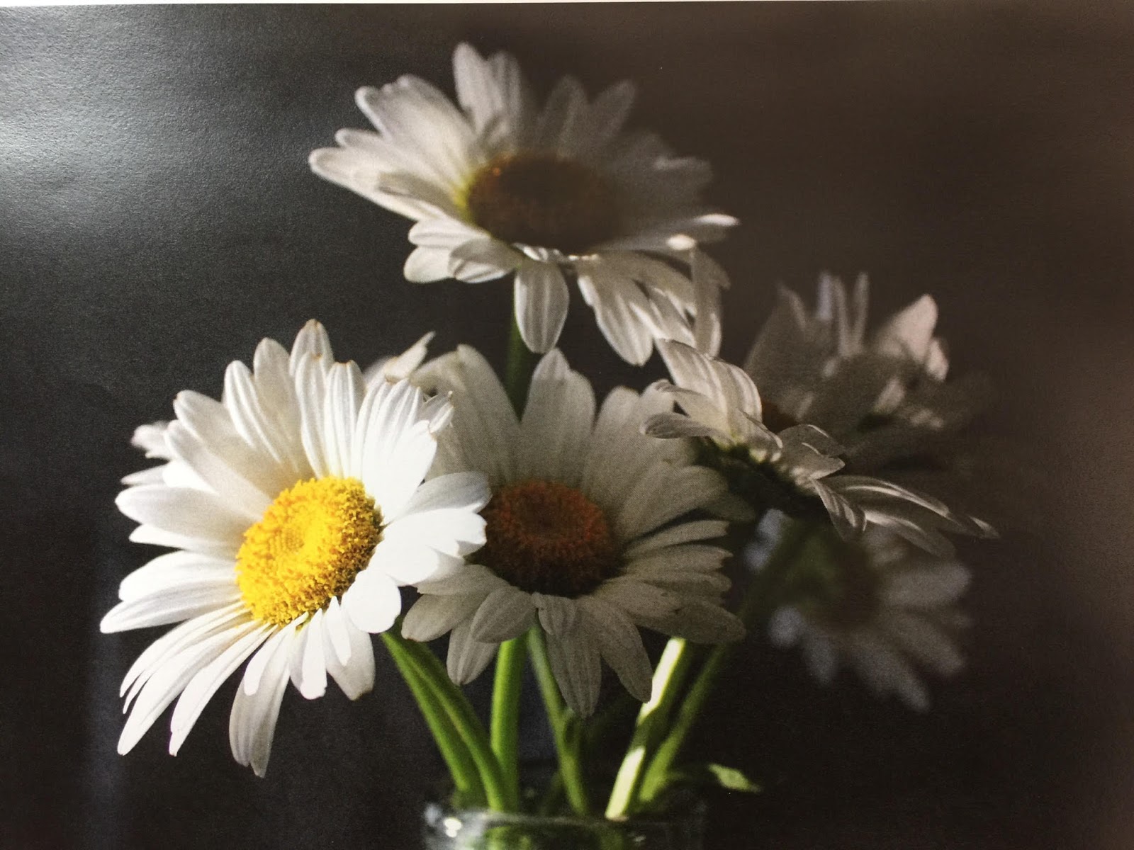
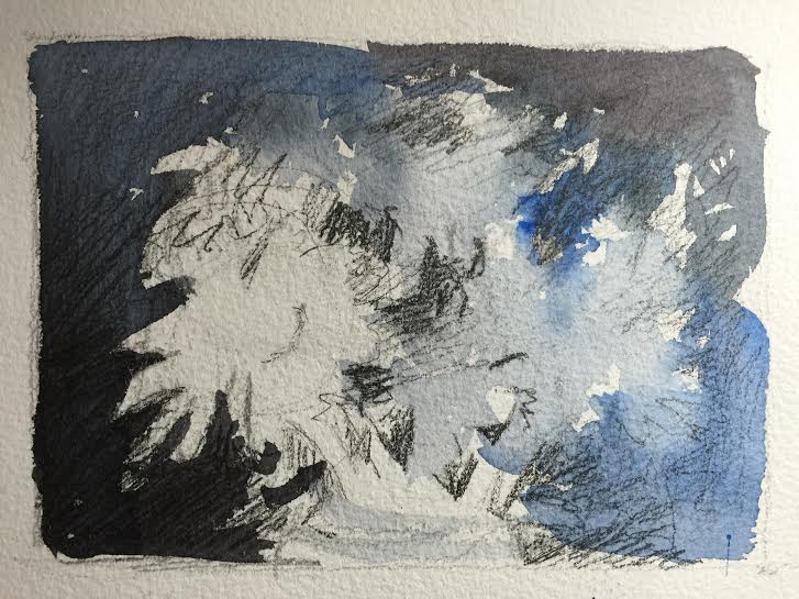
Then I started painting the background first, but before I did that I wet the flowers with plain water because I wanted the background to be a soft edge against some of the flowers on the right. I used payne's gray mixed with cobalt blue. Sometimes I added more cobalt to look more blue and other times I used more payne's gray. You can tell in the picture when I did that.

I was not super careful with getting all the petals correct and worked quickly. I didn't want this picture to be so exact and tight.
I then painted the flower centers. I started with the very left flower. That center should be the brightest and it doesn't have any blue glaze over it like the others do so the colors should come out a little brighter. I painted the whole center with cadmium yellow and cadmium yellow light, and pulled the color through to some of the petals where I saw some yellow in them. I added some cadmium red light around the edges of the centers to give it more warmth and then I touched in some cobalt blue around the bottom edge. I did that same procedure with the other centers but looking at the photo for differences in shape and color for each one. Also I started to add the darks of the background in between some of the petals and the stems.


Then I did the stems which I used the cobalt blue and cadmium yellow light to achieve. One of the stems is very white which I liked and left alone except to give it a very light wash of cadmium yellow light. I basically made a very light green and painted that first on the stems. (From this photo it doesn't look very light but it is) I then made the green a little darker by adding more blue and then painted the darker side of the stem when almost dry but wet enough to make a soft edge. This takes a little patience to wait for the right timing to paint that in. If you mess up, you can always just scrub out a highlight. This works as well and makes a soft edge.
There are shadows on the petals and I painted those with cobalt blue and maroon perylene. I used the same colors and the background to fill in the glass vase and made sure the stem colors were carried down into it. Keep a highlight around the rim and just a few other highlights in there but it is mostly observing the glass and see what you see. There are no tricks to doing glass really....just paint what you see!
beautiful........
ReplyDelete